Stamp Community Family of Web Sites
Thousands of stamps, consistently graded, competitively priced and hundreds of in-depth blog posts to read


Stamp Community Forum
 
Username:
Password:
Save Password
Forgot your Password?

This page may contain links that result in small commissions to keep this free site up and running.

Welcome Guest! Registering and/or logging in will remove the anchor (bottom) ads. It's Free!

Scott 1564 - Color Changeling Or Red Omitted Error?

Previous Page
 
To participate in the forum you must log in or register.
Author Previous TopicReplies: 26 / Views: 4,890Next Topic
Page: of 2
Pillar Of The Community
Canada
2277 Posts
Posted 02/25/2012   12:21 pm  Show Profile Bookmark this reply Add nitrolures to your friends list  Get a Link to this Reply
I'm taking my few years as a printer but with litho printing (aluminum plate rubber transfer) - KHJ you are correct with dot positions as the lighter pale red for the skin tones would be present but if I am thinking right the ommision of even the darker reds would be the same effect. Basically the magenta(red) would be constant and only the pick up or transfer amounts would account for the shades. In order to get the brighter reds it would have been printed ober top of the yellow possibly even directly over the yellow dots (thats the part I'm not 100% on with the 2 types of printings. The misregistration of the yellow should infact make the reds even more prominent in some places and less in others but with the close ups I am even more certain there has never been red on this stamp. Bleach would have effected the other colors even the black so I think that is out of the question. WT I believe with a 98% certainty this is an ommision but the condition makes warranting a cert a hard one. Is there any listed in scott within the same time period +/- 10years that can give a rough idea of value? Deserves a special notation in your album if nothing else .
Send note to Staff  Go to Top of Page
Pillar Of The Community
United States
6756 Posts
Posted 02/25/2012   1:03 pm  Show Profile Bookmark this reply Add khj to your friends list  Get a Link to this Reply
I agree that it certainly looks more promising with the close-ups. It would be quite difficult to find an expert willing to certify it, although you can try. The main problem remains, to me, all the colors seem to be faded -- even the postmarks seems faded. That's why it is so hard to get used color missing errors certified. There are a few used color missing errors that are rather easy to certify, and some of them are listed (although not priced) in Scott. For example, the 25c honey bee with black missing, and the 22c AMERIPEX booklet stamps with black missing.


Quote:
Is there any listed in scott within the same time period +/- 10years that can give a rough idea of value?

There are a few examples of red missing errors from the Andreotti Press during that time free. Here is a sampling of 2 with MNH price:

US #1528b(4May1974) horse racing
$2250, red omitted, quantity found <100

US #1561b(25Mar1975) Haym Salomon
$225, red omitted, quantity found 300+

However, I am not aware of any reported for the Bunker Hill stamp.

Used color missing errors are usually worth much much less. Quantity is very small compared to mint, but demand is almost non-existent. I bought my used AMERIPEX booklet single (#2198) with black missing error for under $5.
Send note to Staff  Go to Top of Page
Bedrock Of The Community
United States
12128 Posts
Posted 02/25/2012   1:10 pm  Show Profile Bookmark this reply Add wt1 to your friends list  Get a Link to this Reply

Quote:
Deserves a special notation in your album if nothing else


That's exactly what I plan to do. I doubt it's worth much with all the damage, but it is an interesting study in a modern US issue.

I never expected this thread would prompt so many responses. Many thanks to everyone who responded!
Send note to Staff  Go to Top of Page
Pillar Of The Community
United States
6756 Posts
Posted 02/25/2012   1:14 pm  Show Profile Bookmark this reply Add khj to your friends list  Get a Link to this Reply
Thanks for posting the thread and pics! It was an interesting stamp and question.
Send note to Staff  Go to Top of Page
Valued Member
United States
175 Posts
Posted 02/25/2012   2:14 pm  Show Profile Bookmark this reply Add eaglebub7 to your friends list  Get a Link to this Reply
Though being new to the stamp world, I have been in the printing industry for 30 years, working both with pre-press separations and on press reproduction, as well as sales. All though I did not work in the offset industry (i did buy it and know the basics of the process), image reproduction to me is exactly that, image reproduction. Targets are given and targets should be met on press. I don't know if this will help any but below is an example of what are known as gray scales of Cyan, Magenta, Yellow, and Black, also known as CMYK (4 color process). This image is printed in 4CP+1, or modified process. The bars that khj referred to are exactly that, gray scales. They represent a 100% solid lay-down of the color, to as far down as less than 1% of what their press is capable of printing, so in this case it is likely a scale that runs from 100%, 50% then down to 10% which would give them an average representation of how their specified ranges are reproducing on press. From a distance and to the naked eye will appear as 3 different colors. I agree, the yellow shifting has nothing to do with color fade. My experience is when a color is mis-registered, it will contribute only to a "Blurring" effect, this is due to the intended "rosette" patterns being mis-aligned or out of place. If by chance you had a 600X loop, you would see the red in a properly printed sample, in the vast majority of this image, even the blue sky upper right has a hue of red in it. The red could have faded (fugitive color), if it did, you would still see something remaining of the dot used to print the red. as far as washing it off, I don't know if it is likely to completely wash it off. their are a lot more details I could get into here but I would be writing for hours. I hope this helps with your decision wt1.


Send note to Staff  Go to Top of Page
Pillar Of The Community
Canada
2277 Posts
Posted 02/25/2012   2:29 pm  Show Profile Bookmark this reply Add nitrolures to your friends list  Get a Link to this Reply
Thanks eaglebub- Its been 25 yrs since I ran a 4 color full webb press and like you say you could type for hours on water vs inks vs PH balances and on and on. Think the main thing for modern stamps is basically understanding almost everything we see is a 4 color process making up every color imaginable. Occasionally a 5th color or seperate black station will be used for lettering framelines and borders. Then of course there is exceptions for gold/ silver and the like.
Send note to Staff  Go to Top of Page
Pillar Of The Community
United States
6756 Posts
Posted 02/25/2012   3:02 pm  Show Profile Bookmark this reply Add khj to your friends list  Get a Link to this Reply

Quote:
even the blue sky upper right has a hue of red in it.

That is correct. The 25c pheasant stamp is an example of a stamp that was issued with and without the "red" hue in the blue sky. Scott actually assigned the latter its own catalog number. A MNH complete booklet has a decent premium. Even though the latter were printed in large quantities, a lot of collectors didn't notice until it was too late. I remember my post office clerk telling me that the stamps were "different", but he couldn't seem to get any collectors in agree or buy them! Bet they wished they did now!

Thanks for your insights and pics, nitrolures and eaglebub7.

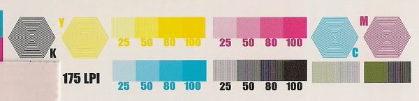
One thing to keep in mind, these are not recent stamps, but from the 1970s. I'm not sure they were printed primarily based on CMYK color mixing, although that process could be utilized. If it were primarily based on CMYK color mixing, then there would only be 4 plate numbers (for each CMYK color).

The Andreotti Press (photogravure) of that era could print up to 7 colors (in practice, 6 colors were used and one plate reserved for applying the taggant). If you look at the selvage markings on Andreotti Press stamps, you will notice that the colors are not necessarily CMYK, although these 4 colors were often included. Rather, the colors are the EXACT colors specified for the printing -- i.e., the ink is mixed prior to printing, rather than relying solely on the printing to "mix" the colors.

For example, on the 10c military uniforms setenant of 1975 there are multiple plates covering different "blue" colors. In the stamp showing the marine, there is a "blue" color for the ship in the background, and another different "blue" color for the Bicentennial emblem. You could apply CMYK to make those 2 different blue colors, but that's not what they did. They used two different plates for the 2 different "blue" colors. It is not the same "blue" ink and it is not just one "cyan" plate/ink.

If the Andreotti Press was used for CMYK mixing, then only 4 plate numbers would be needed. But the Andreotti Press stamps of that era often had 6 plate numbers representing 6 distinctly different colors. In practice, of course, the equivalent of CMYK color mixing did result. But I think there is a limit to how much CMYK process we can apply back to stamps printed during that era. Of course, I have limited understanding of CMYK, so I am open to correction and learning more.

I do appreciate you both talking about CMYK, because I quit studying the press types after the 1980s, which I think is right around the rise of CMYK in commercial printing. So your insights/info are very useful for me to understand stamps printed in the past 20 years.

k
Send note to Staff  Go to Top of Page
Edited by khj - 02/25/2012 3:13 pm
Pillar Of The Community
United States
6756 Posts
Posted 02/25/2012   3:07 pm  Show Profile Bookmark this reply Add khj to your friends list  Get a Link to this Reply

Quote:
Its been 25 yrs since I ran a 4 color full webb press and like you say you could type for hours on water vs inks vs PH balances and on and on.

Feel free to do so! I would find it interesting! If you have to, start new thread if you like. You will have at least one avid reader. Hopefully eaglebub7 will also contribute!

k
Send note to Staff  Go to Top of Page
Pillar Of The Community
United States
6756 Posts
Posted 02/25/2012   3:10 pm  Show Profile Bookmark this reply Add khj to your friends list  Get a Link to this Reply

Quote:
Occasionally a 5th color or seperate black station will be used for lettering framelines and borders.

I'm curious to know why. Thanks!
Send note to Staff  Go to Top of Page
Valued Member
United States
175 Posts
Posted 02/25/2012   3:55 pm  Show Profile Bookmark this reply Add eaglebub7 to your friends list  Get a Link to this Reply
Correction; This image was actually printed 6 colors, sorry to confuse. It was printed using CMYK, Brown and Tan. Typically, even in today's presses they cannot achieve what the artists is intending, so, additional colors are added to aid in a wider range of the color wheel. Getting ready to step out so I can add more later if needed.
Send note to Staff  Go to Top of Page
Pillar Of The Community
United States
6756 Posts
Posted 02/25/2012   3:57 pm  Show Profile Bookmark this reply Add khj to your friends list  Get a Link to this Reply
OK, thanks for the added info, Eaglebub7.
Send note to Staff  Go to Top of Page
Page: of 2 Previous TopicReplies: 26 / Views: 4,890Next Topic  
Previous Page
 
To participate in the forum you must log in or register.

Go to Top of Page

Disclaimer: While a tremendous amount of effort goes into ensuring the accuracy of the information contained in this site, Stamp Community assumes no liability for errors. Copyright 2005 - 2026 Stamp Community Family - All rights reserved worldwide. Use of any images or content on this website without prior written permission of Stamp Community or the original lender is strictly prohibited.
Privacy Policy / Terms of Use    Advertise Here
Stamp Community Forum © 2007 - 2026 Stamp Community Forums
It took 0.24 seconds to lick this stamp. Powered By: Snitz Forums 2000 Version 3.4.05