| Author |
 Replies: 16 / Views: 4,258 Replies: 16 / Views: 4,258 |
|
Valued Member
United States
293 Posts |
|
|
Hello All, I just picked these up, which were included in a small WW lot. I have not had a chance to look these over yet, or start iding them, so any help to start things off with would be greatly appreciated. 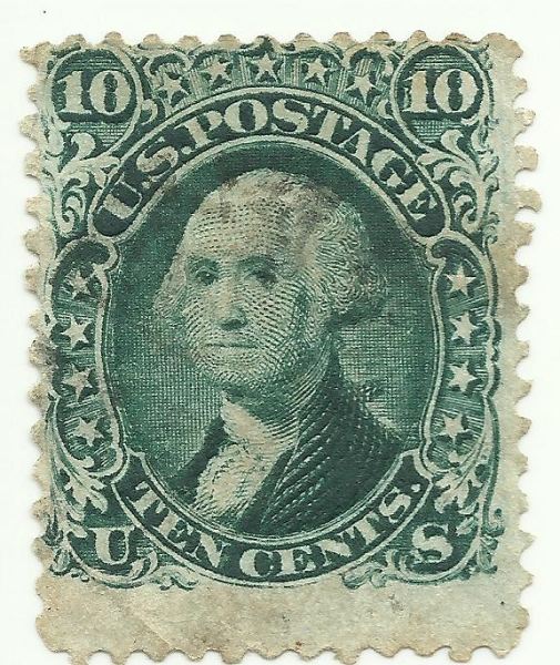 And what is up with the penguin sitting on the "1" of the right hand side ten? And could there be some re-entry items going on here, or am I just seeing things. I am not too familiar with these issues yet as these are the first in my possession. 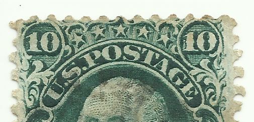 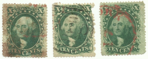 |
|
Send note to Staff
|
|
|
|
|
Valued Member
United States
221 Posts |
|
|
Hello...I posted on the last question about this 10c Issue and seems Im getting rebuffed. He goes on this....a better scan would be helpful, but....35 - 33 - 35. It is easy to tell the TYPE V...period. The pearls on the LR is missing....usually have 2....can not be a TYPE I-IV with only 2 pearls, The 2 ends clearly have 2 pearls. |
Send note to Staff 
|
|
|
Rest in Peace
United States
7097 Posts |
|
|
Ha! it does look like a penguin too..lol I also agree with sheetguy on identity. I also agree that a higher resolution scan would be more helpful for a positive on the 35's at your leisure of course. |
|
Send note to Staff
|
|
|
Pillar Of The Community
United States
2952 Posts |
|
|
The type A27 from 1861 is tantalizing, but there's just not enough of a top margin to definitively identify it as anything other than a 68. I wonder how many 62b's are out there that can't be identified because of margins ...
As for the other 3 stamps, I defer to those with better eyesight that I!
Brian |
|
Send note to Staff
|
|
|
Valued Member
United States
293 Posts |
|
|
Thank you all for the comments. I knew I should have done those stamps individually but was being lazy. I just got off work and got errands to do and fish to eat so will get some better scans up later.
Sheetguy2 thank you for the information.
ILS don't he though. Thanks for the confirmations.
MR. Brian thanks for looking in. It really is tantalizing, but knew that top margin was going to get me on this one. The other items look pretty good to me on it though..uggg..hate when this happens. |
|
Send note to Staff
|
|
|
Pillar Of The Community
United States
2480 Posts |
|
|
Quote:
It really is tantalizing, but knew that top margin was going to get me on this one. According to the Scott catalog description, the heavy curved line cut below the stars, in addition to the outer line added to the ornaments above them, differentiate the A27 design from that of the A27a. This image shows portions of your stamp flanked by a Philatelic Foundation-certified Scott 62B on the left and a Scott 68 on the right. The arrows show the heavy curved line of the A27 design. 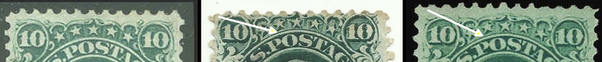 |
|
Send note to Staff
|
|
|
Valued Member
United States
293 Posts |
|
|
You are absolutely right tomiseksj. I was looking at catalogue incorrectly for the pictures, yet the description for the A27a in the catalogue suggests that it is the one with the heavy curved line. Strange. Using the Scott's 2012 issue specialized. Unless I'm reading it wrong. |
|
Send note to Staff
|
|
|
Pillar Of The Community
United States
2480 Posts |
|
|
I don't have the 2012 version but this is the depiction in the 2011 Scott Specialized. I think what may add to the confusion with this design is that Scott shows the diagram of A27a before that of A27. 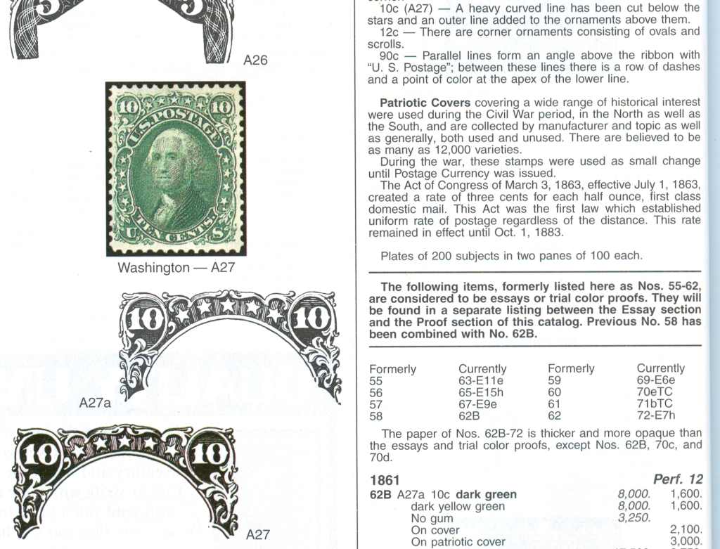 |
|
Send note to Staff
|
|
|
Valued Member
United States
293 Posts |
|
|
Ah ha... your description has the (A27) while the 2012 has (A27a). I'm guessing a mistake in the printing. |
|
Send note to Staff
|
|
|
Rest in Peace
United States
7097 Posts |
|
|
Valued Member
United States
293 Posts |
|
|
ILS, I learn something from the board everyday. Not sure if your huh was about my response, but thought I would clarify.
At the top right of tomiseksj's image from Scott's it reads10cents (A27) then the stuff about the stamp... in the 2012 copy I have it has 10 cents (A27a) then the same exact description.
Kind of makes things confusing. |
|
Send note to Staff
|
|
|
Pillar Of The Community
United States
2480 Posts |
|
|
sirruspoe,
Does the A27a design diagram correspond with the written description or is it still the same as was shown in the 2011 edition?
Steve |
|
Send note to Staff
|
|
|
Valued Member
United States
293 Posts |
|
|
Hello Tomiseksj, Yep, the images are the same as your copy and correctly identified per your information, but here is the written information from the book. 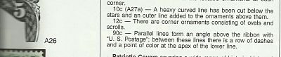 |
|
Send note to Staff
|
|
|
Valued Member
United States
293 Posts |
|
|
And as promised: a better scan of the three earlier stamps in the same order as the above image. 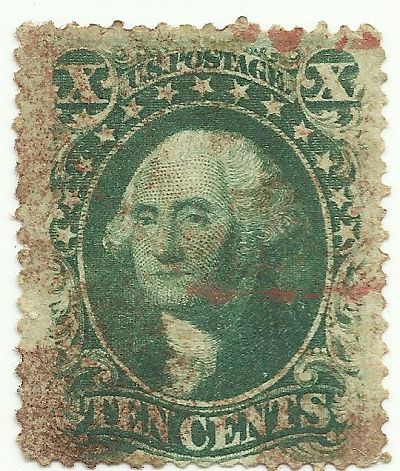  Okay, on this one you will notice a little difference in overall color as I wanted to see if I could at all possibly get the cancellation color to come across properly. I did in fact get the cancel color to be correct, but the color of the stamp design is a bit darker than in real life. Just did not want any confusion on this, as I never mess with the setting on the scanner and whatever comes up, comes up, but wanted to get the cancel right on here to see if anyone would say this is red orange or orange. I decided on red orange (I think, unless it has no orange to it0. And what city ends with "RR"? 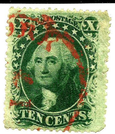 |
|
Send note to Staff
|
|
|
Valued Member
United States
221 Posts |
|
|
SIRRUSPOE....I keep with my orginal post....35 - 33 - 35.
Cancel on bottom stamp is red....not a RR...RK, New York. |
|
Send note to Staff
|
|
|
Valued Member
United States
221 Posts |
|
|
Replies: 16 / Views: 4,258 |
|


