| Author |
 Replies: 11 / Views: 427 Replies: 11 / Views: 427 |
|
|
Valued Member
147 Posts |
|
|
I acquired a Newfoundland collection, and the second stamp is described as the Prussian blue shade. Unitrade only lists two shades, dark blue and Prussian blue. As these are distinctly different, can I assume the second (lighter shade) is the Prussian blue? 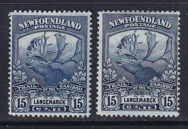 Thank you in advance for your input. |
|
Send note to Staff
|
|
|
|
|
Valued Member
United Kingdom
330 Posts |
|
|
Judging by the image on Arpin Philately's website, the one on the right's Prussian Blue, i.e. the darker less saturated colour. |
Send note to Staff 
|
|
|
Bedrock Of The Community
12618 Posts |
|
|
A certified Prussian Blue courtesy of Seigel: 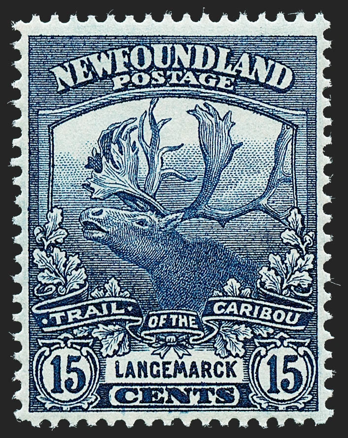 Keep in mind the usual caveats about colors and monitors/scanners etc. |
|
Send note to Staff
|
|
|
Valued Member
United Kingdom
330 Posts |
|
|
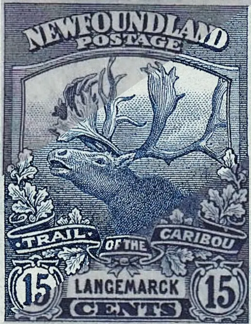 Siegel's the centre stripe, Prussian Blue at the top, Dark Blue at the bottom. This is Cornelissen's image of Prussian Blue; they're an artists' supply shop in London. 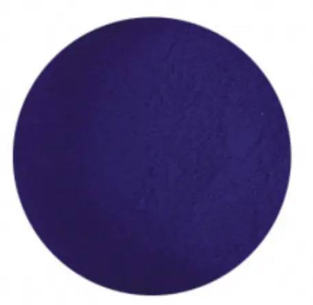 |
|
Send note to Staff
|
|
|
Pillar Of The Community
Netherlands
6587 Posts |
|
|
Pillar Of The Community
United States
1108 Posts |
|
|
As with all of these "color" comparisons, I warn that with using these images, the sources are not calibrated to a standard shared by all images. My point is that the actual stamp colors may be (1) different than what we see on our computer or mobile device, and (2) if they are not shown side-by-side from the same photo or scan, the comparison is not valid. |
|
Send note to Staff
|
|
|
Pillar Of The Community
605 Posts |
|
|
Impossible to tell from a scan but a modern analysis suggests they are all Prussian Blue, and that the difference in hue arises from the fineness of the pigment grind. I do not have a link or reference at hand sorry. |
|
Send note to Staff
|
|
|
Pillar Of The Community
605 Posts |
|
|
Link to a similar thread in this forum - it has been discussed in the past. https://goscf.com/t/73826Also, it's better to think of Prussian Blue as a chemical compound rather than a shade variant, as it was among the very first synthetic pigments. |
|
Send note to Staff
|
| Edited by archerg - 08/01/2026 08:58 am |
|
|
Valued Member

United Kingdom
201 Posts |
|
|
Stanley Gibbons calls the two shades Indigo and Prussian Blue, but your scans look more like Greyish Blue and Blue-Grey to me.
NSK's laughter is understandable, because it's ridiculous to try to tell the difference from a scan. If you examine the stamps in bright daylight but not direct sunlight, and compare them with certified reference examples, you may find an answer. Or not. But you'll still be the owner of two beautiful little works of art. |
|
Send note to Staff
|
|
|
Pillar Of The Community
Netherlands
6587 Posts |
|
|
Valued Member
United Kingdom
330 Posts |
|
|
Valued Member
United Kingdom
330 Posts |
|
|
As pjr states, it is ridiculous to try to tell the difference, from a scan, on the internet, Even when the actual pigment is illustrated, it still don't look right (the point of including the Cornilissen patch). |
|
Send note to Staff
|
|
| |
Replies: 11 / Views: 427 |
|



 Posted 07/30/2026 12:30 pm


