| Author |
 Replies: 140 / Views: 64,556 Replies: 140 / Views: 64,556 |
|
|
|
Pillar Of The Community
United States
1947 Posts |
|
|
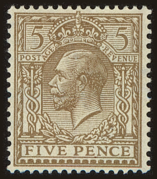
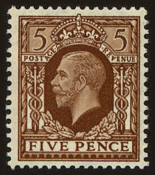
Concerning the Venezuelan issue above. I think that I really prefer the photogravure version based on these two images. it seems a much cleaner and crisper print. Engraved is usually very sharp and well defined. This is not the case with most photogravure printings. They tend to be somewhat "fuzzier". |
Send note to Staff 
|
|
|
Pillar Of The Community
Canada
5821 Posts |
|
|
This Austrian stamp for the the 75th death Anniversary of the poet Franz Grillparzer was first issued February 2, 1947 via steel engraving. Designed & engraved by Ferdin and Lorber (1883 - 1957) Michel 802I  The stamp was reissued on June 14, 1947 but this time using photogravure. Two types. Michel 802II 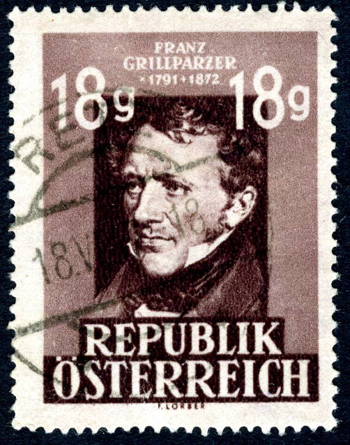 Michel 802III  |
|
Send note to Staff
|
| Edited by lithograving - 03/22/2018 12:47 am |
|
|
Rest in Peace
Netherlands
963 Posts |
|
|
Valued Member
United Kingdom
314 Posts |
|
|
Presumably it's the noticeable 'edge' to the white lettering at the top of the stamp?
GLENN MORGAN |
|
Send note to Staff
|
|
|
Pillar Of The Community
Canada
5821 Posts |
|
|
Quote:
Presumably it's the noticeable 'edge' to the white lettering at the top of the stamp? Glenn you are right on there. Michel states that for 802 II the upper frame is brighter whereas for 802 III the frame is evenly toned. On the other h and Michel states that 802 II is braunlila (brown-lilac) and 802 III is dkl'brownlila (dark brown-lilac) The former is obviously darker than the latter so something is wrong here. Actually the Austria Netto Katalog lists three different colour shades for the photogravure version. |
|
Send note to Staff
|
|
|
Valued Member
United Kingdom
314 Posts |
|
|
When I responded previously to this post I failed to notice that the designer imprint on the lower photogravure version also appears to have been made larger. There would have been a technical reason for this, as the top version has the middles of the letter B filled with ink, whereas the bottom version is closer to that of the intaglio printing (but nowhere near as clear, of course!). GLENN 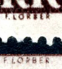 |
|
Send note to Staff
|
|
|
Pillar Of The Community
1918 Posts |
|
|
Pillar Of The Community
Canada
5821 Posts |
|
|
jorgesurcl
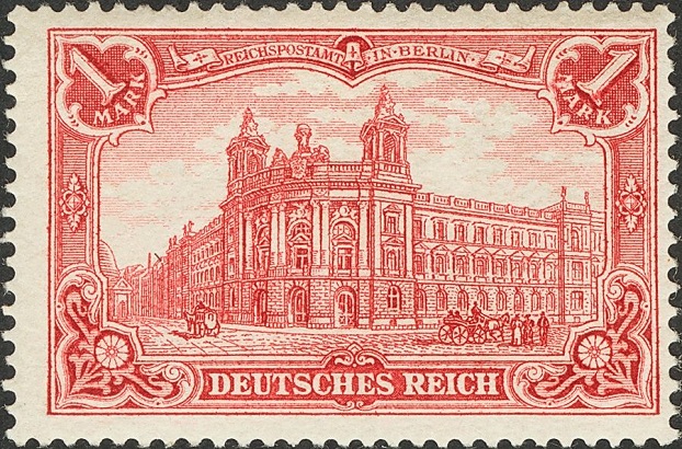
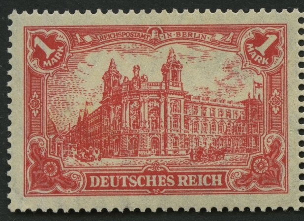
Those two German stamps are a fine example
showing the differences between engraved and offset/litho
printings. |
|
Send note to Staff
|
|
|
Valued Member
United Kingdom
64 Posts |
|
|
New Zeal and 1915-30. Both printed in New Zeal and from steel plates made by Perkins, Bacon. The left is recess printed and the right surface printed. 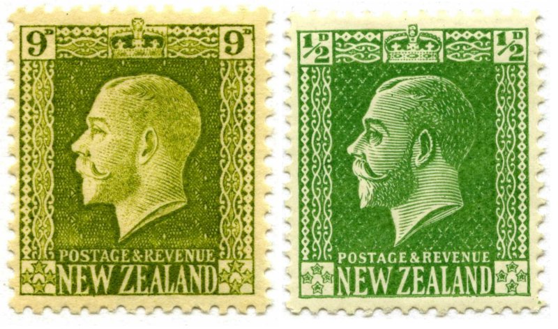 Mike |
|
Send note to Staff
|
|
|
Pillar Of The Community
Canada
5821 Posts |
|
|
mikyh, thanks for posting those examples of different printing processes. Quote:
The left is recess printed and the right surface printed.
Of course another name for surface printing would be typography or letterpress. https://goscf.com/t/17416That is why this forum is so important since it helps new collectors underst and the various terminology of our hobby. |
|
Send note to Staff
|
|
|
Pillar Of The Community
1918 Posts |
|
|
Spain 1930Spanish American Exhibition Printed by Talleres MAG de Madrid10 pesetas - Photogravure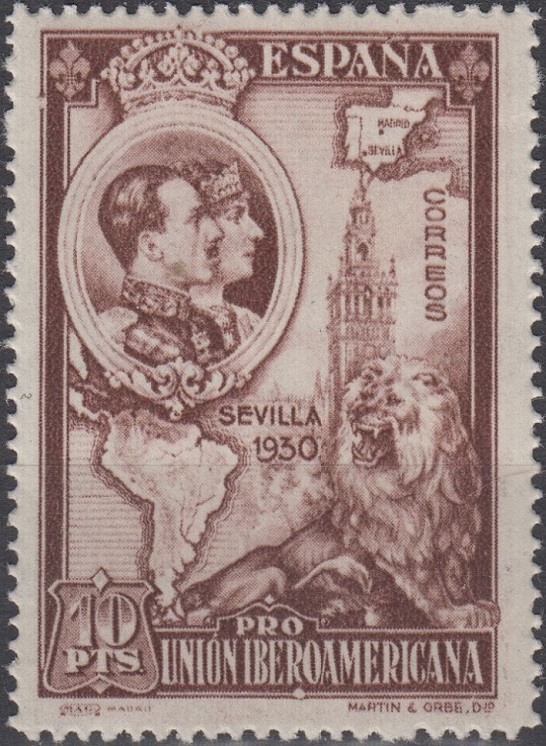 10 pesetas - Engraved / Recess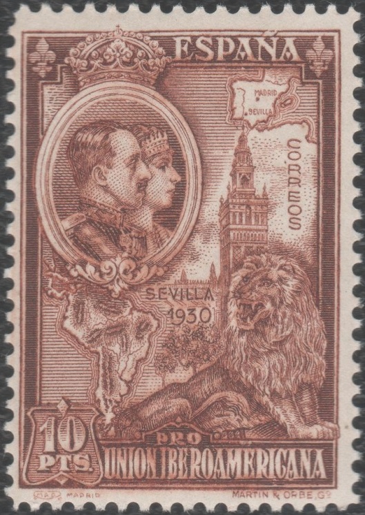 |
|
Send note to Staff
|
|
|
Pillar Of The Community
1918 Posts |
|
|
Pillar Of The Community
3865 Posts |
|
|
Here are some slightly different printed Canadian stamps: 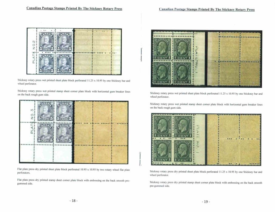 |
|
Send note to Staff
|
| Edited by jogil - 01/26/2016 08:59 am |
|
|
Pillar Of The Community
1918 Posts |
|
|
ColombiaSimon Bolivar Printed by American Bank Note Co. (1939) and Columbian Bank Note Co. (1944) 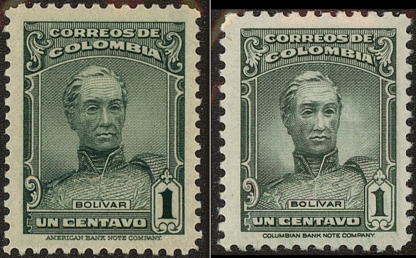 ABNC (Scott 467) 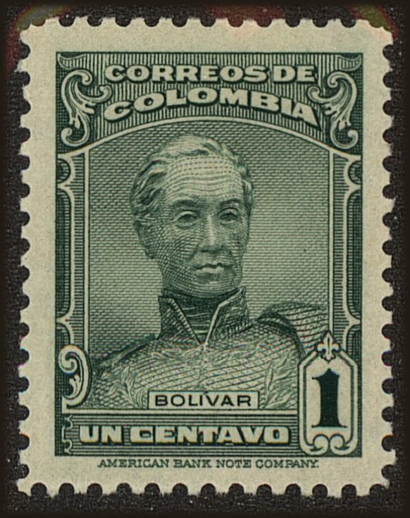 CBNC (Scott 497)  |
|
Send note to Staff
|
|
|
Pillar Of The Community
1918 Posts |
|
|
Replies: 140 / Views: 64,556 |
|




 Posted 03/21/2013 05:47 am