Quote:
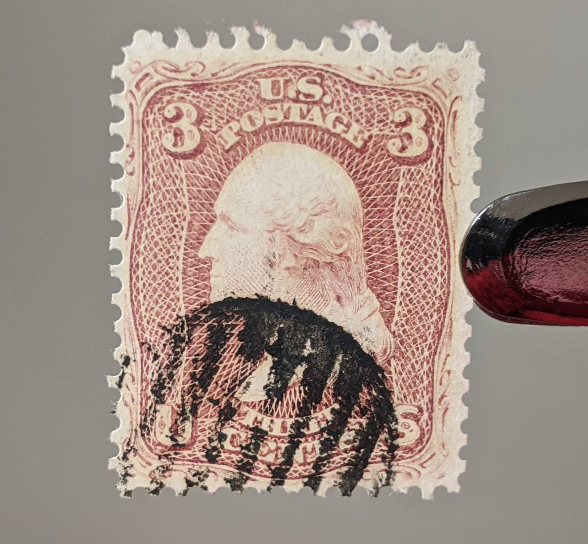
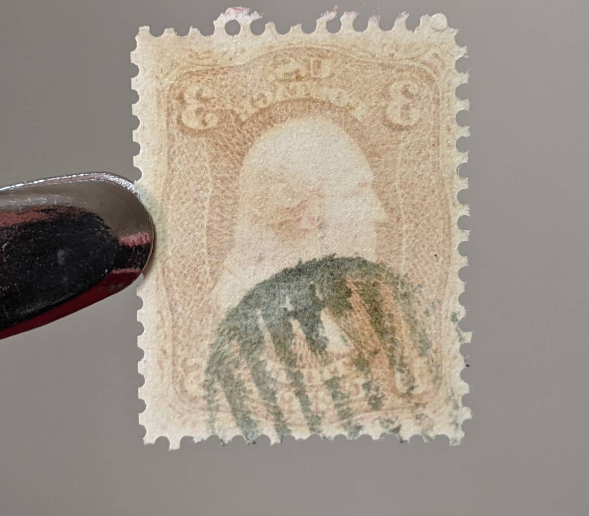
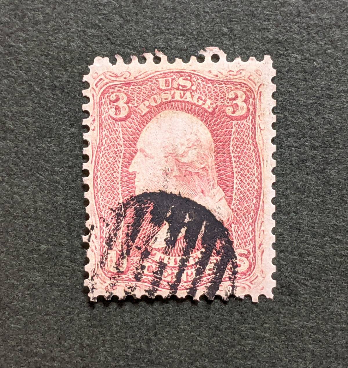
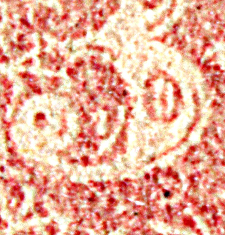
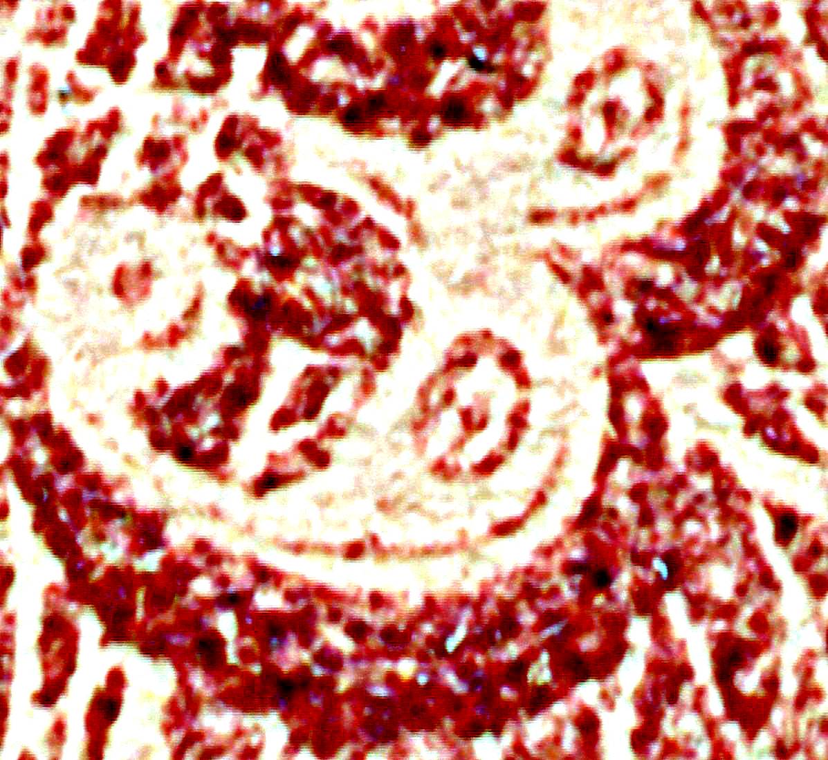
Also, does this stamp have what is called a 'cameo effect' going on? I saw a similar occurrence on some GB SG8s from a separate thread where a particular ink would 'stain' the paper blue. It would be visible mostly from the reverse, but also faintly around the design elements in the front much like the 65 here. They called it "cameo", but I would like to know more about that and what causes it.
A little off topic for a US thread, but since you asked, briefly, no, US stamps don't exhibit the same Cameo or Ivory Head phenomenon as the early GB stamps.
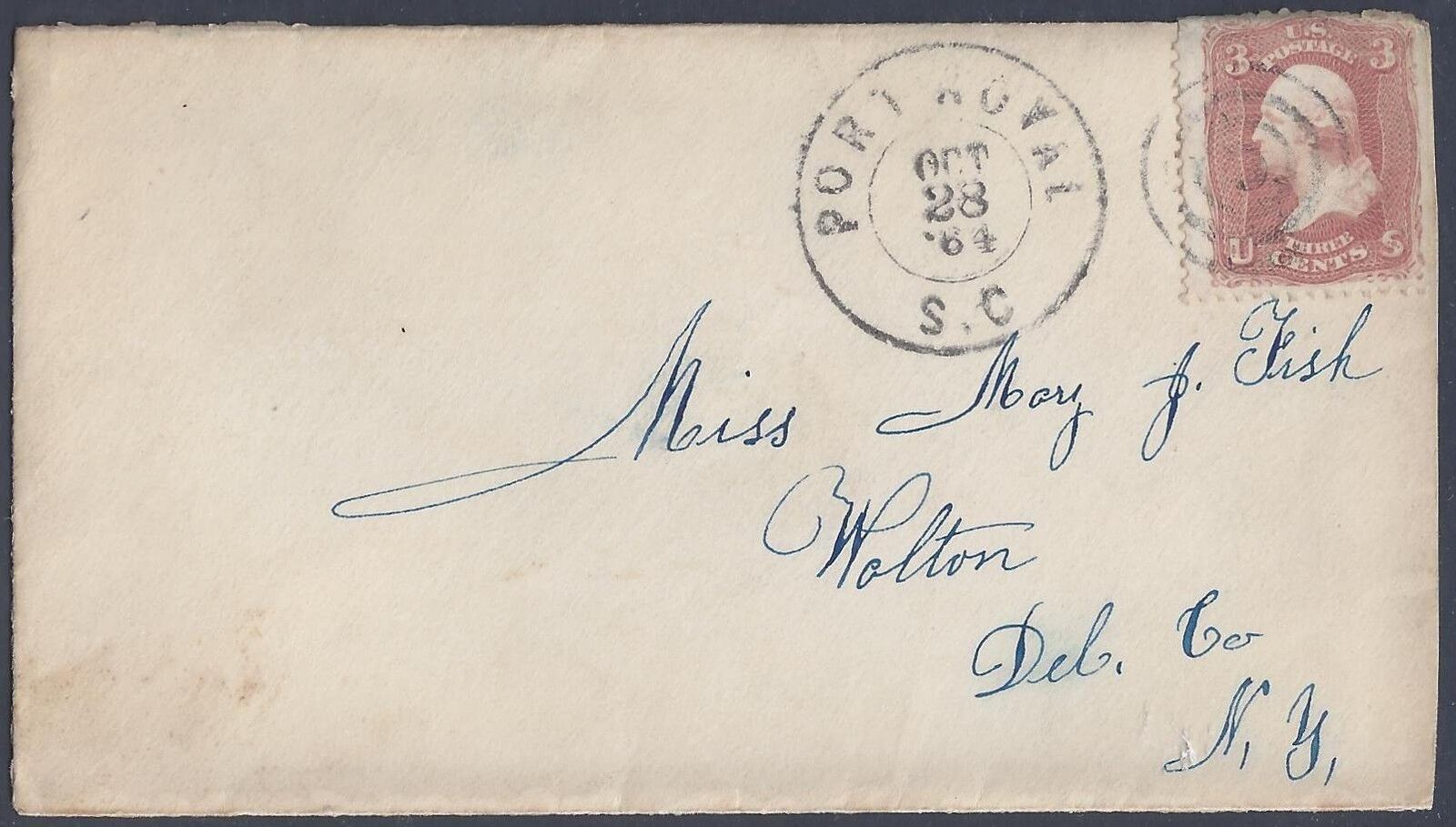
From Linn's, here is an excerpt of the interesting story how these came about.
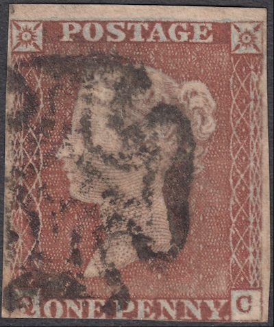
https://www.linns.com/news/us-stamp...lations.htmlRowland Hill, "inventor of the postage stamp", was concerned about people removing cancellations and re-using stamps. While a red Maltese Cross cancel on the Penny Black is very pretty, it was sometimes hard to see the cancellation, so they soon switched to red stamps and black cancels. Hill was concerned about the cancellations being removed by various chemicals so he added extra measures to the papers and inks to help combat this.
Many experiments involved a chemical then called prussiate of potash, now called potassium ferrocyanide.
This chemical would make the red ink of the stamp more fugitive, that is, destroyed by any substance that might be used to remove the cancel.
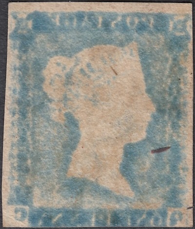
A side effect, however, was that when prussiate of potash combined with water (as it would be when the paper was dampened for printing), it would turn the paper blue.
Prussiate of potash was tested in three different ways: incorporation into the paper, incorporation into the red printing ink, and dipping the printed stamp into a solution of the chemical.
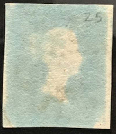
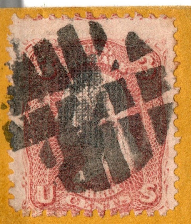
Eventually, some prussiate of potash was incorporated into the ink used to print the Penny Red. Some stamps have so much of this chemical that the paper has turned blue in the areas where the red ink is heavily applied but remains white where the red ink is light, primarily the queen's portrait.
These stamps are called "ivory heads" because the portrait area appears as an ivory color when the back of the stamp is viewed.
This bluing was eliminated in 1857 by a change in the formula of the ink.
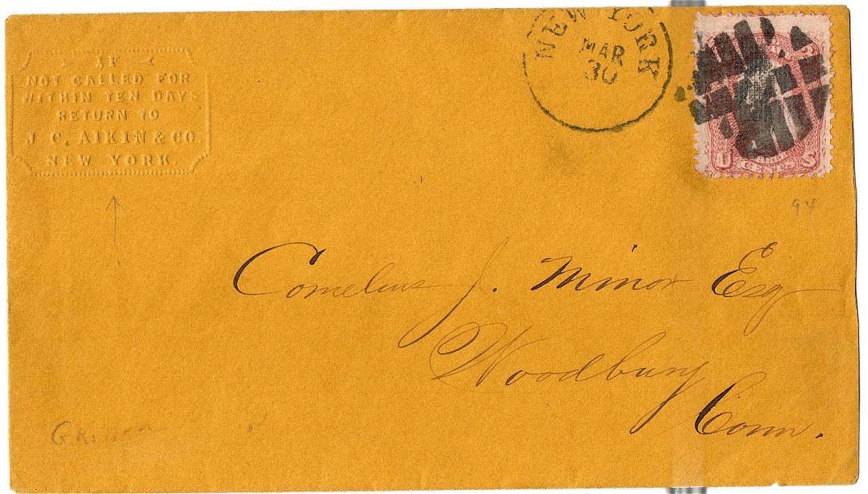
Here are a couple of examples from another SCF thread
https://goscf.com/t/69294