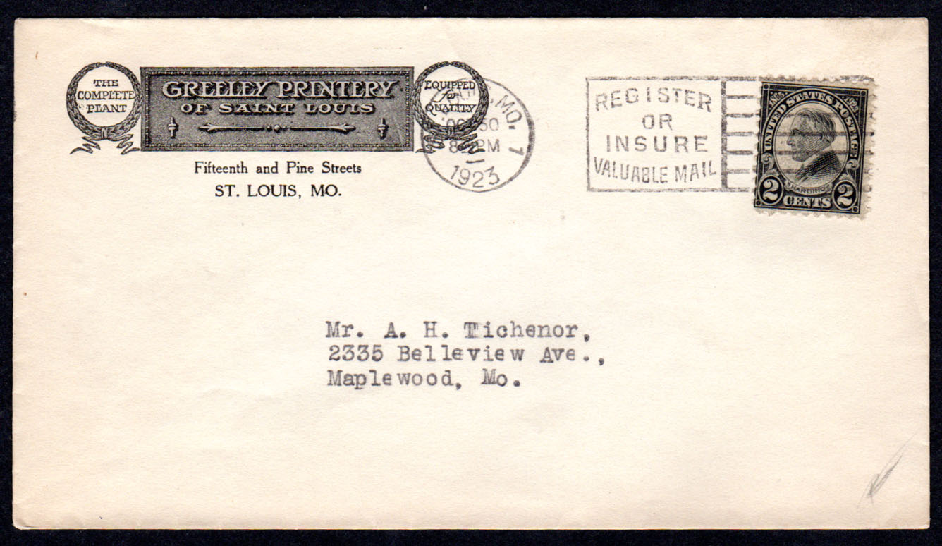
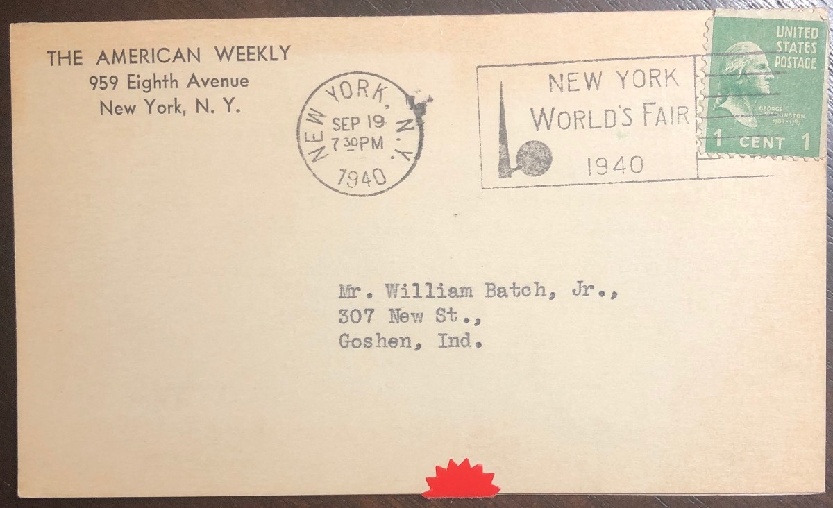
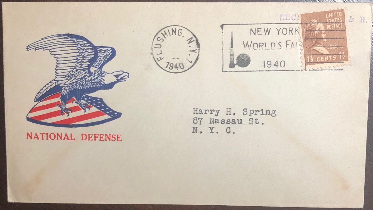
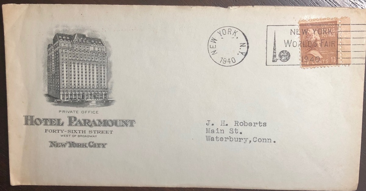
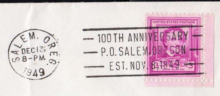
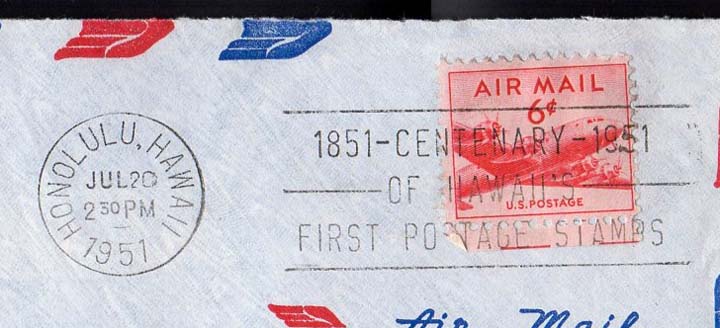
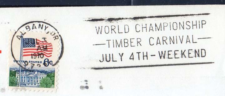
Just joining this topic. I have always thought slogan cancels were a very interesting topic to study and exhibit that really doesn't cost a lot of $$$. But it is fun and interesting and as this thread shows there is so much to study. I have shown three from my collection. I have a pretty large specialized collection of these advertising slogan cancels from the 1939-40 New York World's Fair. These cancellations were used at several post offices around New York to publicize the 1940 season on the Fair.
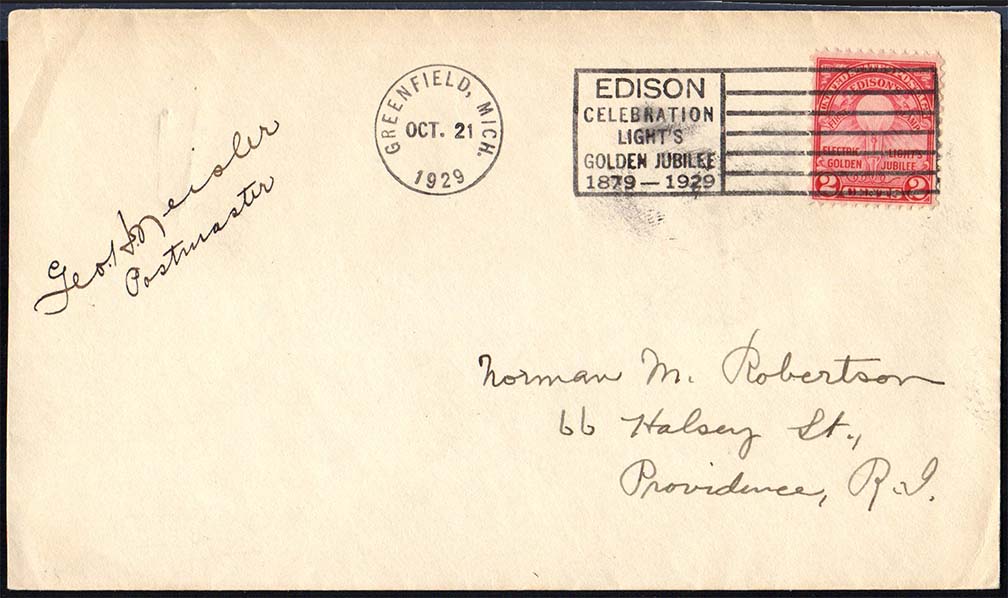
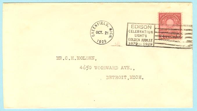
Here's a nice slogan cancel from Greenfield, Michigan. The font doesn't look standard, though, I'm wondering about the legitimacy of this post office. Greenfield Village, adjacent to Henry Ford Museum in Dearborn, is a re-created 1890s town -- but no one actually lives there. If I recall, Ford moved Edison's early laboratory to the site, hence the postmark.
rod222 raises a good point for discussion of machine vs handstamp.
The literature attributes this to a handstamp, and I agree. With only 1 copy at hand, the quick glance might say "machine", but when several copies are compared it becomes more obvious that this is a handstamp. Here is a copy I had handy:
Clearly the postal clerk did a good job of making good impressions which generally resemble a machine. Now having 3 scans posted, one would expect near-identical cancels if this were a machine, however:
1. All cancels from a machine would be parallel to top edge and the same distance down from the top. The cancel on my example is too low and angled, and essentially impossible to feed and get a low impression.
2. The horizontal displacement of the cancels should also be nearly identical as each mail piece passes through the feeding mechanism of the machine. This is not exhibited with these 3 examples either. I do suspect the clerk aligned the hand-held cancel against a jig block to get many of them very close to parallel, but the left/right consistency is not there.
Additionally, the font and style of the dial does not come close to matching any then-current machine.
Yeah, the bars on my example are wonky. No doubt this device is made of rubber, but still not quite sure how they managed to make the impression they did!
Quote: but still not quite sure how they managed to make the impression they did!
I was considering that too, I must say quite a good effort, the dial as you call it, as well. Some sort of reverse moulding. Australian modern "click" and press cancellers are rubber I think.
George H. Neisler was postmaster of Dearborn, MI, not specifically "Greenfield". So I think this was probably more like a show cancel for the event. But why they went to the trouble of making a hand cancel look like a machine cancel is puzzling. Maybe to give Greenfield Village the appearance of a real town?
Disclaimer: While a tremendous amount of effort goes into ensuring the accuracy of the information contained in this site, Stamp Community assumes no liability for errors. Copyright 2005 - 2026 Stamp Community Family - All rights reserved worldwide. Use of any images or content on this website without prior written permission of Stamp Community or the original lender is strictly prohibited. Privacy Policy / Terms of UseAdvertise Here