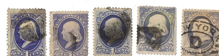
I may be able to shed some light on your questions about these differences, but please understand that many factors contribute to the quality of impression on any given stamp. The second, fourth, and fifth stamps in your last group are all #206 with the A44b design, and there is a certain amount of variability in the image quality among them.
Now look at this group, all of which are #206, design type A44b:
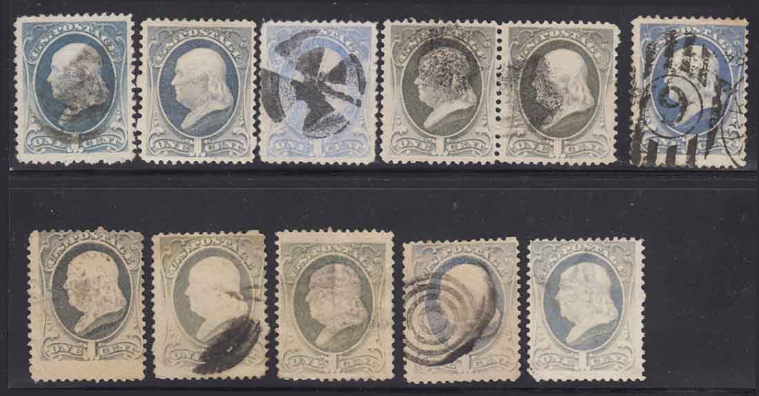
This design was in production from 1881 through 1886. Look at how much variability in color and quality of impression exists for these. To understand why, it is important to remember that at the beginning of this period the American Bank Note Co was required to use hand operated presses for printing the stamps, but by the end of the period they were required to use steam operated presses.
On hand operated presses the plates were manually inked and wiped while the press was in operation. Despite the skill and experience of the press operators, the wiping of the plates was not entirely uniform, so some of the stamps on a sheet printed with less ink than their neighbors. On steam powered presses the inking and wiping of the plates was done automatically by the machinery. The job was much more uniformly done, but the settings for those tasks could vary from one press run to another. Factor in the character of the paper or the consistency of the ink and you could still get variance in the print job.
Now let's take a close look at a couple of the stamps in the group I selected which seem to have similar characteristics to the stamp on the extreme right in your group. I'm using my examples because the scans show more detail.
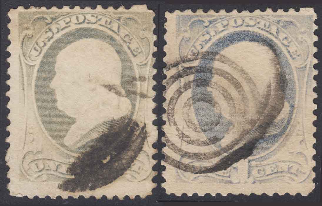
Notice the lower arabesques on both of these stamps (when they are not obscured by cancellation). The stamp on the right has a weakly defined arabesque on the lower right, while that on the left has a weakly defined one on the left. Just like yours. Notice the vignette on both of these stamps is practically down to a mere silhouette. These have less detail than your example. The shading around the lettering is washed out the same as on your stamp. The background shading on both of these is so thin it is down to an albino impression in places.
These stamps were printed with less than the usual amount of ink. These variances have nothing to do with differences in the engraving on the plates used to produce them. And I think they have that in common with your stamp. It is a variation from the norm, into the poor end of quality control, but these are not bad enough to be good. If they were down to bare trace outlines of the design, then you might have something. But most collectors will turn away from examples like these as merely poor impressions that fail to show the design well.
It happens.