| Author |
 Replies: 18 / Views: 5,401 Replies: 18 / Views: 5,401 |
|
Rest in Peace
7742 Posts |
|
|
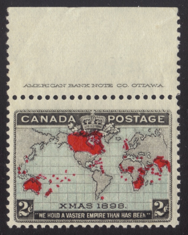
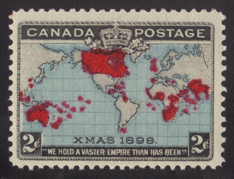
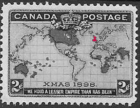
Hi guys..I was thinking about all the threads I have seen about colour variations, colour shifts, bad inking etc. and come to realize that the 1898 map stamp Scott #85 and 86 are probably the worst I have seen..I have about 24 used and mint stamps and the first two I looked at are different from each other as the picture below indicates...There are more than likely many more discrepancies with these stamps...Nothing earth breaking, but interesting. Robert 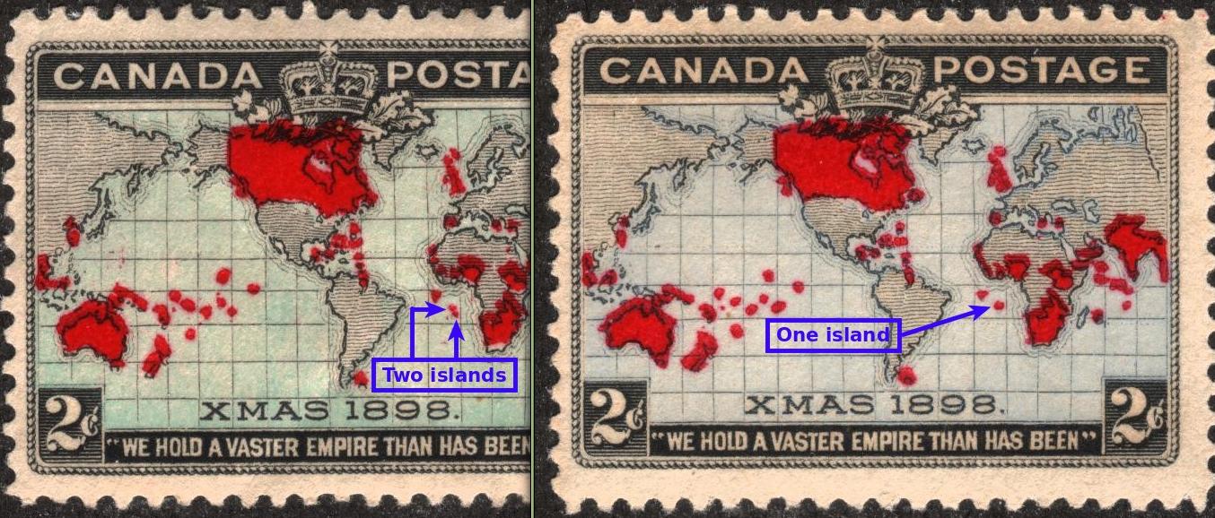 |
|
Send note to Staff
|
|
|
|
|
Pillar Of The Community
Canada
6525 Posts |
|
|
Valued Member
Canada
228 Posts |
|
|
Wert, these stamps were always some of my favourites when I started collecting as a young boy. I loved the world map and the first use of multiple colours on a Canadian stamp. I was also fascinated that the same stamp had wildly different colours for the oceans for no apparent reason.
An interesting thing that many casual collectors do not know is that there was never an intention to have two distinct shades as they are now divided into and listed with separate Scott numbers. This stamp was always meant to be a single issue, but the ink differences when first printed and after being exposed to light soon after caused some wildly different shades to appear. It has never been clear to me how the catalogues actually discriminate between these. The "blue" shades makes some sense, but the "lavender" is often just a dirty light grey/brown to the point where there is almost no colour at all.
A bigger shame is that, more than a hundred years later, many of the nicest blue copies are oxidizing and turning into the so-called "muddy waters" variety. I have a couple of nice mint ones that I always worry will turn brown on me one day!
Also of note for this stamp is that it was also the first Canadian stamp to use typographic printing for the two coloured plates. I guess it was deemed too expensive and/or unsuccessful since this process was never explored again on Canadian stamps for another half century!
In addition to the anomalies with the blue shades and some obvious differences with the red islands for the typographic plates, there are also a huge number of minor re-entries and retouches on the later black engraved plates. Quite a fascinating stamp actually.
It would be nice for members to post some of their favourite copies or varieties for us all to see. How about it everyone? |
Send note to Staff 
|
|
|
|
Pillar Of The Community
United States
1125 Posts |
|
|
Pillar Of The Community
Canada
728 Posts |
|
|
Pillar Of The Community
United States
576 Posts |
|
|
The quote at the bottom of this stamp is from Sir Lewis Morris's song, "A Song of Empire" , written for the Jubilee. The basis for the design was from an essay drawing by Warren. L. Green, president of the American Bank Note Co. All according to Robson Lowe Encyclopedia. |
|
Send note to Staff
|
|
|
Pillar Of The Community
923 Posts |
|
|
Pillar Of The Community
United States
3174 Posts |
|
|
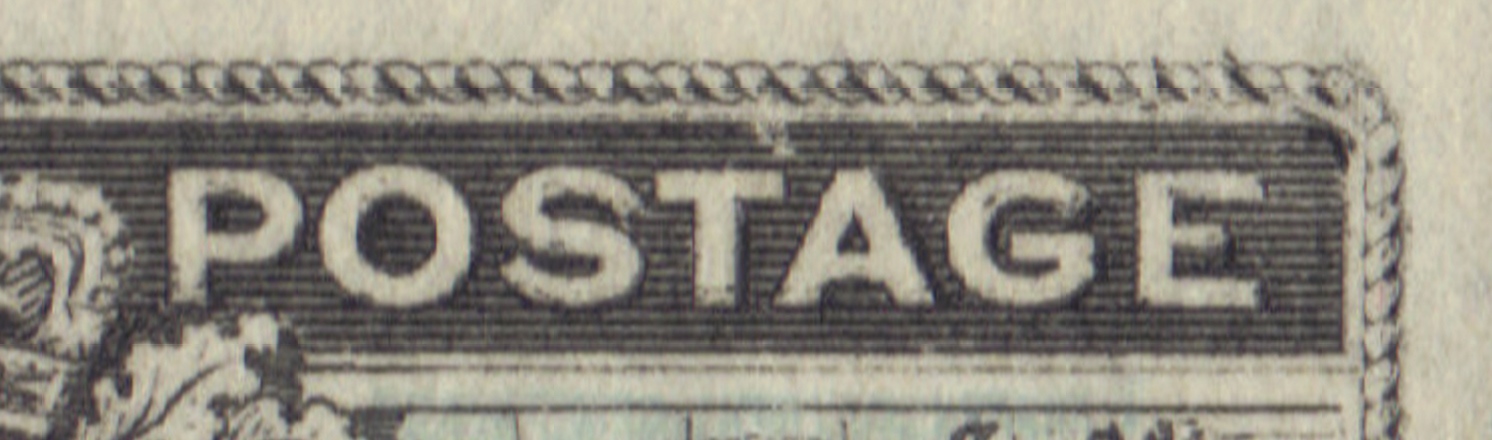
Quote:
Obviously a major re-entry Looks like a different quote was re-entered.  |
|
Send note to Staff
|
|
|
Valued Member
Canada
290 Posts |
|
|
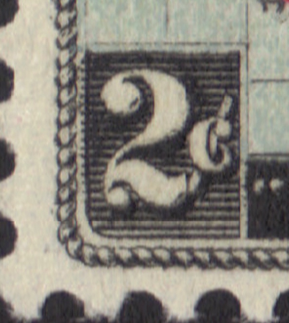
It seems there are a lot of major re-entries listed in the catalogs.
Is there such a thing as a "minor re-entry".........or, is it something like a "tiny shrimp?
Wouldn't "re-entry" suffice?
Like ungilded lilly. |
|
Send note to Staff
|
|
|
Rest in Peace
7742 Posts |
|
|
There are also lots of colour shifts, even on the same sheet/block..Take a look at my block below..Colour shifts are different from the 2 left side stamps as opposed to the 2 right stamps. Robert 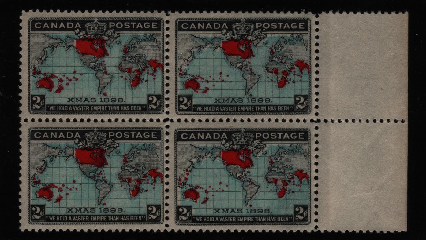 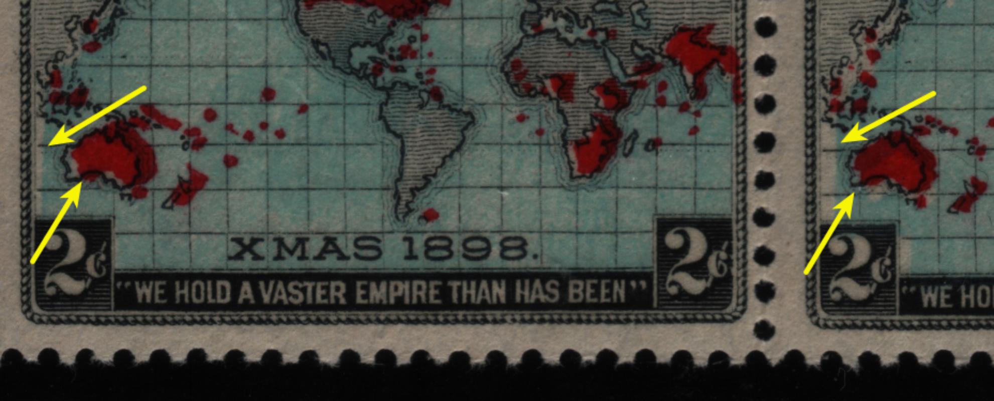 Now here is a weird one..Deep lavender with PINK continents. 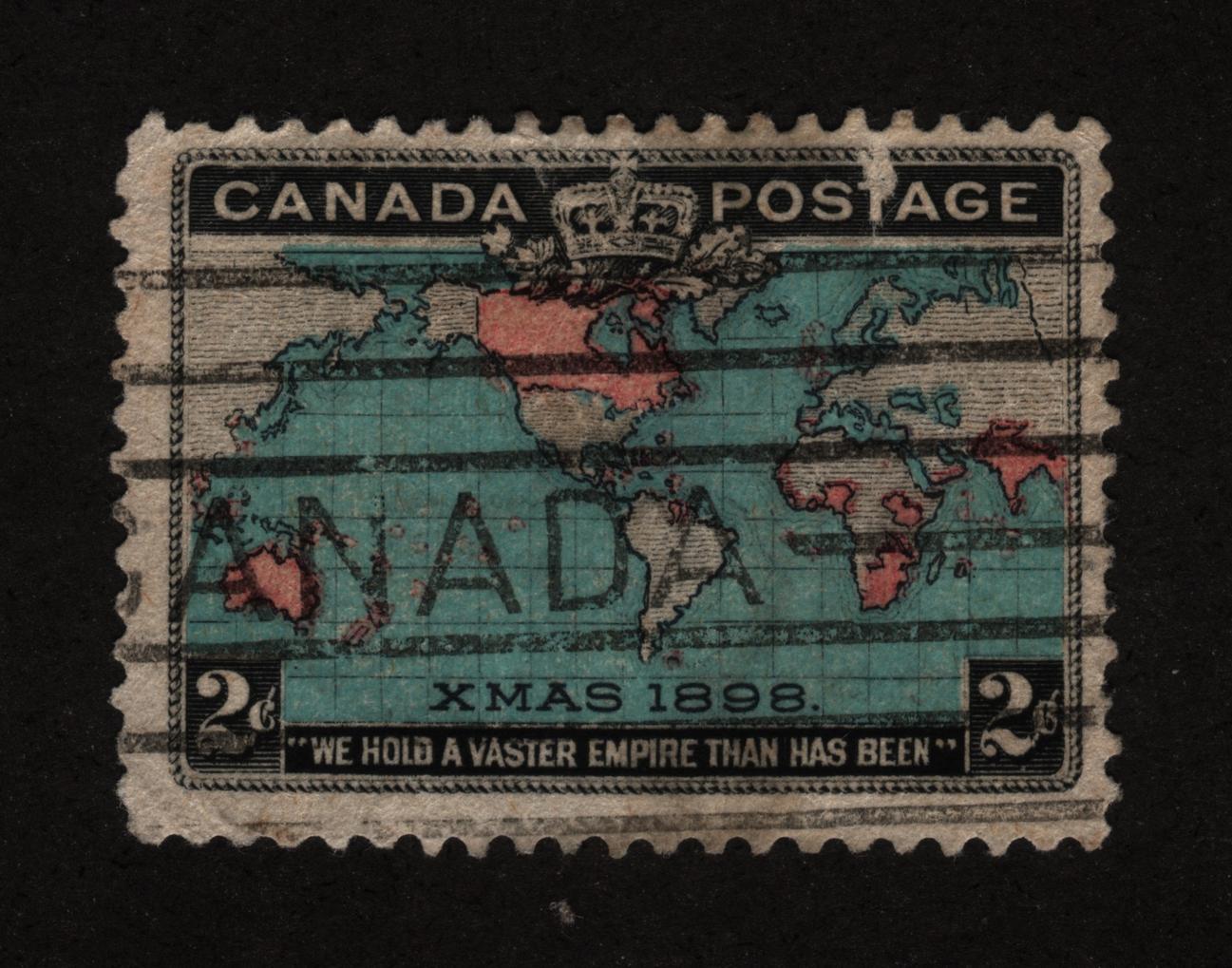 |
|
Send note to Staff
|
| Edited by wert - 07/05/2015 10:46 pm |
|
|
Valued Member
Canada
228 Posts |
|
|
Hey chipg, those copies may indeed be nicely centered but I think it is the lovely dated cancels that makes that album page so great! Good work.
Some nice re-entries jimjung. I used to have the major from position 5B91, but I lost it many years ago. I either did a poor job packing my stuff up from a stamp meet or someone absconded with it when I was not looking.
wert, you are quite correct that the three colours of this issue float all over the place. There was not much alignment going on within or between the three plates. I like your deep blue, light red stamp. |
|
Send note to Staff
|
|
|
|
Pillar Of The Community
Canada
644 Posts |
|
|
There are many re-entries as mentioned, and yes, to answer the question asked, some are referred to as "minor" or sometimes "strong".
The definition given to me by Ralph Trimble" (re-entries.com author) is that to qualify as a "major" re-entry, there should be particularly visible re-entries in the letters/numerals. |
|
Send note to Staff
|
|
|
Rest in Peace
7742 Posts |
|
|
Quote:
there should be particularly visible re-entries in the letters/numerals.
And to go one step further 3Dadeo..They should be seen with the naked eye for a large major re-entry. Robert |
|
Send note to Staff
|
|
|
Moderator

United States
12330 Posts |
|
|
Rest in Peace
7742 Posts |
|
|
Valued Member
Canada
290 Posts |
|
|
Tnx 3Dadeo.
I think some adjectives should be saved for the day when we have to modify something that is supercalifragilisticexpialidocious.
My apologies to Dick van Dyke, Julie Andrews and the brothers Sherman, Richard and Robert.
Mary Poppins was around in 1964, after all. |
|
Send note to Staff
|
|
|
Replies: 18 / Views: 5,401 |
|