You're correct, of course. But as the average collector in most of the cases has every color of a stamp but not the rare one, it's not the rule that one can compare to real examples of this color. For this, we have our words, scanners, websites and some books. When I started looking at those 2 Cents stamps, I thought that the carmine lake was quite a dark color, but today I guess it's perhaps more similar to the rose carmine of the 2 Cents with triangle (1894/99) than the lake colors of this design.
So I still think it's very useful for other collectors to read from someone who actually owns a stamp with such a color how he would describe it, or, even better, hear his opinion about scans of this stamp in the internet (as the RGB display of modern monitors is quite good today, although better of course with color management which I use).
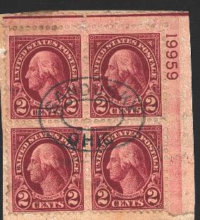
I pick up two other examples from the Siegel database (by the way the PF database shows a scan of your block in a really different color than here in your scan):
https://siegelauctions.com/2016/1120/1562.jpghttps://siegelauctions.com/2015/1092/1381.jpgIs the carmine lake color more a deep color like the first link, or is the bluish cast more important like in the second link?