Stamp Community Family of Web Sites
Thousands of stamps, consistently graded, competitively priced and hundreds of in-depth blog posts to read


Stamp Community Forum
 
Username:
Password:
Save Password
Forgot your Password?

This page may contain links that result in small commissions to keep this free site up and running.

Welcome Guest! Registering and/or logging in will remove the anchor (bottom) ads. It's Free!

The 1972-1978 Caricature And Landscape Issue Of Canada

Next Page    
 
To participate in the forum you must log in or register.
Author Previous TopicReplies: 139 / Views: 10,817Next Topic
Page: of 10
Valued Member

Canada
97 Posts
Posted 01/08/2019   8:14 pm  Show Profile Bookmark this topic Add Brixtonchrome to your friends list Get a Link to this Message
I wanted to share a series of posts that I have started this week which will delve into an issue, that, in my opinion, has the potential to be more rewarding and fun to collect than the 1967-1973 Centennial Issue that preceded it. When I was a kid growing up, there were almost no recognized paper varieties in Unitrade and only a few listings for perf. changes, type differences and the basic tagging differences. However, over time as the issue has gained in popularity, more and more varieties have been uncovered by specialists. Sadly though, many of these are quite scarce now, especially in corner block form, because many of these stamps were being used by collectors and dealers in the 1980's-2000's as discount postage, with the result that much of the existing supply of mint stamps has been severely depleted. In fact, there are several listed varieties in Unitrade that I have never seen at all, ever.

Today's post will serve as an overview of the issue and will outline what there is to collect and what attributes can form the basis for specialization. Then, like I did with the prior Centennial issue, my first series of posts will discuss, in detail, the various physical attributes of the stamps, as they pertain to the issue as a whole. Then, finally, I will write a post or two for each value of the series, depending on the level of complexity associated with it.

This is the first Canadian definitive set to be printed by three different printing firms: British American Bank Note Company (BABN), the Canadian Bank Note Company (CBN) and Ashton Potter. Unlike the previous Centennial Issue, which was printed by engraving only, this issue combines three different printing processes: engraving, photogravure and engraving and lithography. It was also issued in stages between 1972 and 1973, with subsequent printings of various values being issued until well into 1977. The low value sketches of the prime ministers and the Queen were issued On October 17, 1973, with the 7c value being issued on April 8, 1974, and the 10c value being issued on September 1, 1976. The mid-range values from the 10c to 50c were first issued on September 8, 1972. The first printings of the $1 and $2 were issued on March 17, 1972, so they were the first stamps to be issued. Finally, the later printings of the $1 were issued starting October 24, 1973.

David Annesley a sketch artist, designed the low value stamps, with the lettering designed by Ken Rodmell. The high values from the 10c to the $2 were designed by Reinhard Derreth after photographs by John De Visser (10c), Harry Rowed (15c), Chris Lund (20c), Ted Grant (25c) and Fred Ruggles (50c).

It is hands down, my favourite definitive issue, and the one that got me started on stamps, as I described in my background page. Without further ado, I give you the designs.


The Basic Stamp Designs


1c Orange - Sir John A. Macdonald


2c Green - Sir Wilfred Laurier


3c Purple brown - Robert Borden


4c Blue-black - William Lyon MacKenzie King


5c Rose-lilac - Richard Bedford Bennett


6c Scarlet - Lester Pearson


7c Sepia - Louis St. Laurent


8c Ultramarine - Queen Elizabeth II


10c Carmine - Queen Elizabeth II


10c Orange and green - forest scene


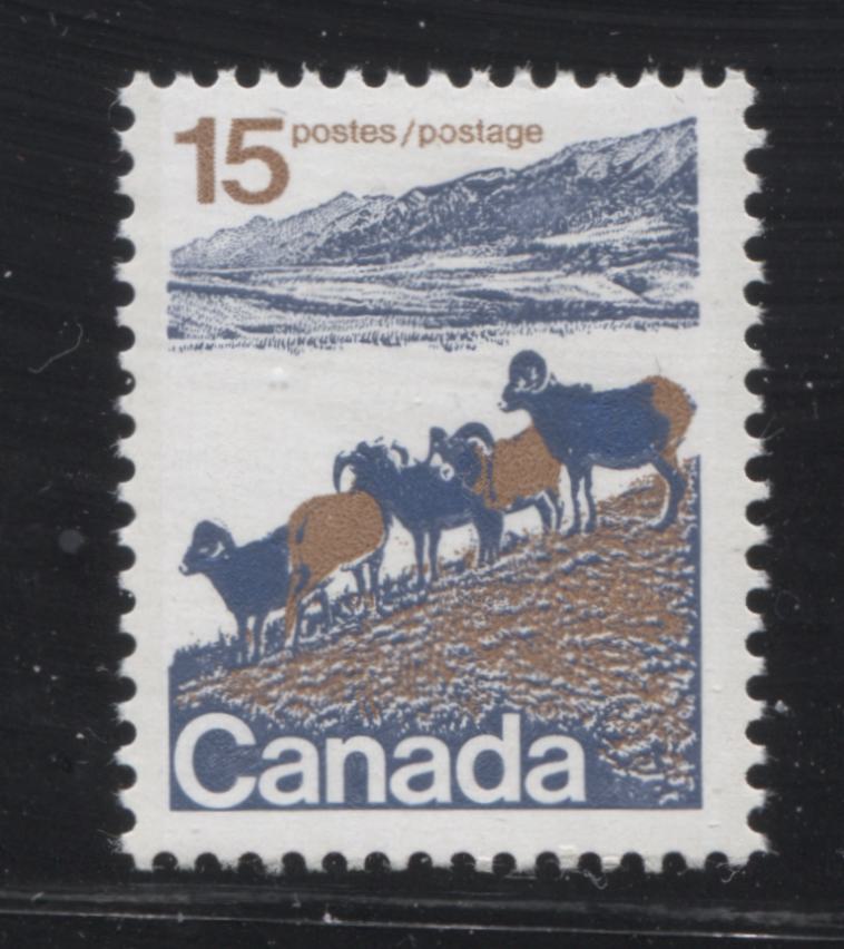
15c Brown and blue - mountain sheep


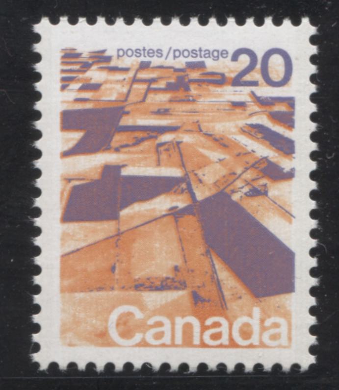
20c Deep lilac and orange - aerial view of prairies


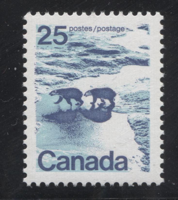
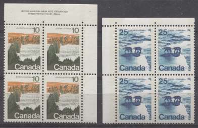
25c Azure and dark blue - polar bears


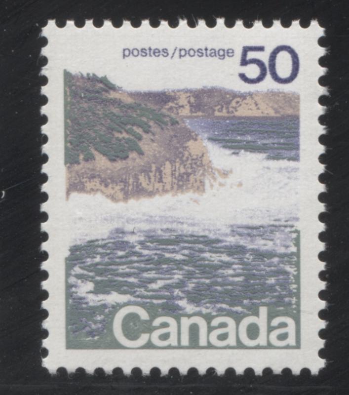
50c Grey-green, beige and blue - seashore scene


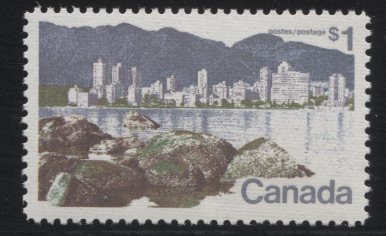
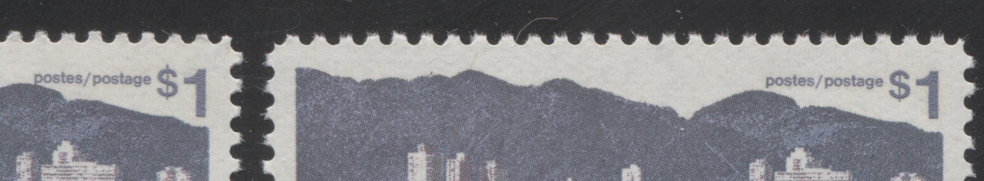
$1 Vancouver, as seen from Kittsilano - lithographed printing


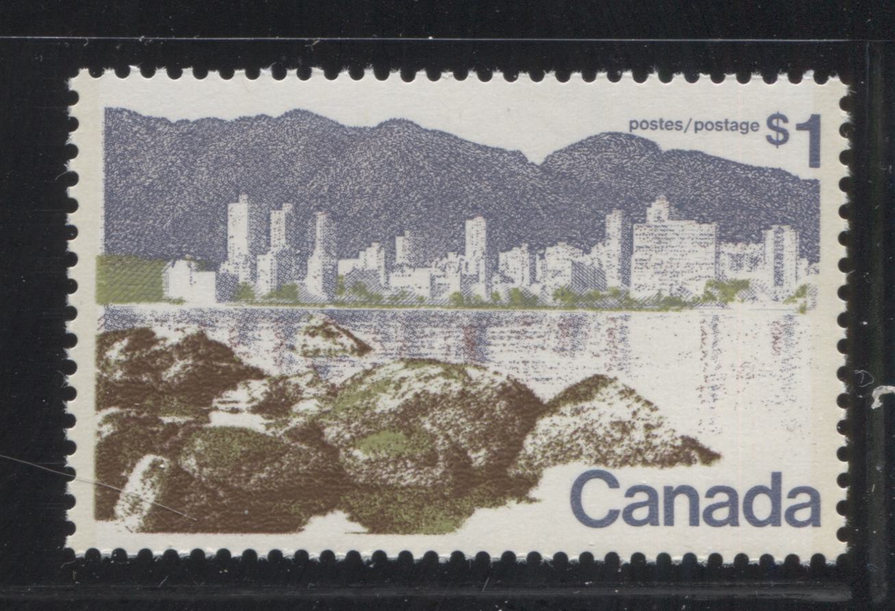
$1 Vancouver - BABN printing
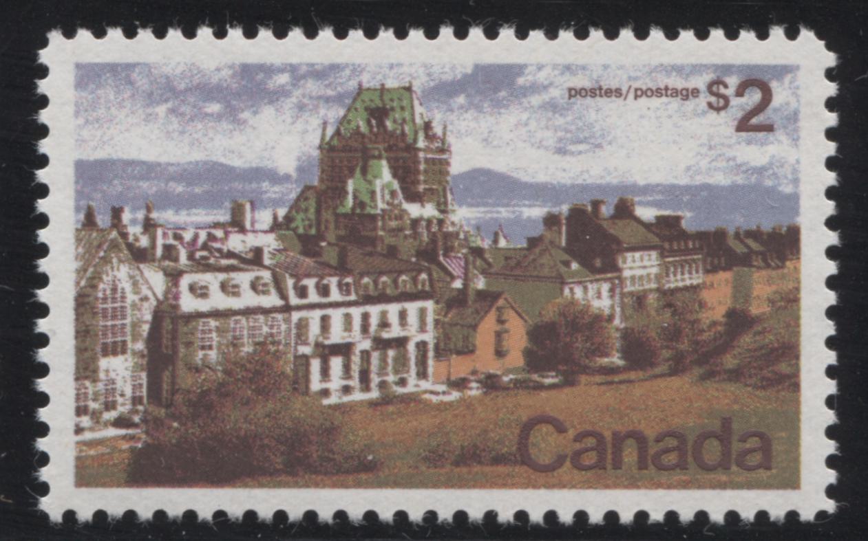


$2 Quebec City


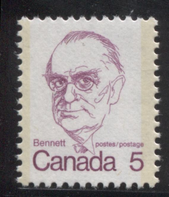
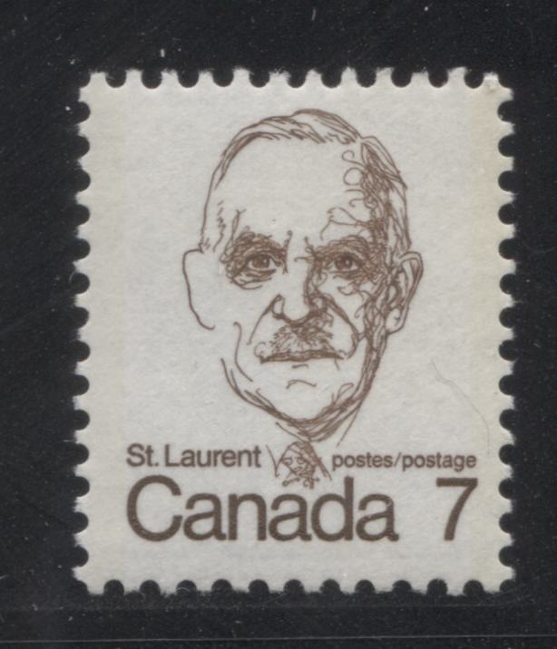
So there you have it: very different styles of design, which may not appeal to some collectors, but I quite like them, especially the sketches of the prime ministers. Now, I will provide an overview discussion of all the ways in which a collector can specialize in this issue and drill deeper beneath the surface of the basic stamps.


Stamps That Were Printed by More Than One Printer


Other than the $1 Vancouver, a number of the low value stamps of this issue were printed by more than 1 printer. All of the low values were printed by the CBN. But the 1c, 2c, 6c, 8c and 10c were all printed by the BABN also in booklet form, while the sheet stamps of the 7c, 8c were printed by both BABN and CBN, while the 10c Queen sheet stamps were only printed by BABN.

The coil stamps, mid-values and high values, with the exception of the $1 were only printed by one printer: CBN for the coil stamps, BABN for the other values to the 50c and Ashton Potter for the $2.

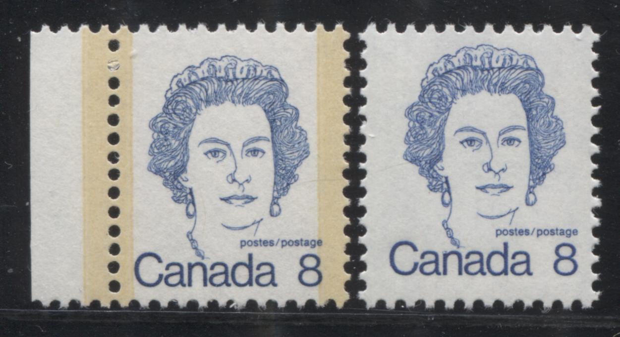
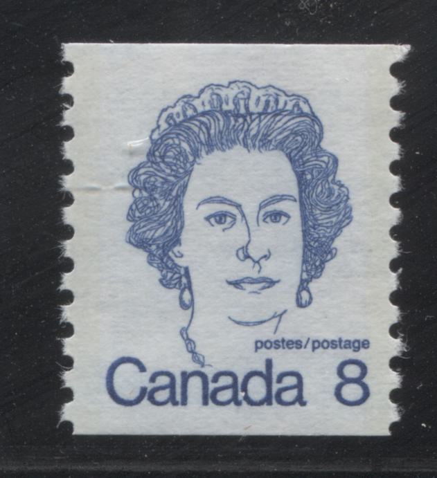
For the low values the main differences between the BABN and CBN printings lie in the paper, the appearance of the tagging and the colour. An example of the difference between the BABN and CBN printings of the 8c Queen is shown above. Typically, the paper of the CBN printings has a slightly rougher texture, the colours appear lighter and the tagging bars are usually much more visible, although the intensity of the colour does vary, with the example shown above being one with very dark tagging. In contrast, the paper of the BABN printings appears smooth, the colours are deeper and the tagging bars are usually almost invisible. On some printings of the 8c, the ink has mixed with the taggant compound, resulting in light blue tagging bars.

Type Differences on The Mid-Range Values


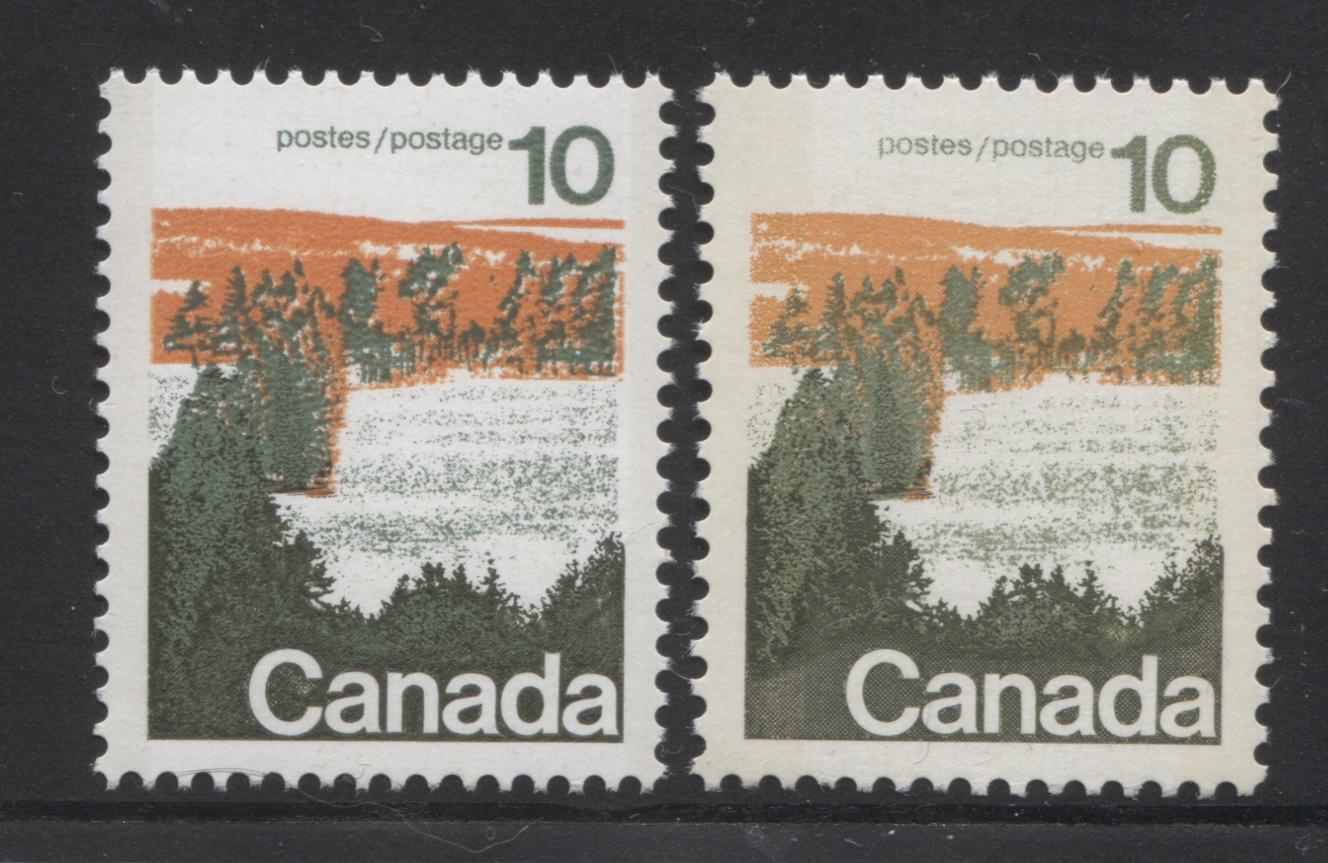
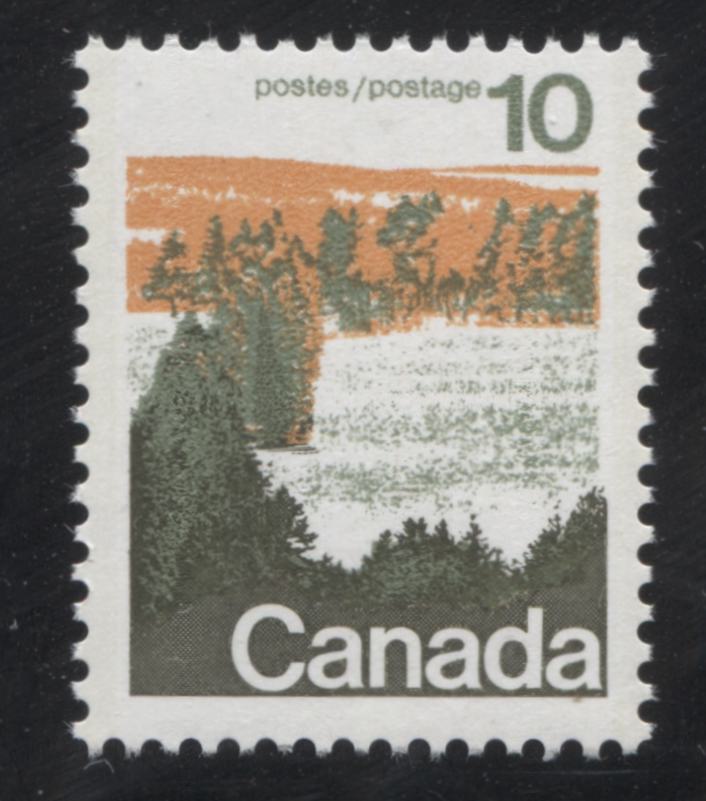
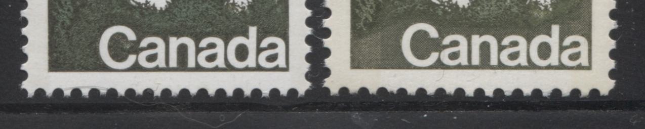
All of the mid-range values except the 20c are found to exist with two, slightly different versions of the design, that differ in small details. Typically these differences are attributable to a particular plate. The picture above shows two examples of the 10c forest stamp, with the right stamp being type 1 and the left stamp being type 2. The differences between the designs lie in the appearance of the shading around the word "Canada". On type 1 stamps, the background shading around the word Canada is clearly cross-hatched. On type 2, the shading appears solidly linked. For this stamp type 1 appears on all plate 1 printings, while type 2 appears on plates 2 and 3.

The close-up scan below shows the differences between the type 1 and type 2 designs more clearly:


I will illustrate the other type differences on the 15c, 25c and 50c in a subsequent post.


Shade Differences on The Stamps


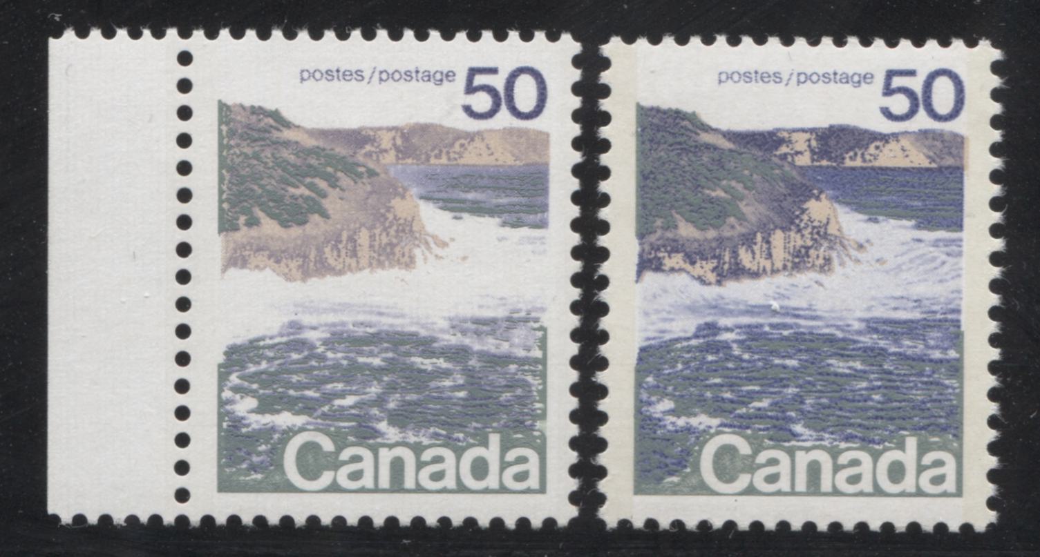
Although Unitrade does not list any of them, most stamps of this issue can be found with shade differences that range from prominent to subtle. As I mentioned in the discussion of the different printings of the low values, there are clear shade differences on stamps printed by the different firms. However, even within the printings made by a particular firm, there can be some marked shade differences. For example the booklet stamps of the 2c Laurier can be found in a bright and dull green shade. Many of the CBN printings of the 1c, 3c, 5c and 6c can be found with subtle, but discernible differences in shade. The two examples of the 50c above show a prominent difference in the shade of blue on the cliffs. I will cover the major and subtle shade differences I have found in a separate post.


Differences in Paper Colour and Texture

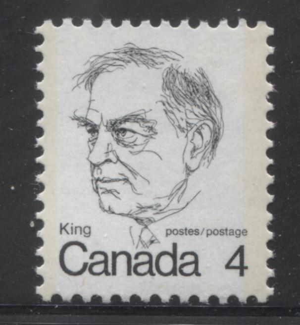
Like the previous Centennial issue there are some subtle variations in the paper colour and texture. Most all of these were unlisted by Unitrade until the past 20 or so years when many began to be listed. Still, there are variations that remain unlisted, such as the one shown below:


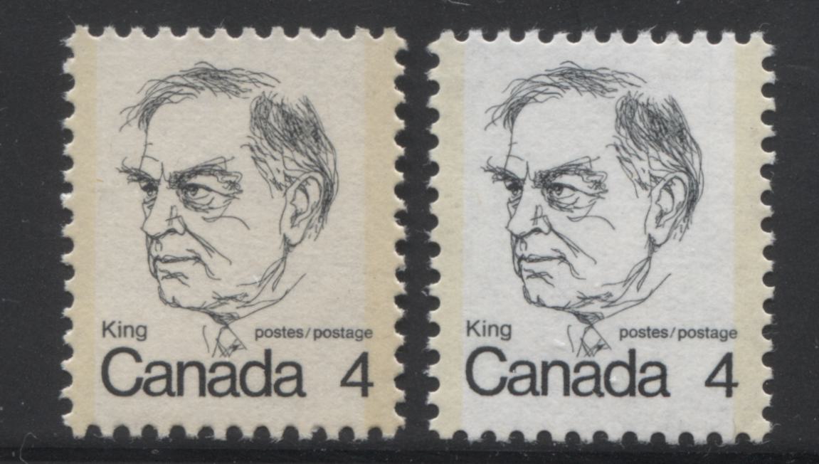
The scan shows two examples of the Mackenzie King stamp, with the normal printing shown on the right. Usually the normal paper appears dead white. However, I have found some versions printed on a paper with a light brownish rose tint, such as the example shown on the left. Also, the initial printings of the mid-values are printed on a very light cream paper, while the later printings are on a dead what paper. You can see this difference if you scroll back and look at the scan showing the two types of the 10c forest stamp again.


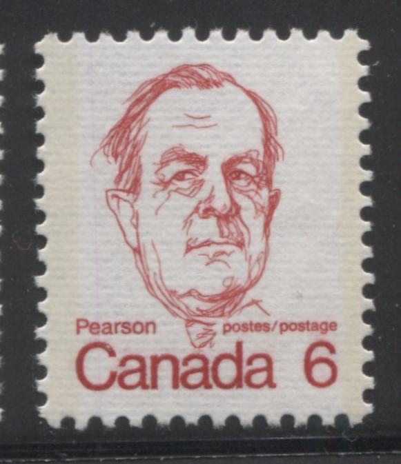
One difference that is listed by Unitrade now is the ribbed papers. These are listed as occurring on some printings of the 1c, 2c, 4c, 6c and 8c. For some reason no examples of the 3c and 5c are known thus, though they may exist. The ribbed paper shows distinct horizontal ribbing on the surface. An example of this paper can be seen on the 6c Pearson stamp and the lithographed $1 Vancouver stamps that I illustrated here.


Another difference that is now listed in Unitrade concerns the different textures of the chalk surfacing that is found on the 10c-50c values. The early printings were produced with a distinct vertical ribbed effect on the surfacing, and some small portion of the printings were printed with surfacing that is smooth, except for some very light horizontal striations. Finally, the very last printings of these stamps, made after 1974 had completely smooth chalk surfacing.


Differences in Paper Fluorescence Levels


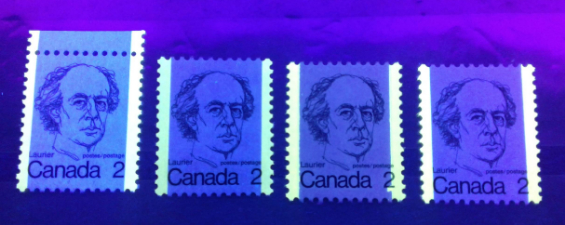
Paper fluorescence is one area in which this issue really shines in my opinion. Fluorescent papers are the norm here, as compared to the previous issue where dull paper was the norm. However, the fluorescence levels found cover the full spectrum, from non-fluorescent to hibrite. In addition, these fluorescence levels are different on both the front and the back of most stamps. While this might be expected on the mid-values and high values, where the paper is chalk-surfaced, it may surprise collectors to realize that they can be found on the low values as well, which were generally printed on uncoated paper.


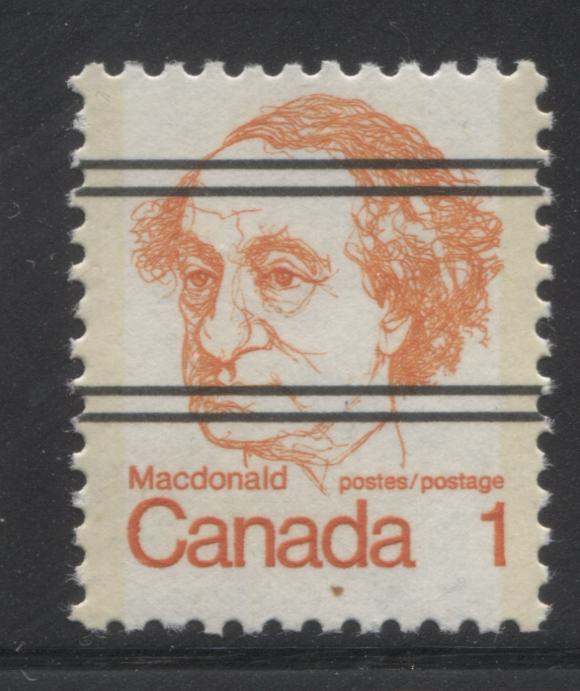
Differences in Tagging


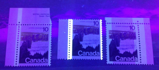
This is the first definitive issue in which all of the stamps, except the Ashton Potter printings of the $1 and $2 are tagged. Untagged examples of the values below $1 are errors and are highly sought after and scarce. Like the previous issue, the stamps can be found with a variety of different tagging formats:


1. Winnipeg tagging, shown on the right above, was used on the some portion of the first printings of the 10c, 15c, 20c and 25c, even though it was in the process of being phased out by 1972.

2. Ottawa Migratory OP-4 tagging, shown on the left above, was used on the majority of the first printings of the 10c, 15c, 20c, 25c and 50c.


3. Ottawa OP-2 tagging, shown above centre, was used on the 1973-1974 printings of the 10c-50c values. Initially this tagging was 3 mm wide, but was switched to 4 mm tagging in late 1974. I have heard that 2 mm tagging can also be found, but I have not seen examples.


In addition to the different formats of tagging, differences can be found in the intensity of the colour under UV and in normal light, as well as the positioning of the tagging on the stamp. Two examples of 1-bar tagging errors that result from shifting of the tagging bars, relative to the sheet are shown on the 2c Laurier below:


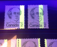
The picture above shows an example of a 1-bar right tagging error on the left, and a centre 1-bar tagging error on the right.


Perforation Differences and Anomalies

Like the previous issue, the stamps of this issue were printed using different perforations, and was the last issue to feature line perforated stamps, on the Ashton Potter printings of the $1 and $2. These are perforated 11. This was CBN's first time adopting comb perforating as well, since all the stamps they printed up to this point were line perforated 12 x 12.5, which was an entirely new gauge that they had not used before. They struggled with the process, as can be seen from the 2c pair below:


This pair shows a slight discontinuity in the vertical perforations which results from two strikes of the comb perforator not quite being properly aligned. Other examples of stamps and multiples can be found that show double punched perforations, extra large perforation holes, elliptical perforation holes and perforations that do not fully punch through the paper. These are only found on the CBN printings of the low values.


The BABN used a comb gauge of 12 x 12.5 on the booklets and 12.5 x 12 on the values from 10c-$1 that it printed from 1972 to 1976-77, when the gauge was 13.3. This later perforation is found on all sheet stamps of the 10c Queen and the last, plate 6 printing of the 8c Queen stamps.


Precancels


The low values of this issue printed by the CBN, except for the 4c and 7c exist precancelled with two pairs of horizontal black lines, as shown above. This is similar to the precancels found on the previous Centennial issue, except that here there are only 2 pairs of lines instead of the three pairs that are found on the Centennial Issue. Like the Centennial issue, the side margins of the precancelled sheets contain a warning telling people that these stamps are only to be used with the proper authorization.


Coil Stamps


The CBN printed coil stamps for both the 8c and 10c values, and an example of the 8c stamp is shown above. The 8c coils were issued on April 10, 1974, while the 10c coils were issued on September 1, 1976, at the same time as the sheet stamps. As with all CBN coil stamps, these also exist with the usual range of wide and narrow spacing varieties, as well as jump strips. The jump strips are much more tricky to identify on these, because there is no border on the stamp design, which would make the jumps more visible.


Plate and Corner Blocks


This is probably the most challenging aspect to forming a specialized collection of this issue. Most all stamps were issued with plate inscriptions like the block shown on the left, and most are found with 2-3 plate numbers, although the 8c is found with 6. However, it is now been determined that most of the scarce printings of the stamps of this issue were produced on field stock only. Thus many of the printings can only be found with blank corner blocks like the one shown on the right. Consequently, many are very scarce because until this fact came to light it was common practice for dealers to eschew field stock blocks, since they did not have inscriptions. Many were either broken up for singles, or otherwise used for postage, before anyone realized what they were.

Another interesting aspect to collecting the plate and corner blocks concerns the appearance of the selvage. On some stamps, the selvage is perforated through, while on other stamps it is either imperforate, or contains a single extension hole. Still, on others, remnants of holes can be found at the top or bottom of the upper and lower selvage tabs, which can serve as evidence that the panes were printed in a larger press sheet layout that was guillotined apart.
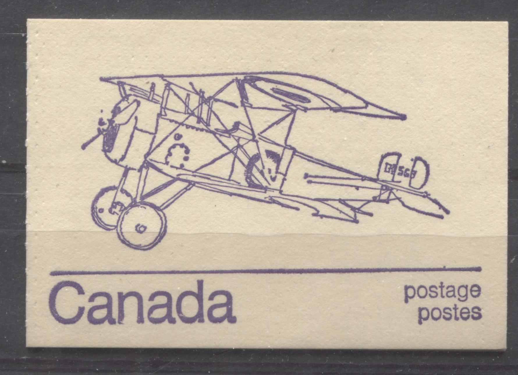
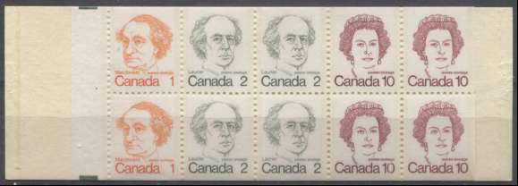


Booklets

On this issue there were three basic booklets issued: a 25c booklet, a 50c booklet and a $1 booklet. These followed the most popular booklets issued during the Centennial era. Only the $1.50 booklets were discontinued. All of the booklets were integral booklets printed by BABN. On both the 50c and 25c booklets the cover designs featured aircraft, and like the very last booklets issued for the Centennial series, 10 different designs were used for each booklet. The $1 booklet featured a stylized purple and red maple leaf design on the cover.


An example of a 50c booklet is shown below:


Here is the what the inside pane of the booklet looks like:


The number of basic booklet formats is much less complicated than the previous issue due largely to the fact that the method of production was not changed mid-issue and there were no postal rate increases until the end of 1976. However, which this issue lacks in basic differences, it more than makes up for in varieties. The quality control on these booklets was very, very poor, resulting in a lot of minor plate, inking and tagging varieties, as well as numerous variations in the fluorescence level and texture of both the stamp paper and cover stock.


Plate Flaws

This issue is found with a number of constant and non-constant plate flaws and varieties. Many of these are listed in Unitrade for the mid-values and the $1 Ashton Potter printing. The most famous of these is the "short dollar" flaw, which occurs on the Ashton Potter printings of the $1. This is shown below:


The left image shows the normal $ sign on the stamp. On this, the line clearly extends through both the top and bottom of the "S". On the short $ flaw, the line does not extend above the "S". A second version also shows a clear dot after the word "Postes".


The 15c, and 25c values exist with varieties that are the result of colour shifts, that are listed in Unitrade, while similar shifts on the 10c, 20c and 50c are not listed. The 50c is noted to exist with six minor constant varieties, though none of these are formally listed or illustrated in Unitrade.


The low values can also be found with a lot of minor flaws and hairline varieties that may or may not be constant. The 6c Pearson booklet stamp exists with a major re-entry, in which the word "Postage" is clearly doubled.


Sealed Post Office Packs

This is the first issue in which you can find sealed packs issued by Canada Post. These packs contained either:


1. A complete set of single stamps, or
2. Matched sets of plate blocks, or corner blocks of the precancels.


The packs consist of a card insert bearing the Canada Post Emblem, which changed 3 times during the life of this issue, and the stamps or blocks. Not surprisingly, it is possible to find more than one type of pack for several of the stamps in the series. In addition the fluorescence of the insert cards can vary widely. This is an aspect of the philately of this issue which has not been completely explored. It is getting more and more challenging though, because many of these packs have been opened to get the blocks or single stamps. Consequently they are becoming scarcer and scarcer, with the passage of time.

First Day Covers

[center]


Most of the first day covers found on this issue are of the official Canada Post design shown above. Occasionally, you can find private cachets, though by now they are reasonably scarce. Canada Post used the same cachet for the original printings of the low and mid-values, and then a new cachet design when the 7c Saint Laurent and 10c Queen stamps were issued.


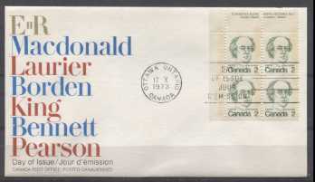
There are several ways that these can be collected. Firstly, they can be found franked with singles, pairs, blocks of 4 and plate blocks. Secondly, the fluorescence of the envelop stock can be found with several variations.


Postal History

[center]


Some very nice covers can be collected for this issue, despite the fact that the rates were much simpler by the time this issue was released. However, there are still rates like third-class mail and many different special delivery rates that make the collection of these covers interesting. In addition, there are lots of commemoratives, approximately 100 or so that can be found used in combination with the stamps of this issue, like the registered airmail cover to Vilnius, USSR shown above. Finally, because this set replaced the Centennial issue gradually, you can find many covers in which the franking consists of stamps of this issue as well as the Centennial issue. Many of these covers are not nearly as common as you might expect, and so they can represent quite a rewarding challenge for the patient philatelist.

This concludes my overview of this issue. Next week I will discuss the type differences on the 15c, 25c and 50c, as well as the constant varieties that can be found on the stamps. I expect that the entire series of posts will number 30 or so, and will stretch out over 6 months or so. I am eager to hear your thoughts about these stamps and about any unlisted varieties you may have in your collections.

Send note to Staff

Rest in Peace
7742 Posts
Posted 01/08/2019   8:28 pm  Show Profile Bookmark this reply Add wert to your friends list  Get a Link to this Reply
Brixtonchrome..WELCOME to the forum my friend..
Nice write up...(Did you start typing on January 1st...haha..Teasing you.)
Very good write up...and again welcome.

Robert

BTW..Nice to see another East Coastner on here.
Send note to Staff  Go to Top of Page
Edited by wert - 01/08/2019 8:30 pm
Pillar Of The Community
Canada
6525 Posts
Posted 01/08/2019   8:46 pm  Show Profile Bookmark this reply Add jamesw to your friends list  Get a Link to this Reply
I do love those portraits, but it ALWAYS drives me crazy to see them described as caricatures. I've ranted about it before, here and other forums. These are NOT caricatures!
The Cambridge English Dictionary (online) defines a caricature as '(the art of making) a drawing or written or spoken description of someone that usually makes them look silly by making part of their appearance or character more noticeable than it really is'
Merriam-Webster (online) writes, 'exaggeration by means of often ludicrous distortion of parts or characteristics'
Collins English Dictionary (online) defines 'A caricature of someone is a drawing or description of them that exaggerates their appearance or behaviour in a humorous or critical way.'
Oxford Dictionary (online) says, 'A picture, description, or imitation of a person in which certain striking characteristics are exaggerated in order to create a comic or grotesque effect.'

Once again I'm feeling a need to write to Unitrade and have them change the heading in their catalogue. Where's my crayon!!!!!!
Send note to Staff  Go to Top of Page
Edited by jamesw - 01/08/2019 8:47 pm
Rest in Peace
7742 Posts
Posted 01/08/2019   9:02 pm  Show Profile Bookmark this reply Add wert to your friends list  Get a Link to this Reply
Hi jamesw.....Good point..

Maybe not "The 1972-1978 Caricature and Landscape Issue of Canada"

Maybe "The 1972-1978 Portrait and Landscape Issue of Canada"

Robert
Send note to Staff  Go to Top of Page
Valued Member
Canada
97 Posts
Posted 01/08/2019   9:58 pm  Show Profile Bookmark this reply Add Brixtonchrome to your friends list  Get a Link to this Reply
I totally agree with James. However, I stick with the name because it is the one commonly known to collectors. Thanks for the welcome Wert. I've been meaning to post to this board for a long time but haven't gotten myself organized to do so until now. I am a full time dealer and philatelic blogger and have been at it full time for just over 3 years now. I wrote a 53 post series on the Centennial issue last year and my customers have been waiting for me to get around to this issue, which I have finally started this week. I am looking forward to seeing what level of engagement comes on these posts as I really believe the modern era has much to offer to collectors. So, thanks again.
Send note to Staff  Go to Top of Page
Pillar Of The Community
Canada
1415 Posts
Posted 01/08/2019   10:48 pm  Show Profile Bookmark this reply Add Gilles le timbre to your friends list  Get a Link to this Reply
Brixtonchrome,
welcome to the forum. I have been reading your posts on many topics of Canadian stamps, and am very pleased that you have joined SCF forum.
Your posts have been of very high quality and contain a wealth of great information. The Kriegoff and the Kane ones were particularily interesting, recently. Soon, I will get to the caricature, (after I finish the centenials....) which still intrigues me, especially the paper varieties such as ribbed paper.
Send note to Staff  Go to Top of Page
Valued Member
Canada
97 Posts
Posted 01/09/2019   07:24 am  Show Profile Bookmark this reply Add Brixtonchrome to your friends list  Get a Link to this Reply
Thanks Gilles. If you like the Centennial issue and you like paper varieties then you are REALLY going to like this issue! I spent 4 months, no joke sorting out my stock for listing last year and I was amazed by the number of different variations. The amount of experimentation done from 1972-1978 was considerable, and it is reflected in the papers, gum and tagging of the stamps.

I am really glad to have finally joined the community too. I've been meaning to for a long time, but my stamp business has kept me so busy that I just haven't been able to find the time until now.
Send note to Staff  Go to Top of Page
Pillar Of The Community
United States
1047 Posts
Posted 01/09/2019   08:22 am  Show Profile Bookmark this reply Add DonSellos to your friends list  Get a Link to this Reply
Brixtonchrome:

Without doubt, yours is the most informative post I have read on the Canada forum. I'm looking forward to your future contributions.

Thanks for posting.

Don
Send note to Staff  Go to Top of Page
Rest in Peace
Netherlands
963 Posts
Posted 01/09/2019   12:15 pm  Show Profile Bookmark this reply Add Galeoptix to your friends list  Get a Link to this Reply
Chris,

your blog articles are fascinating!

As to the OBA's variation - both in the coatings and/or paper itself - I think we should realize that in time the effect might change. And also in used/washed-off stamps, the OBA's should be treated with suspicion, unfortunately.

If the OBA-impression of the front differs from that of the back, it means the paper had been coating - een though it may be hard to see the coating. Calendering doesn't change the OBA-effect, so it must be the coating, unless the gumming is spoiling our game ....

Rein
Send note to Staff  Go to Top of Page
Pillar Of The Community
Learn More...
Canada
3963 Posts
Posted 01/09/2019   12:41 pm  Show Profile Bookmark this reply Add Dianne Earl to your friends list  Get a Link to this Reply
Excellent Presentation Brixtonchrome.

I very much enjoyed reading it

Dianne
Send note to Staff  Go to Top of Page
Don't grumble that the roses have thorns, be thankful that the thorns have roses
Pillar Of The Community
Canada
5821 Posts
Posted 01/09/2019   1:20 pm  Show Profile Bookmark this reply Add lithograving to your friends list  Get a Link to this Reply
Brixtonchrome, welcome to the forum and thanks for your
detailed study of the Centennials and Caricature/Landscapes.

That decade,late sixties to late seventies was for me
the most exciting time collecting Canadian stamps.
Yes those were the days.
Send note to Staff  Go to Top of Page
Valued Member
Canada
97 Posts
Posted 01/09/2019   6:39 pm  Show Profile Bookmark this reply Add Brixtonchrome to your friends list  Get a Link to this Reply
Thanks for all your kind feedback everyone. I only just getting started with this issue. I fully expect to take 6 months or so to cover all the variations. Galeoptix, what do you mean by OBA? I wasn't entirely clear. Perhaps you could clarify. I do agree that soaking may affect the paper but even if the papers change over time, one would expect them to all be equally affected, so that if they aren't then that tends to suggest to me a collectible difference in paper - even if what we see with our eyes now is different from what we would have seen in 1974.

Anyway I look forward to more comments and discussion!!
Send note to Staff  Go to Top of Page
Pillar Of The Community
Canada
1462 Posts
Posted 01/09/2019   7:51 pm  Show Profile Check gmot's eBay Listings Bookmark this reply Add gmot to your friends list  Get a Link to this Reply
I have been reading your very informative blog posts for the past year with interest, but sometimes forget to check. So very happy that you are posting here, so I won't miss any.
Send note to Staff  Go to Top of Page
Valued Member
Canada
97 Posts
Posted 01/10/2019   09:20 am  Show Profile Bookmark this reply Add Brixtonchrome to your friends list  Get a Link to this Reply
Thanks very much Gmot.
Send note to Staff  Go to Top of Page
Rest in Peace
Netherlands
963 Posts
Posted 01/10/2019   09:26 am  Show Profile Bookmark this reply Add Galeoptix to your friends list  Get a Link to this Reply
OBA or optical brightening agents are responsible for the "white fluorescence" reaction under UV. Originally they were coming from recycled textiles [having been washed with "whiter than white" detergents] but gradually in the later 1950-ies the OBA were added deliberately to the paper pulp to make paper look brighter, but also to the coating substance no matter whether the coating itself had other luminescent substances [different colours under UV] in order to help postal automation.

OBA's can be in the paper pulp itself hence the reaction of the back or the uncoated front of a stamp; or in the coating which is usually appplied at the front BUT can occur on both sides as well! In the latter case we can have back that is "white" and a front that is "violet" [violet as no OBA in the front coating but "reflecting" thre UV, hence the violet!].

In the days of uncoated papers the lack of OBA [or any other luminescence] resulted in a darkish, brownish or yellowish appearance under UV.

With luminescence I meant the reaction under UV no matter when that stopped after removal of the UV-source [fluorescnce] or could still be observed [phoshporescence].

The OBA reaction can vary from practically nothing to overwhelming [HIBRITE]. We do not have a really practically way of subdividing such reaction - as it depends on the strength of the source, the wave-length and the quantity/density of the OBA.

As I said the judgement of the UV-reaction of used and/or washed-off stamps is highly NOT reliable! OBA's coming from the enveloppes, from other stamps that were washed off simultaneously, etc...

What is more important is t study the structure pof the paper itself; "grooves" at the fornt or at the back, wire structures that come from the long-sievee of the paper machine.

You refer to "wove" which is rather inaccurate as ALL stamp paper may showe a wire structure that results from a woven sieve.


This is a rather modern type woven wire....
Send note to Staff  Go to Top of Page
Valued Member
Canada
97 Posts
Posted 01/10/2019   12:51 pm  Show Profile Bookmark this reply Add Brixtonchrome to your friends list  Get a Link to this Reply
Hi Galeoptix. Thank you very much for the clarification. I do agree that it is studying fluorescence on used stamps and that the characteristics of the paper other than fluorescence are of vital importance. However, I still think that there is a way to subdivide the brightness of fluorescent reactions - it takes experience, but it can be done. I've tried to come up with a nomenclature for paper fluorescence on my website, but it is rather complicated and not everyone's cup of tea.
Send note to Staff  Go to Top of Page
Page: of 10 Previous TopicReplies: 139 / Views: 10,817Next Topic  
Next Page
 
To participate in the forum you must log in or register.

Go to Top of Page

Disclaimer: While a tremendous amount of effort goes into ensuring the accuracy of the information contained in this site, Stamp Community assumes no liability for errors. Copyright 2005 - 2026 Stamp Community Family - All rights reserved worldwide. Use of any images or content on this website without prior written permission of Stamp Community or the original lender is strictly prohibited.
Privacy Policy / Terms of Use    Advertise Here
Stamp Community Forum © 2007 - 2026 Stamp Community Forums
It took 0.27 seconds to lick this stamp. Powered By: Snitz Forums 2000 Version 3.4.05