| Author |
 Replies: 40 / Views: 5,501 Replies: 40 / Views: 5,501 |
|
Pillar Of The Community

United States
1838 Posts |
|
|
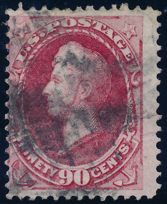
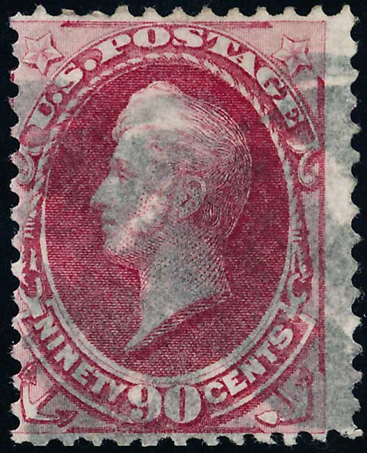
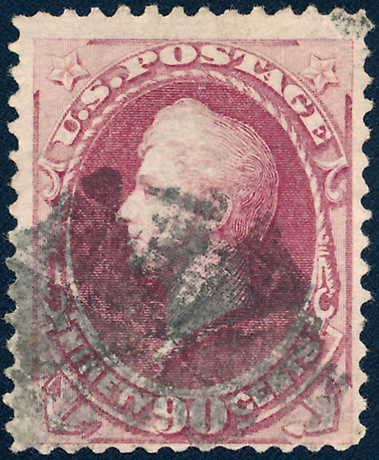
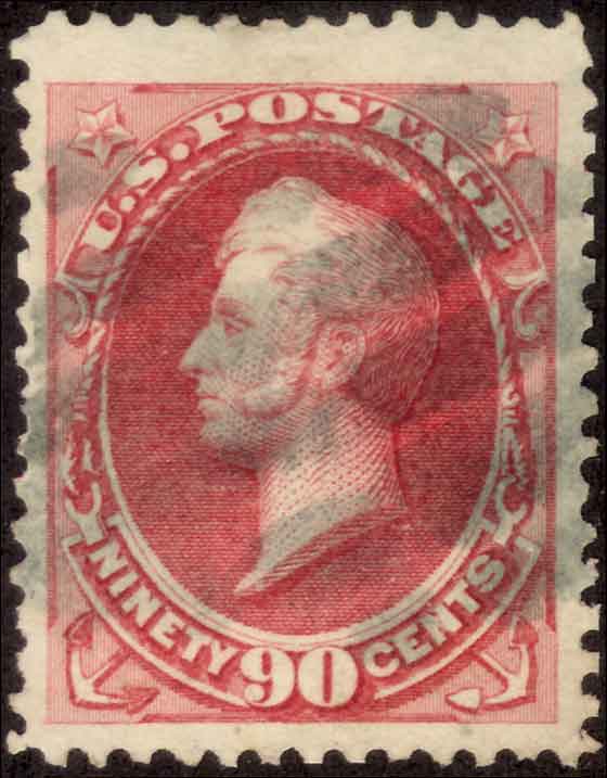
I thought I had a pretty solid way of separating 155s from 166s based only on color, but lately I've been having doubts. With all the stamps go through I think the color alone is not sufficient. So I went through an exercise and tried to use the differences in the impression instead. In this scan I think the top row are Continental (166) and the bottom row are National (155). That is based less on the color and more on National having a sharper impression and the Continental being a bit more inky. But'I'd love any feedback you have, because my confidence is not that high.  |
|
Send note to Staff
|
|
|
|
|
Pillar Of The Community
United States
1414 Posts |
|
|
You may be correct, but I don't know of any article of formal study. I don't see color differences between the top and bottom row in the scan. Scott 155 is much scarcer than 166. A certified Scott 144 with a grill and a good cert would make an excellent reference, but most collectors don't have one on hand.
It is the case that 15 cent National Bank Note Company printings have complete fine lines in the upper and lower corner triangles while Continental Bank Note Company printings are missing some of the fine lines. However, Continental printings on ribbed paper have the fine lines, but the color is distinctive. The 90 cent stamps cannot be separated without a reference. Otherwise, the colors start to all look the same, especially in unfavorable lighting conditions. I also believe that the 30 cent national printings have better defined fine lines. When I examined a cover submitted as the Continental EDU, I concluded that the fine line detail would classify it as a National printing.
Also, the middle stamp in the top row has a reperforated bottom margin. Unlike 20th Century Bureau Issue stamps, bank note company printed stamps should have perforations in sync, or aligned, between rows. If you want to verify this, check the perforations in the recent Siegel Auction blocks and multiples sale. The first block without aligned perforations was in the Pan American issue. Except for the top and bottom of middle stamp in the top row, all the other stamps have aligned perforations. The rightmost stamp in the second row may also need a careful look at the perforations on the left side. |
Send note to Staff 
|
|
|
Pillar Of The Community
United States
1838 Posts |
|
|
Thanks for this. I do have a good 144 and 155. Those have been my references, but I'm having a hard time with a number of these. I'm not convinced that I've got this right. Sometimes I think I've got it and then I think I've got it backwards. Is it your experience that with good reference stamps using color is good enough to separate these two? |
|
Send note to Staff
|
|
|
Pillar Of The Community
1375 Posts |
|
|
Wouldn't it help to sort out at least those CBN stamp on soft paper, then you would perhaps have few left.
The cancel in the middle at the bottom seems to be a NYFM cancel (Weiss ST-8P10), but that does not help for CBN vs. NBN. It's time that there is a sensational discovery of the secret mark of the 90c :). |
|
Send note to Staff
|
|
|
Pillar Of The Community
United States
1414 Posts |
|
|
My experience is that there are stamps that seem to fall somewhere between a 155 reference and lighter 166 shades. If a group of 166 examples are examined without a 155 reference, some may appear to be 155. The safest approach is to assume that unclassifiable examples are 166. I don't know if anyone has tested the stamps under multi-color light sources or and XRF to determine if differences in the ink exist. The Institute of Analytic Philately would be a possible source of information. |
|
Send note to Staff
|
|
|
Pillar Of The Community
United States
1838 Posts |
|
|
stemperix, I've already removed all the soft paper stamps out. That's the easy part.
cfrphoto, thanks, I think that is probably the right approach until something better comes along. I may well end up saying all 6 of these are 166s. That's actually how I had them classified before I tried this idea.
Back to the drawing board. |
|
Send note to Staff
|
|
|
Rest in Peace
United States
920 Posts |
|
|
This discussion begs the question...What do PF/PSE use to differentiate between 155 and 166? There are many listings under both Scott #'s by both companies. Are we saying they are guessing? I find that difficult to swallow.
Scott lists the paper type for both as -
155 White Wove, Thin to Medium Thick, and
166 White Wove, Thin to Thick.
It sounds like they are saying a 155 is the same as most 166's minus the "Thick" ones.
I'm really interested as I have a 155/166 MH and there's a big difference in the values between the two! |
|
Send note to Staff
|
| Edited by Caper123 - 08/14/2019 11:15 am |
|
|
Pillar Of The Community
United States
1414 Posts |
|
|
Pillar Of The Community
United States
1838 Posts |
|
|
Those all look rather bright to me. I wish it were always as clear as that. |
|
Send note to Staff
|
|
|
Pillar Of The Community
United States
1414 Posts |
|
|
Rest in Peace
United States
920 Posts |
|
|
cfrphoto - The 144 ought to be easier as it is grilled whereas the others are not.
Any chance any of these were certified as that particular Scott #?
Also, what do you have to offer about the color of Scott 191? |
|
Send note to Staff
|
|
|
Rest in Peace
United States
920 Posts |
|
|
I often do a Siegel of PF search but you can see how helpful this is. From Siegel below: from L to R - 166, 155, 191. These were selected at random from their unused listings.  |
|
Send note to Staff
|
| Edited by Caper123 - 08/15/2019 7:29 pm |
|
|
Rest in Peace
United States
920 Posts |
|
|
RLSNY - it might be my eyes but is there some doubling of the bottom frame line on your top center stamp? |
|
Send note to Staff
|
|
|
Pillar Of The Community
United States
2555 Posts |
|
|
It's a bottom row stamp with a layout line and even a layout dot.
Also, Caper123, there is indeed a lot of guessing going on, just don't expect many people to admit it. |
|
Send note to Staff
|
|
|
Pillar Of The Community
United States
1838 Posts |
|
|
Just as a follow-up, I've gotten my reference stamps out and I'm going only by color. The "fine lines" idea didn't really hold up on close inspection. I think the suggestion that any borderline color stamp should be considered a 166 is the right one. My scanner is definitely not calibrated. I'm going to look into doing that and if I get a good set of examples together I'll post it.
Sometimes just airing out ideas helps. I have a much more solid understanding of the 154/165 color differences now, partly due to help I got here. I think I'm getting there with this case. It's that almost "burgundy" character, solid and dark, to make a 155. Anything else is rejected. Working on it.
I do have a very high quality 155 (purchased from Siegel), and a 144 that isn't bad either. So that has to take precedence.
|
|
Send note to Staff
|
|
|
Pillar Of The Community
United States
1414 Posts |
|
|
Quote:
Any chance any of these were certified as that particular Scott #? The 144 has a PSE certificate. Quote:
Also, what do you have to offer about the color of Scott 191? American Bank Note Company soft paper printings of Scott 191 exists in a rich carmine color, like 155, and rose shades. I don't know how close the carmine rose or rose is to the Continental rose carmine or pale rose carmine listed in Scott for 166. Continental Bank Note was consolidated into the American Bank Note Company on Feb 4, 1879, but the transition to soft paper was complete in August 1878, so it is possible that carmine rose and rose examples of 191 could have been printed by the Continental Bank Note Company. National Bank Note plate 23 was used for all 90 cent bank note printings including the purple Scott 218. |
|
Send note to Staff
|
|
|
Replies: 40 / Views: 5,501 |
|




 Posted 08/13/2019 4:02 pm