| Author |
 Replies: 3,821 / Views: 253,067 Replies: 3,821 / Views: 253,067 |
|
|
|
Pillar Of The Community

United States
1831 Posts |
|
|
Pillar Of The Community
United States
1831 Posts |
|
|
It looks like it is 25L2 but I can't tell the difference between the E and L. I'm yet to be able to see any difference. I don't know the reliefs, but just looking at the white oval for differences - I'm not seeing them. Help? |
Send note to Staff 
|
|
|
Valued Member
United States
327 Posts |
|
|
You found the position. Nice job. You wont see much difference in the white oval area as there wasn't any recutting of this area when plate 2E was re-entered and became 2L. The outer frame lines and top label block were recut (along with other areas) however. Compare the upper frame line and the top label block of your stamp with Chase's 25L2L and 25L2E especially the area above "S.POSTA". This area on 25L2E is narrower than your stamp but the same area on 25L2L matches up nicely. I'll try and put together a comparison image that shows it. Also, there is a gap in upper left corner where the outer frame lines meet in the corner that is visible on your stamp and Chase's 25L2L. Its not visible on Chase's 25L2E.
Having said all this, I am still learning and do make mistakes. Perhaps Ioagoa and others can weigh in but I feel very confident that your stamp is 25L2L.
Regards,
Harper1249
|
|
Send note to Staff
|
|
|
Pillar Of The Community
United States
636 Posts |
|
|
Hi RLSNY --
I agree with Harper that your 25L2 stamp is from the Late state of the plate -- and thus is 25L2L.
In addition to the differences between 25L2E and 25L2L noted by Harper -- other noteworthy differences are as follows:
-- Early has a double transfer that shows as dots of color in the U and the S of U.S. POSTAGE. No DT on Late state. You can see the DT on the StampSmarter copy of 25L2E.
-- On Early state the 1 line recut in the ULT is noticeably stronger versus Late state. Same goes for the horizontal line that is recut across the top of the URDB. Again -- compare both of these areas on your stamp against the StampSmarter copy of 25L2E and you should be able to see the difference.
-- On Early state there is a weak spot in the middle of the BFL just below the E C of THREE CENTS. When 2E was re-entered to become 2L, the re-entry restored this weak spot. This can also be seen by comparing your stamp against the StampSmarter copy of 25L2E.
There are numerous other differences between the two states -- but those mentioned by Harper -- plus those listed above -- are enough to conclude that your stamp is definitely from the Late state of the plate.
Regards // ioagoa
|
|
Send note to Staff
|
| Edited by ioagoa - 06/24/2023 02:46 am |
|
|
Pillar Of The Community
United States
1831 Posts |
|
|
Thank you guys. Sometimes I wonder if you guys weren't bitten by a radioactive spider or accidentally transported into the quantum realm to pick up super-micro-vision. Anyway, thanks for your help. |
|
Send note to Staff
|
| Edited by rlsny - 06/24/2023 6:53 pm |
|
|
Pillar Of The Community
United States
939 Posts |
|
|
Pillar Of The Community
United States
2947 Posts |
|
|
Pillar Of The Community
United States
636 Posts |
|
|
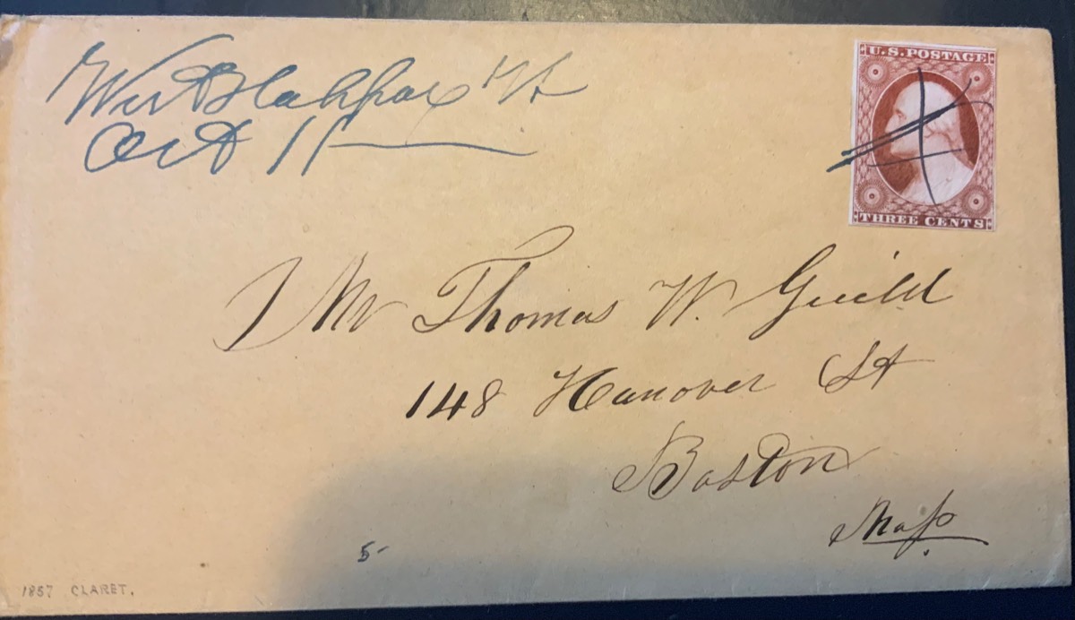
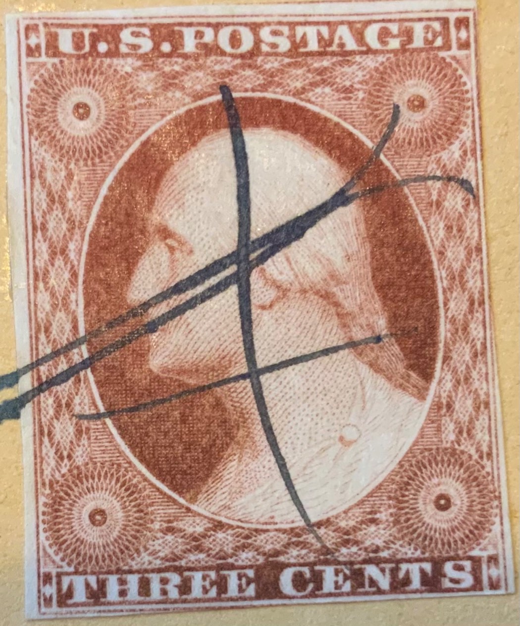
Hi stampcrow --
Nice -- I love those DT's -- thanks for showing your 56L1L !!
As an aside -- I see that the prior owner annotated the cover at the lower left corner that the stamp is an 1857 claret -- which cannot be true as the stamp is from plate 1L which was taken out of service in 1855.
Impossible to colorize a stamp from a scan -- but if a claret hue -- would have to be either "early 1852 claret" or "late 1852 claret" -- both of which are relatively tough colors (the late 1852 claret being much more elusive than the early 1852 claret IMHO) -- just sayin!
Nice stamp on a nice clean cover -- thanks again for showing it!
Regards // ioagoa
|
|
Send note to Staff
|
|
|
Pillar Of The Community
United States
2947 Posts |
|
|
Ioagoa,
Yes I would say this stamp is a Deep Claret? Not a purplish version.
I took the pics with my ipad. I don't have a scanner. The image of the stamp that's shown with the entire cover is closer to the actual color.
Don't love notations on covers. Some day I'll be "the previous owner" blamed for this erroneous notation. |
|
Send note to Staff
|
|
|
Pillar Of The Community
United States
3520 Posts |
|
|
Quote:
Some day I'll be "the previous owner" blamed for this erroneous notation. Heh, yea, there are plenty of incorrect notes on covers around. Its a little less bad, at least, if the incorrect notes are on the back - and really quite annoying when they are on the front. Fewer and fewer people now, fortunately, make notes on the front of covers anymore. I sense there has 'mostly' been a general lesson-learned there over time. |
|
Send note to Staff
|
|
|
Valued Member
United States
342 Posts |
|
|
Hey all! I'm just going to drop a couple of images for your ieeing pleasure. Stan Shepp Scott US #8, position 36L4, with a suspected silent precancel. PSE Certified (2022) as VF80 (demerits for the pen cancel) (2) ungraded Philatelic Foundation Certs (2004, 2005) 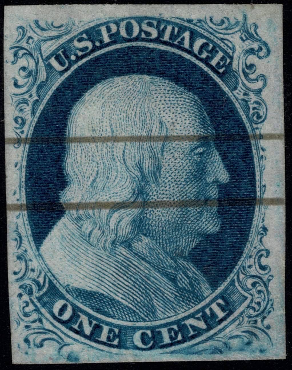 1851, 3¢ orange brown, type II (10A). Ample margins, lovely rich color, neat dated postmark, microscopic basically invisible pinhole, still graded Very Fine to Extremely Fine by the PSE. Expertization: with clear 2020 P.S.A.G. certificate and 2022 P.S.E. certificate, the latter graded VF-XF 85. As yet unplated. 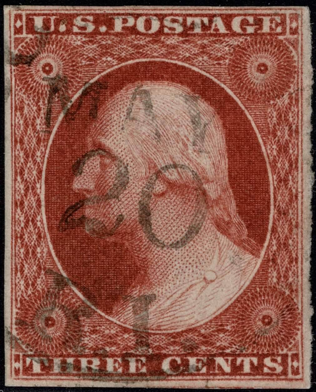 1852, 1¢ blue, type IV (9). Recut at top, twice at bottom, beautifully balanced margins with pieces of adjacent stamps at the sides, light town postmarks, bright and fresh, an Extremely Fine jumbo. Expertization: with 2007 P.S.E. certificate graded XF-SUP 95J. 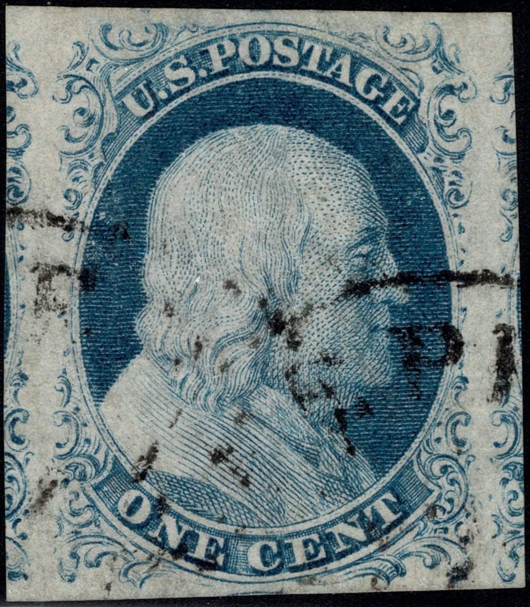 |
|
Send note to Staff
|
Stan Shepp |
|
|
Valued Member
United States
342 Posts |
|
|
Advertised as a cracked plate. It appears that there might be a marking coming down from the top of the stamp, directly above the E of POSTAGE and another one coming up from the bottom between the N & E of ONE. I did not see anything in Neinken's book that hsows these, but I may have missed it. Thoughts? Stan Shepp 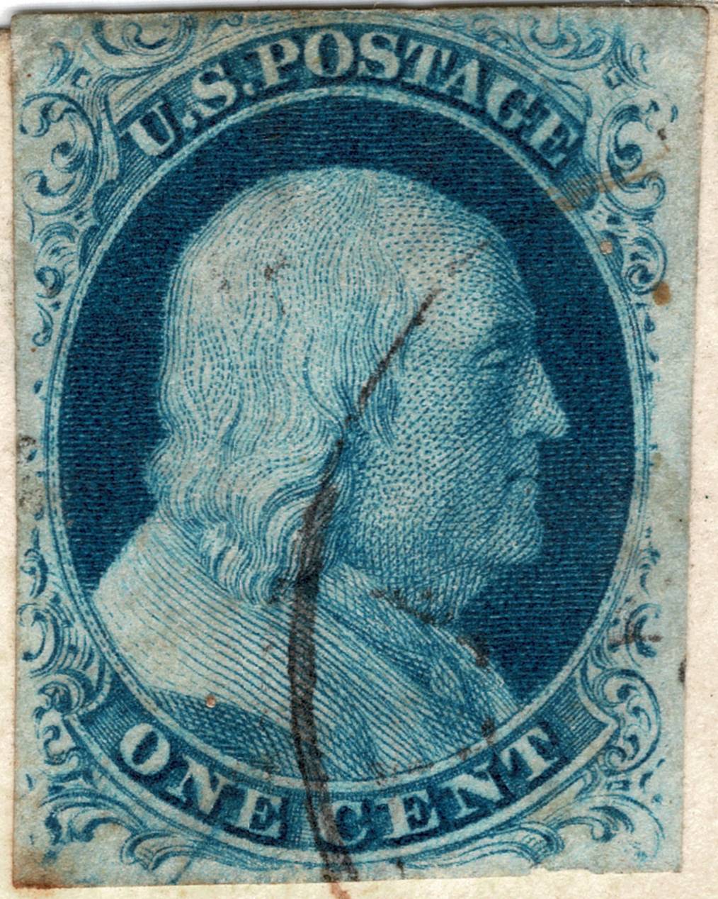 |
|
Send note to Staff
|
Stan Shepp |
|
|
Pillar Of The Community
United States
3520 Posts |
|
|
Position 56L2. Its a consistent 'curl'.
edit: many of the markings on this stamp outside of the curl at top right, are, in my opinion, ink-pulls, or, at any rate, printing anomalies. In particular most of the stuff at the lower left. |
|
Send note to Staff
|
| Edited by txstamp - 07/17/2023 4:02 pm |
|
|
Valued Member
United States
342 Posts |
|
|
I just received this beauty on cover and plated it as 3R1i, but I know enough to ask for a confirmaation on that plating. Thoughts? Stan Shepp 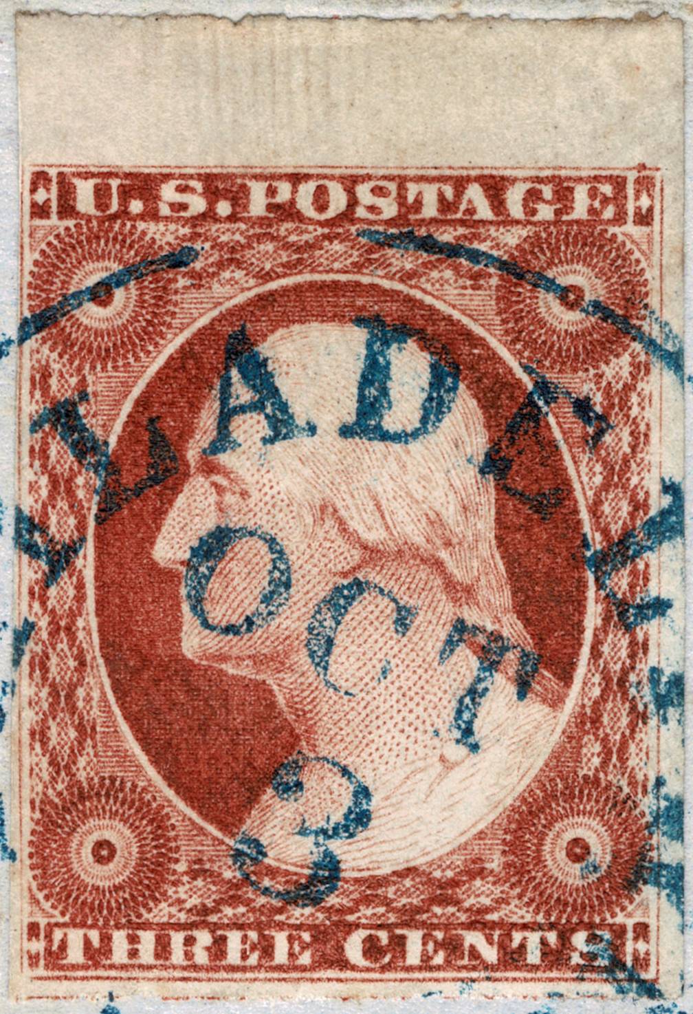 |
|
Send note to Staff
|
Stan Shepp |
|
|
Valued Member
United States
342 Posts |
|
|
txstamp,
I see it now.
It matches Neinken, but faintly.
Thanks!
Stan Shepp |
|
Send note to Staff
|
Stan Shepp |
|
|
Replies: 3,821 / Views: 253,067 |
|




 Posted 06/23/2023 7:51 pm