| Author |
 Replies: 3,821 / Views: 252,982 Replies: 3,821 / Views: 252,982 |
|
|
|
Pillar Of The Community

United States
1831 Posts |
|
|
Valued Member
United States
342 Posts |
|
|
The color on this 3c Washington is amazing. It just pops right out and catches your eye. I thought it to be an Orange Brown, but I had no luck plating it as such. The closest I came to plating it correctly was 4R8 - maybe 5R8. The right side is cropped a little bit too close. There is likely a guide dot in the UR corner that got cut off. This makes it a little harder to confirm the position. Proof-like impression. Massive gash on shoulder. Beautiful color. Any advice on the plating? Or the color? Possibly, it is an early printing from Plate 8 (EKU about April 1856) in the rare 1856 Orange Brown? Stan Shepp 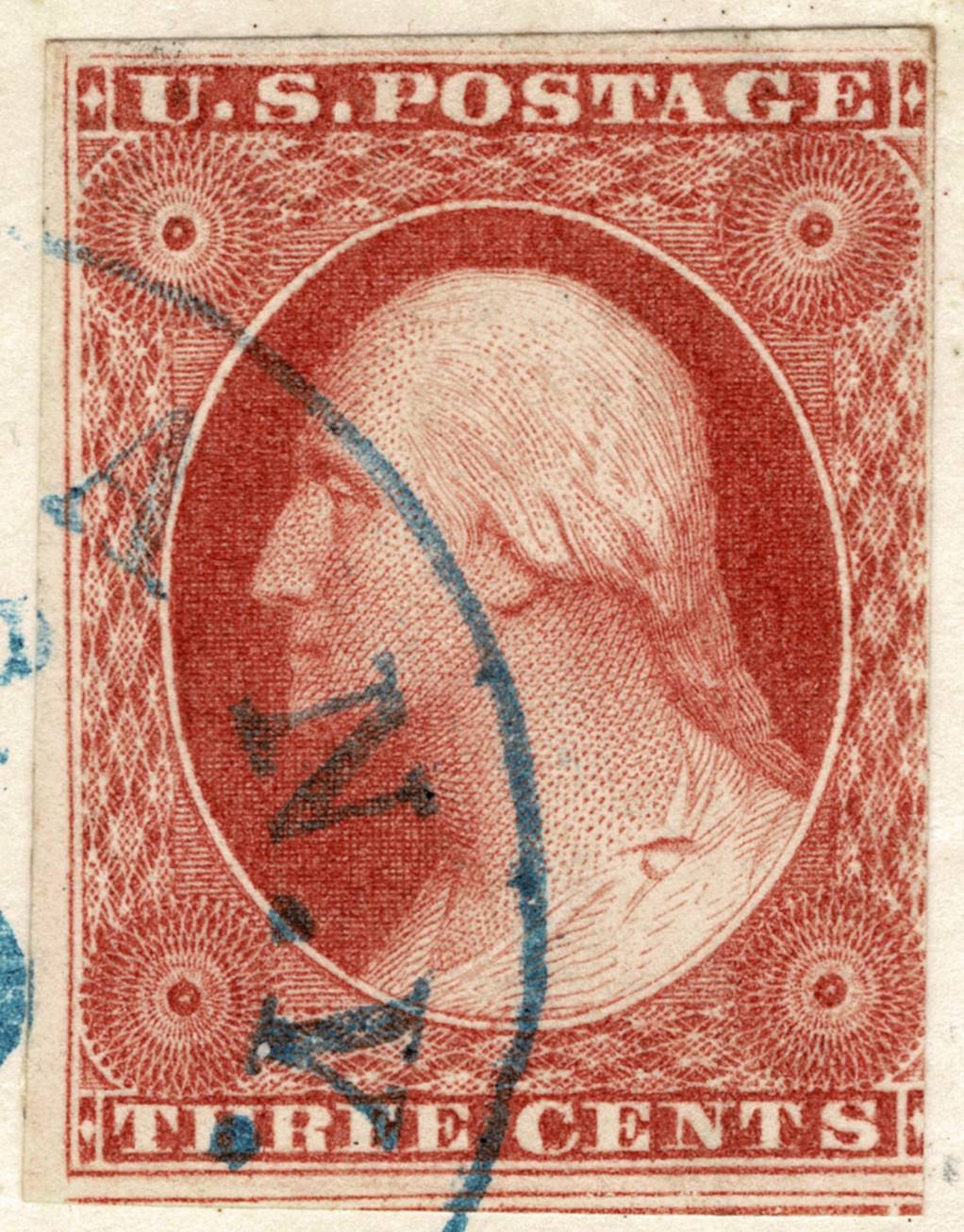 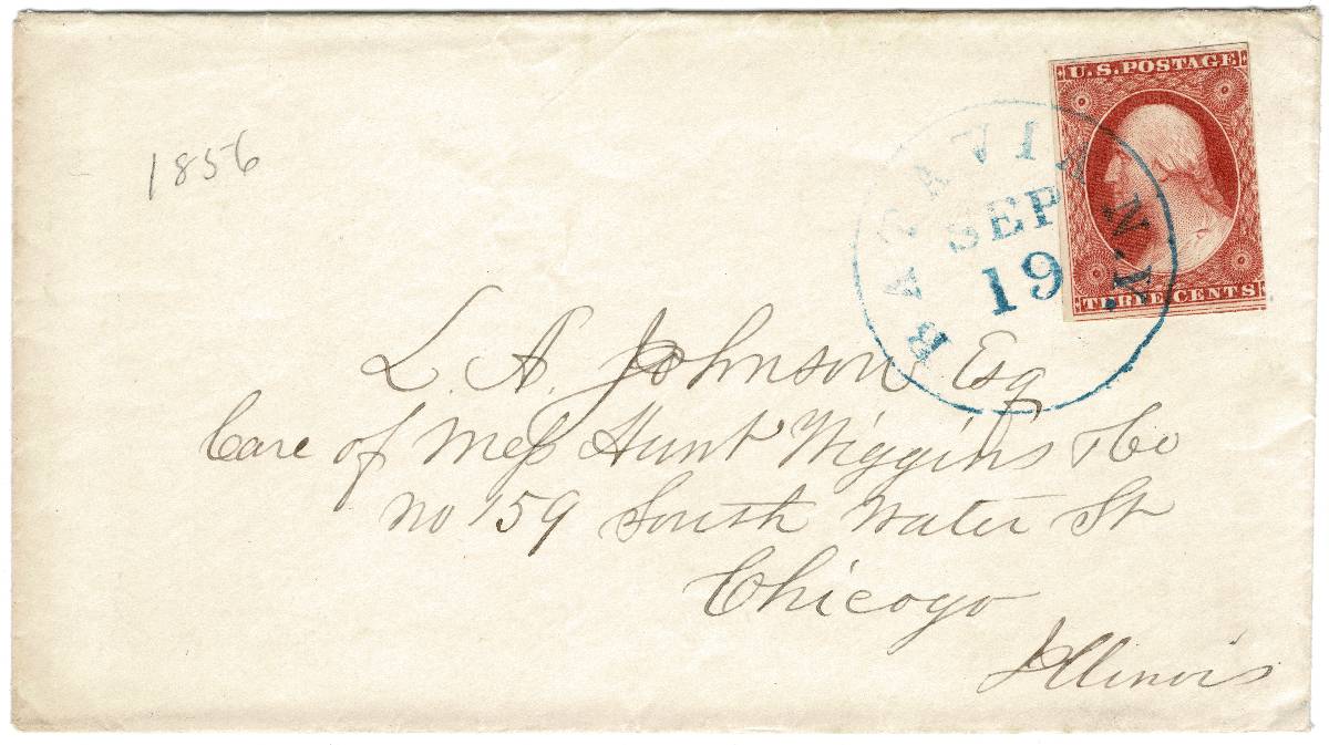 |
Send note to Staff 
|
Stan Shepp |
| Edited by stanshepp - 03/25/2024 8:38 pm |
|
|
Valued Member
United States
342 Posts |
|
|
BTW, I have quite a few certified Experimental Orange Brown -
and some of them are so far apart in color that it doesn't seem right. |
|
Send note to Staff
|
Stan Shepp |
|
|
Pillar Of The Community
United States
636 Posts |
|
|
Hi Stan --
Your stamp on the cover with the blue SEP 19 CDS -- is position 6R8.
In addition to everything else -- the TFL of the adjoining 16R8 below shows on your stamp and is a solid match. FYI -- There is a copy of 16R8 on StampSmarter that likewise shows the adjoining BFL of 6R8 if you want to check this out.
Regarding the color -- no comment as it is near impossible for me to colorize off a scan -- and especially when dealing with a potentially rare color like 1856 OB.
Regards // ioagoa
|
|
Send note to Staff
|
|
|
Pillar Of The Community
United States
2230 Posts |
|
|
Hi, Stan,
Your 6R8 on cover appears to be a very early plate 8 printing with a fully detailed gash. Other examples of 6R8 don't show near as much detail in the gash as yours does. Also, it looks to me like your stamp shows a portion of the left inner line near the bottom that apparently survived the process of transferring the design from the master die. This inner line portion and the fully detailed gash indicate to me that this is a very early printing from plate 8.
Since you described the color as amazing, I would guess that it might be in the yellowish rose red family, as some YRR variants are strikingly beautiful in person. Color studies indicate that the earliest printings from plate 8 were in YRR.
Dr. Bill Amonette and Wilson Hulme wrote of yellowish rose red in Chronicle 206:
Some of the most striking colors come from this group, especially from Plates 5L and 8 which seem to have some shades of yellowish rose red that are not seen from the other plates. It is interesting that this color is rarely seen from plates 2L and 3, suggesting that these plates were taken out of use for a period of time, perhaps for cleaning. Some of the more striking of the yellowish rose reds resemble the 1851 orange brown printings at first glance; however, a direct comparison will reveal the difference. |
|
Send note to Staff
|
|
|
Valued Member
United States
342 Posts |
|
|
ioagoa & Classic Coins,
4R8 - 5R8 - 6R8. I might have gotten there eventually.
LOL - Probably not. Thanks for the assistance.
I will also look into the Yellowish Rose Red color and see if it is a match.
Thanks! |
|
Send note to Staff
|
Stan Shepp |
|
|
Pillar Of The Community
United States
2230 Posts |
|
|
Stan, Trying to match a newly-acquired yellowish rose red to another one in your collection may not be so straightforward. In Chronicle 206, Amonette and Hulme stated how they grouped a wide variation of difficult to sort shades into two broad YRR classifications of "paler and yellower shades" and "medium and deep shades." Quote:
As early as September 1855 the printings changed color and once again the impressions became clear. The ink used from late 1855 and more extensively during the first six months of 1856 presented a wide variation of shades. This makes it difficult to assemble the shades in an orderly manner as is possible for the other years, with the shades varying from pale to deep, and it is for this reason that the classification is rather general. They are grouped into "paler and yellower shades " and "medium and deep shades." Some of the paler shades have a lot of yellow color and the medium and deep shades have varying amounts of rose and red. We attempted to divide these into groups with more yellow, rose or red, but the shades were difficult to separate. Below are two YRRs from my collection. I classify the left stamp as pale and yellowish YRR and the right stamp as a medium and deep YRR. In my opinion, the right stamp is pale also, but the rose color is more dominant on it.  |
|
Send note to Staff
|
|
|
Pillar Of The Community
United States
3520 Posts |
|
|
If the scans and my perception of them is remotely correct, then I would definitely agree that the left stamp is paler than the right stamp, which is deeper than the left. |
|
Send note to Staff
|
|
|
Pillar Of The Community
United States
1335 Posts |
|
|
rlsny, the best match that I could find using the small part of the top left adjacent stamp was column 5 of plate 2 left or column 6 from plate 1 early left pane. 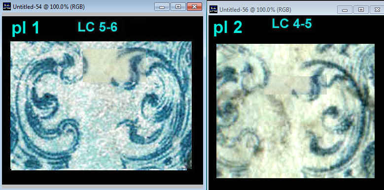 |
|
Send note to Staff
|
| Edited by jaxom100 - 03/26/2024 12:21 pm |
|
|
Valued Member
United States
327 Posts |
|
|
Greetings all. Below is a 11A on folded letter dated February 18, 1852. Its a nice early specimen of 23L1L. There is a tiny vertical crease on it. If you look real hard you can sort of see it.  My question is related to color... Is it correct to say that since this stamp is from February 1852 and Plate 1L it is either brownish carmine or claret (or some variation of those)? Harper1249 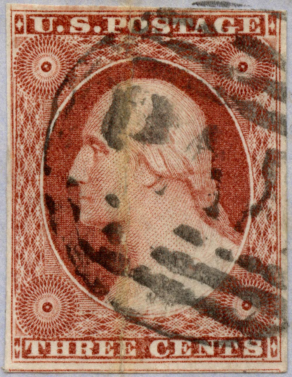 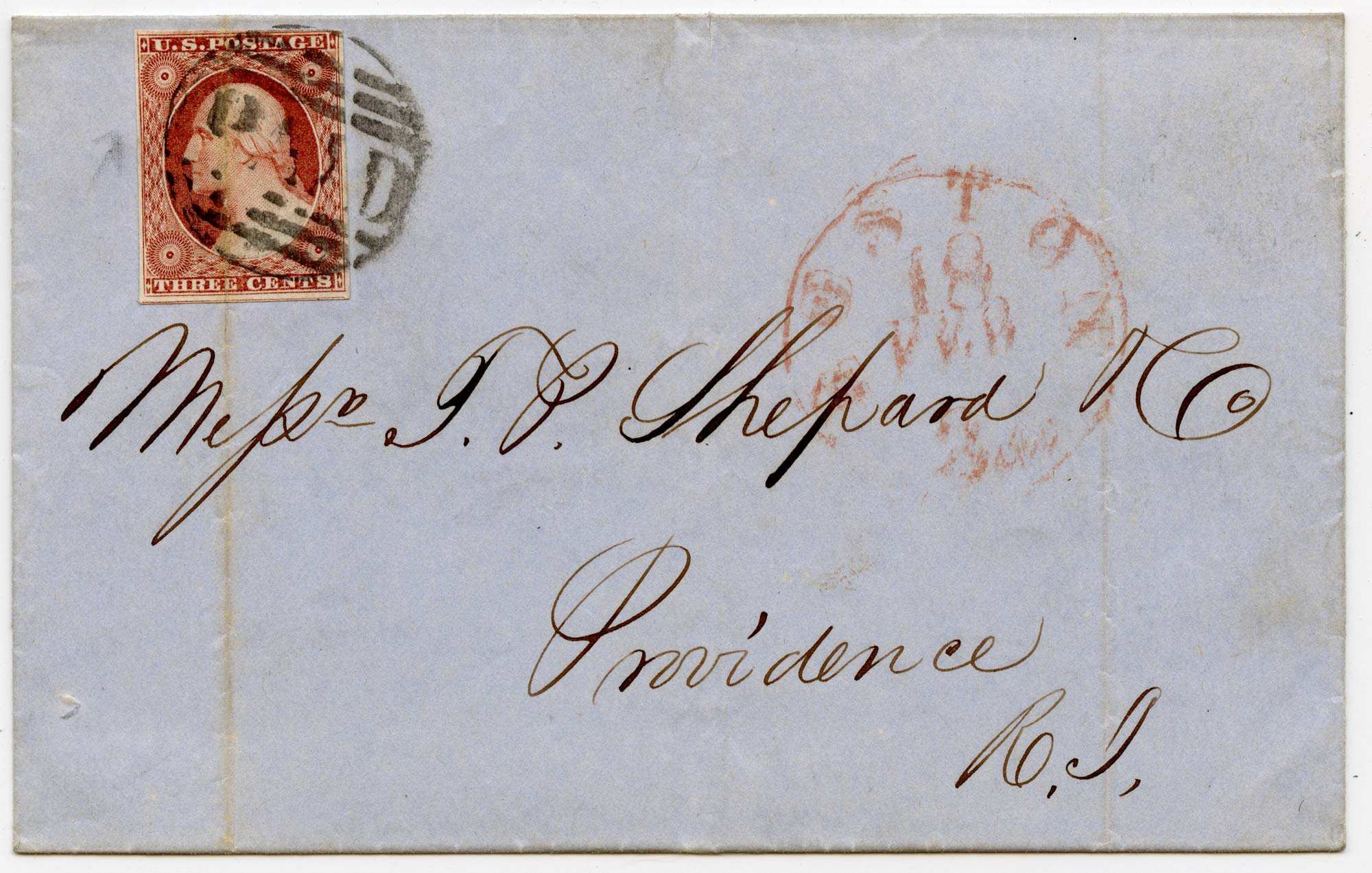 |
|
Send note to Staff
|
|
|
Pillar Of The Community
United States
636 Posts |
|
|
Hi Harper -- As far as the color of your 23L1L goes -- generally speaking -- your understanding is correct -- although it would be possible for the stamp to be any color printed prior to its date of usage. For example -- Experimental OB (and all of its variations) would be another possibility for a plate 1L stamp used in Feb 1852 The Early 1852 Claret would also be another possibility (although I cannot recall how early in 1852 those clarets started to appear). I believe that the 1852 yellowish brown and the mid-1852 OB did not appear until later in the year. In any case -- in 1852 Boston was a very busy post office -- so anecdotally -- stamps probably did not sit around very long prior to usage. Attached below is an extract from USPCS Chronicle #207 showing the Chase / Amonette / Hulme color classifications by year of printing that you may find helpful -- and in the article -- they discuss the progression of colors by year in more detail. FYI -- If you want to look at the article -- it is in Chronicle #206 -- but the rarity factors in the color table got misaligned, so they published a corrected version of just the table in Chronicle #207. Regards // ioagoa 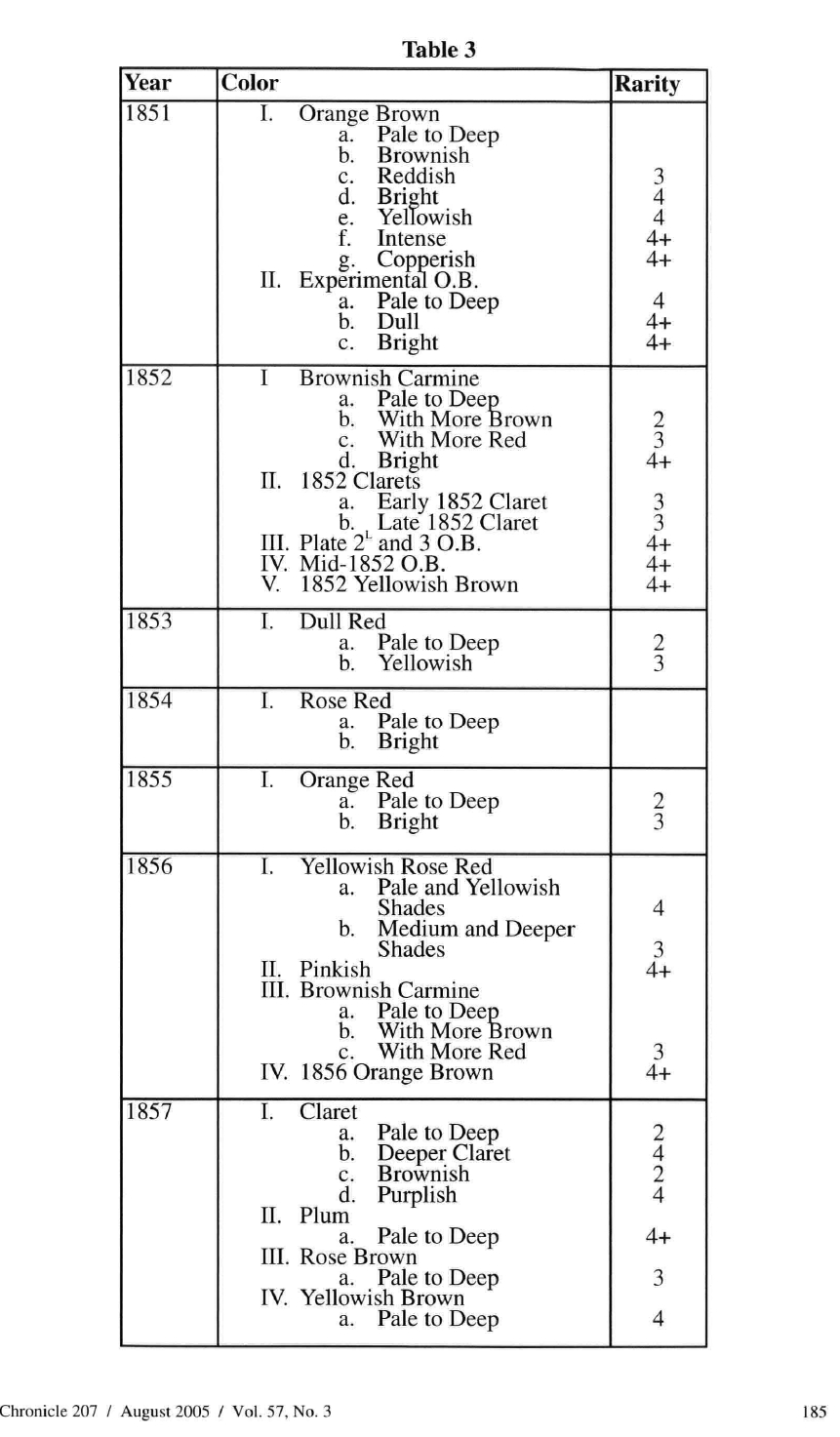 |
|
Send note to Staff
|
|
|
Valued Member
United States
327 Posts |
|
|
Thanks Ioagoa, The table is very helpful as is the entire article and its predecessors. I have so many of these 3 cent stamps now (1200+) that I want to start evaluating and identifying their color. Obviously a reference set is crucial so I'm starting on that as well.
Thanks again.
Harper1249
|
|
Send note to Staff
|
|
|
Pillar Of The Community
United States
1831 Posts |
|
|
Valued Member
United States
327 Posts |
|
|
Here's an interesting one. Its a folded letter from Boston, MA to Providence, RI postmarked March 26th. Letter is dated 1852 and docketing identifies 1852 as well. Stamp appears to be OB in color and plates to position 64R from Plate 2. I'm leaning towards Plate 2E but this position on 2L is very similar. The upper left triangle and its single line recut look more like examples from 2E. The recut line appears slightly longer on 2E than 2L, but I don't have many good examples of 64R2L to compare it with. Curious what others think. Do I have a late usage of 62R2E OB? Or is it an early OB variation of 62R2L? Regards, Harper1249 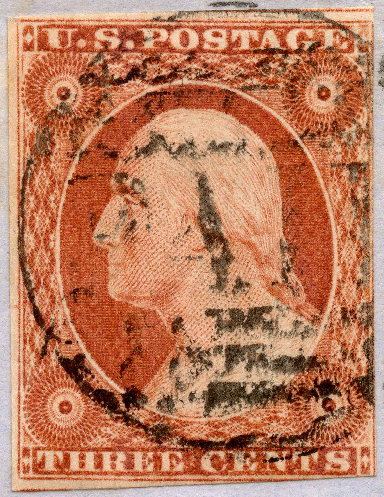 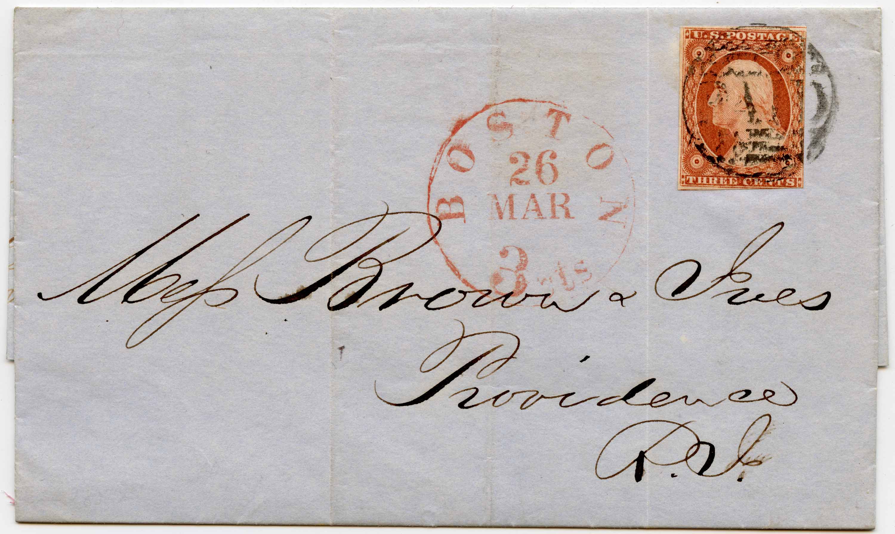 |
|
Send note to Staff
|
|
|
Pillar Of The Community
United States
636 Posts |
|
|
Hi Harper --
I believe that your stamp is a late printing impression from the Early state of the plate -- so 64R2E. Comments as follows:
As you already noted in your SCF post -- the ULT of your stamp is typical of Early state. One thing of note is that for this position the fine lines of the ULT -- especially the horizontal fine lines -- did not transfer very well when the design was rocked in. When 2E became 2L the re-entry process restored these fine lines (while at the same time "pressing out" the 1 line recut).
We know that generally speaking, the FL's got pressed out and weakened when 2E became 2L. On position 64R2 -- I see a few areas where there is noticeable weakening -- for example -- in the TFL above the AGE of POSTAGE -- and your stamp's TFL is strong in this area.
There are other subtle differences as well -- like the recuts in the TLB and URDB -- although due to inking and impression -- these are not quite as strong on your stamp as on other copies of 64R2E -- but they are still stronger than what is typically seen on copies of 64R2L -- especially above the GE of POSTAGE.
Bottom line -- IMO your stamp is a late printing impression of 64R2E.
Regards // ioagoa
|
|
Send note to Staff
|
|
|
Replies: 3,821 / Views: 252,982 |
|




 Posted 03/25/2024 4:52 pm


