| Author |
 Replies: 3,764 / Views: 245,235 Replies: 3,764 / Views: 245,235 |
|
|
|
Pillar Of The Community
United States
2226 Posts |
|
|
What a beautiful color and impression, ioagoa! Having an imprint on a #10A is really something special. |
Send note to Staff 
|
|
|
Pillar Of The Community
United States
1162 Posts |
|
|
Ditto - what Classic Coins says! Really incredible impression! Some say (I am one of them) that a neatly pen-cancelled stamp is preferable to so many of the handstamps that we see. Your example backs that up. Thank you for sharing. |
|
Send note to Staff
|
|
|
Pillar Of The Community
United States
606 Posts |
|
|
Classic Coins and Mooterutt987 -- Thanks for the compliments -- and I am in the same school of thinking when it comes to neatly pen cancelled stamps -- especially from the perspective of a plater -- as manuscript cancels typically do not obscure the plating characteristics like a CDS handstamp (the large Boston PAID being one of the absolute worst in my opinion). Likewise from the perspective of color study -- a neat black manuscript cancel is always preferable. Plus, in my opinion, they just look better. Quite frankly, I have never understood why the catalogue publishers have so deeply discounted the value of manuscript cancelled stamps -- especially when such cancels are contemporaneous usages -- but for those of us who prefer them, it works to our benefit as we can pick them up for less! New subject -- Here are a couple of my favorite shifted transfers -- two copies of 74L1i -- the triple transfer that shows the design clearly reduplicated both to the left and to the right of the original entry -- and so much so that the tessellation work is visible in both the left and right white margins outside of the frame lines. These two stamps are nothing special by way of centering and soundness -- but they show the variety reasonably well -- although I wish both of them had a slightly wider left margin. Regards // ioagoa 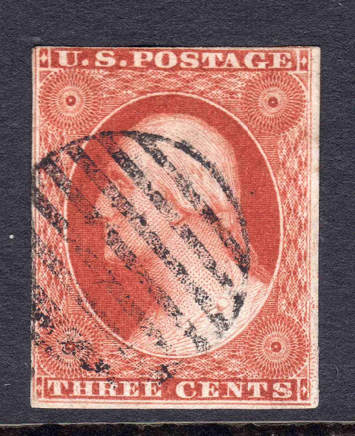 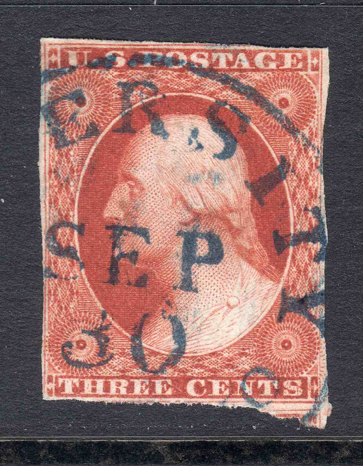 |
|
Send note to Staff
|
|
|
Pillar Of The Community
United States
3489 Posts |
|
|
74L1i is a neat position. I had one, which I sold 15 years ago, thus I don't have a good scan. Here was the scan from the sale - from which you can see some of the right margin mess... 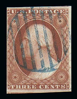 |
|
Send note to Staff
|
|
|
Pillar Of The Community
United States
939 Posts |
|
|
I have to say that I concur with the pen cancels over the handstamps. Makes it REALLY difficult for a beginner, and if the more experienced have issue with it... Well, there you go.
ioagoa, the shifted transfers are very interesting. I've never seen that kind of detail before. Pretty awesome I might add.
Your's too, txstamp.
Thanks for sharing! |
|
Send note to Staff
|
| Edited by Moyock13 - 06/24/2020 3:17 pm |
|
|
Pillar Of The Community
United States
606 Posts |
|
|
txstamp --
That is a really deluxe copy of 74L1i -- with 3 jumbo margins -- and most of the LFL intact except at the upper end -- and with portions of the adjoining 64L1i and 84L1i showing to boot. Very nice!!
If anybody out there has a copy of 74L1i with a wider left margin that shows more of the shift in the white space outside of the LFL -- a scan would be appreciated -- and with as high of a resolution as possible within the SCF 200kb limit.
Regards // ioagoa |
|
Send note to Staff
|
|
|
Pillar Of The Community
United States
2226 Posts |
|
|
Thanks for showing the images of position 74L1i, ioagoa and txstamp. That's quite a dramatic triple transfer, that I'd never seen an image of before today.
I'll also say that I have no problem with pen cancels. As a color specialist, black pen is less distracting than a black CDS or grid, and especially colored CDSs and grids, when studying ink colors. |
|
Send note to Staff
|
|
|
Pillar Of The Community
United States
606 Posts |
|
|
All -- Here is another triple transfer -- this one is 84L1i -- not as striking of an example as 74L1i -- but close. Shift is clearly both to the right and to the left of the original entry -- with remnants visible all over the stamp -- but most significantly between the RIL and RFL to the right of the URR. Neat manuscript cancel to boot! Regards // ioagoa  |
|
Send note to Staff
|
|
|
Pillar Of The Community
United States
2226 Posts |
|
|
Another neat triple transfer, ioagoa! Thanks for showing it.
Your scans are so clear. May I ask what kind of scanner you use? |
|
Send note to Staff
|
|
|
Pillar Of The Community
United States
2226 Posts |
|
|
#10A, position 38L1i, with a short transfer at top (pale orange brown). The cutting of the outer frame lines seems to make the short transfer more obvious, to me.  |
|
Send note to Staff
|
| Edited by Classic Coins - 06/24/2020 7:05 pm |
|
|
Pillar Of The Community
United States
606 Posts |
|
|
Hi Classic Coins --
Regarding my scanner -- please don't laugh, but I am using an Epson Artisan 710 -- "all in one" ink jet printer / scanner / copier -- which I bought back in 2009 -- so over 11 years ago. I know there are better scanners on the market -- but this one has always worked well for my purposes.
Regarding the scanning software -- I am using the Epson scanning software that came with the printer -- and more specifically am using the following default settings: Home Mode -- Photograph -- Color. That's it -- I have never made any adjustments to any of the other settings, nor have I ever tried to use "Professional Mode" which has enough options and adjustments to make my head spin. The one and only setting I have ever changed is to select a "DPI".
Not sure it makes much of a difference, but I have read differing opinions on some of the SCF threads about placing the stamps directly on the scanner glass versus mounting the stamps on a stock sheet and then placing the stock sheet on the glass. In that regard, I can tell you that all of my stamps are housed on Hagner brand stock sheets when I place them onto my scanner glass - so in all of my scans there is clear polyester foil between the scanner glass and the stamp being scanned.
As you know, I am relatively new to SCF -- and I when it comes to scanning technology, I am a beginner. For plating and color work, I usually scan everything at 1,200 DPI -- and I did not know how to most efficiently shrink my 1,200 DPI scans down to the 200 kb SCF maximum. So up until a few days ago, I was re-scanning my stamps at declining "DPI" settings until I was able to get a final scan under the 200 kb SCF limit. For a single stamp, that generally meant going down to 300 DPI or less -- and for pairs and strips -- even lower.
Then I read the SCF tutorial on uploading photos and learned about Irfanview -- which, using the "Save As" command makes it really easy to take a JPG file of any size and resave it at a fixed DPI of your choosing -- (obviously with a loss of image quality).
In any event, all of the scans that I have posted for the last 3 days were made with the Epson Artisan 710 at 1,200 DPI and with the software settings as noted above -- and then re-saved with Irfanview at a fixed file size of 200kb. Despite the loss of quality I was quite pleased with how the scans look. That said, if you download the scans and try to zoom in on them, the loss of quality becomes apparent (especially with the 6-8R3 strip I posted a few days ago).
Regards // ioagoa |
|
Send note to Staff
|
|
|
Pillar Of The Community
United States
2942 Posts |
|
|
Here's a Triple Transfer on a nice clean folded letter, except that someone needed to write "Triple Transfer" on it. The Chase plating notations should've been enough. Oh well. Decent stamp and cover regardless. 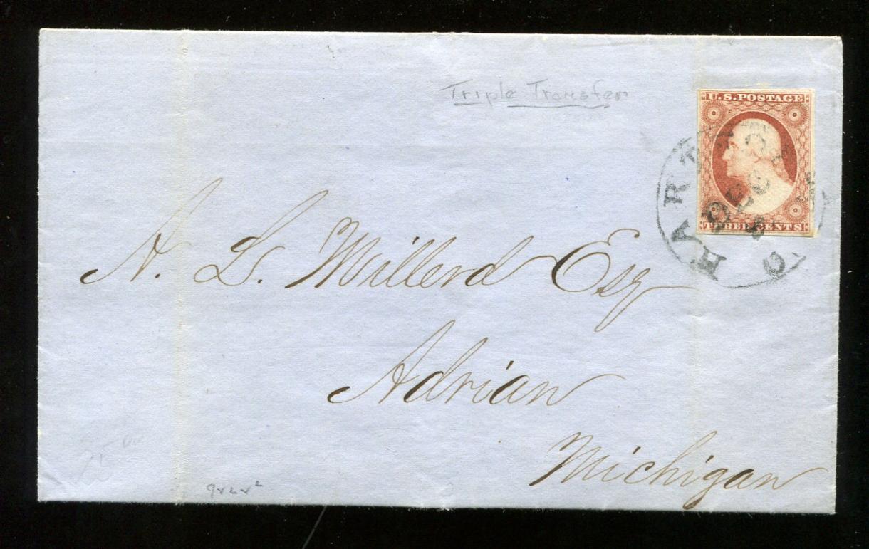 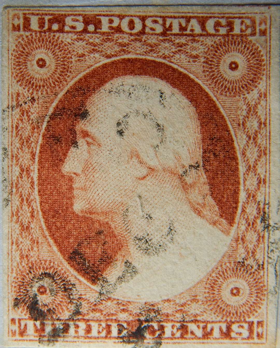 |
|
Send note to Staff
|
|
|
Pillar Of The Community
United States
1162 Posts |
|
|
Concerning file size - if we are primarily interested in higher resolution, how would people feel about grayscale or B&W scans? These 3c '51s are so beautifully colored, it is ALWAYS a shame to present them without their color, but we could get much higher resolution without color. Or... perhaps a color scan AND a B&W scan, each at 200kb.
I have not seen a 74L1i before - that is an incredible position! I gotta keep my eyes open! I WANT THAT! |
|
Send note to Staff
|
|
|
Pillar Of The Community
United States
2226 Posts |
|
|
Nice triple transfer and cover, Stephen! I use and recommend these two erasers to erase unwanted pencil markings from stamps and covers, especially the General's eraser. These can be bought in craft stores in the art section. I like the General's eraser so much, I keep it within reach on my stamp table all the time. It doesn't smear, and it leaves no residue. It's like putty, so you can even dab it if you want to be extra careful.   |
|
Send note to Staff
|
|
|
Pillar Of The Community
United States
2226 Posts |
|
|
ioagoa, I'm really happy that you've joined SCF and this thread. You've posted a wealth of useful information to us all. The reason I asked what scanner you used is because I see a wide range of clarity and color reproduction in the images posted on SCF, and your images are excellent. I could have guessed you use an Epson scanner because of quality of your images. I've used Epson scanners for decades for stamps, and I love the quality of the images I get from them. I bought a Canon scanner once, and ditched it after a few months. I use the "Epson Scan" software that came with it, but I have been using the Professional mode. I just tried using the Home mode, and was really happy with the accuracy of the color reproduction, but for some reason my scanner outputs everything too light. I scanned this 23R5L in the Home mode, but had to open it in paint.net to adjust the levels to get the brightness truer to the stamp. Here is a before (left) and after adjustment composite image. I'll be testing this mode out for a little while. Thanks for sharing your scanner info.  |
|
Send note to Staff
|
|
|
Replies: 3,764 / Views: 245,235 |
|


