| Author |
 Replies: 3,764 / Views: 245,531 Replies: 3,764 / Views: 245,531 |
|
|
|
Pillar Of The Community
United States
3490 Posts |
|
|
jaxom - What you are working on sure looks useful. I look forward to it ! |
Send note to Staff 
|
|
|
Pillar Of The Community
United States
3490 Posts |
|
|
wyostamp - I really like your Oregon Territory cover.
The O.T. is always a good origin in this period, and the postmark is neat. The date on the stamp is quite cool as a killer.
I have an O.T. cover I should post at some point. |
|
Send note to Staff
|
|
|
Pillar Of The Community

Netherlands
641 Posts |
|
|
Pillar Of The Community
United States
2226 Posts |
|
|
jaxom100, Thanks for showing what the 20 percent images look like when compressed to 10 percent. As far as the images go, it does achieve the compression to 10 percent that I prefer to use. One reason I prefer to use more compression is because it gives me the perception that the curves are more enhanced, or amplified. Another reason is because I like to stack compressed images on my computer to match stamp scans to known positions. Sometimes I'll stack them three or four high if I need more plated images for comparison. When I stack three or four, compression to 10 percent also fits on the screen better. One suggestion I have is to straighten the stampplating.com images to the extent possible before compressing. I've downloaded and compressed hundreds of the plating images and Chase images from the site for my plating needs. In the process, I've found that I needed to straighten many of the images to best compare them to the scans of my stamps. Some examples from your composite images are the 32L0 image and the 56L0 Chase image. Below is a composite compressed image I made of the downloaded (and straightened) Chase image of 26L5L and my stamp that I plated using the Chase image. An SCF poll to see what compression factor platers would prefer would be interesting. If you do decide to go with compressing to 10 percent, I suggest re-doing the annotations at the top of you graphics so that the text is not compressed (a ton of work, for sure). Again, thanks for listening.  |
|
Send note to Staff
|
|
|
Valued Member
United States
97 Posts |
|
|
txstamp,
Thanks for the comment. And I would definitely like to see anything you have from territorial Oregon!
Stan |
|
Send note to Staff
|
|
|
Pillar Of The Community
United States
1317 Posts |
|
|
Classic Coins, I appreciate your input. I noted that the text on the 10% compressed images needed to be redone. It was not too much work and I fixed the text. I also adjusted the 2 images that you noted (32L and 56L). I have had to rotate a lot of the Chase images but not too many of the "other" images. Piecing together the images is always a challenge to keep the correct aspect. A poll for the compression preferred would be helpful and interesting. Here are the two redone charts for the 10% compression. I am still not sure where I will post the charts when completed. I think I prefer the 10 per line over the 5 per line aspect. I have decided to start a new post for my charts.
***Image Removed*** |
|
Send note to Staff
|
| Edited by jaxom100 - 12/29/2020 02:35 am |
|
|
Pillar Of The Community
United States
2226 Posts |
|
|
A post-office fresh #10A, position 87L1E, on an October 4, 1851 cover from Rockton New York to Cooperstown New York. In the letter enclosed, the sender informs the recipient that he has been trying to get the money needed to pay a bill coming due on the 8th of the month, but he hasn't been able to. An annotation by Dr. Amonette on the back notes that the stamp is a superb pen-cancelled OB with deep color; a typical stamp from plate 1E. Another annotation is: Herkimer Co. DPO. The village of Rockton, which is actually in Montgomery County, was annexed by the city of Amsterdam in 1901.     |
|
Send note to Staff
|
|
|
Valued Member
182 Posts |
|
|
Pillar Of The Community
Australia
967 Posts |
|
|
Pillar Of The Community
Australia
967 Posts |
|
|
Pillar Of The Community
United States
2226 Posts |
|
|
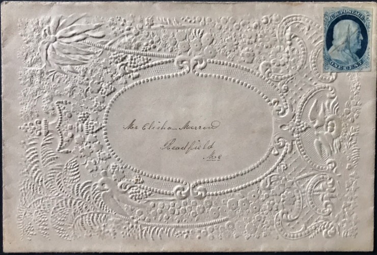
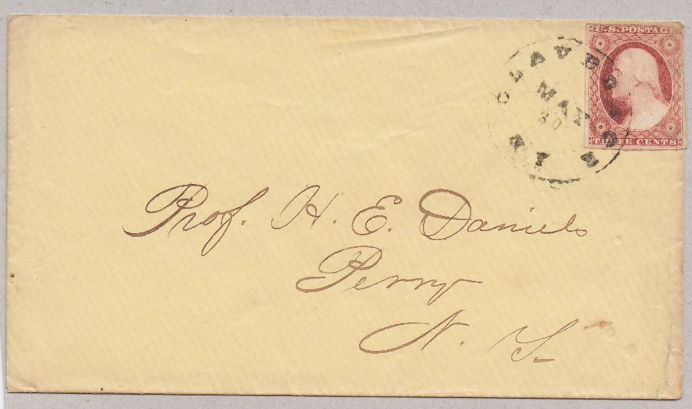
Interesting post, Laurie! The town is Claverack, New York, a postmark I've never seen before. Thanks for showing it!
Yes, it looks like a #11, most likely from plate 6 or 7, almost certainly an 1857 usage. |
|
Send note to Staff
|
|
|
Pillar Of The Community
United States
2226 Posts |
|
|
Pillar Of The Community
United States
606 Posts |
|
|
Hi Classic Coins --
FYI -- the handwriting of the lengthy notation at the bottom on the back of your cover -- (starting with the U.S. #33) is that of Leo J. Shaughnessy -- one of the well known platers of the Chase era. The exception being, as you noted, that a subsequent annotator changed the plate number to the position number. Hard to be sure who the second annotator was -- but to me, looks like it may have been Amonette.
Regards // ioagoa |
|
Send note to Staff
|
|
|
Pillar Of The Community
United States
2226 Posts |
|
|
Thanks for the useful info, ioagoa! I'll add the note about the Shaughnessy annotation to my database record for this one. |
|
Send note to Staff
|
|
|
Bedrock Of The Community
12569 Posts |
|
|
Replies: 3,764 / Views: 245,531 |
|