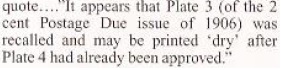
Quote:
Wish Don the moderator could chime in...
Hi Robert,
I have all but given up on color theory education; without this many of us are rarely on the same page. Even something as simple as color nomenclature has little common ground. When I see the term 'shade' I think a hue (color) plus black but others use the term to mean any hue (color)**.
In another example of not being on the same page, we never know what filters or other image manipulation has taken place. We typically post images but do not supply other image generation information. What filters were applied? Was the scanner lid up or down? What monitor is it being viewed on? Without this critical digital imaging context, it is nearly impossible to form accurate color opinions.
And we never get any information on ambient lighting and without this essential piece of information we are just throwing darts in the dark. Is the person viewing the stamp in natural light? LED light? Fluorescent light? What is the color temperature of the ambient lighting?
Of course, online images without context are perfectly fine for determining primary color deltas. Most of us could easily determine red from blue, green from purple. But these threads rarely ask about primary colors, the majority of time they are getting into subtle hue (color), shade (color plus black) or tint (color plus white) deltas**.
This is no different than each of us posting reviews of our favorite chili; not only is there huge delta between recipes, ingredients, and cooking methods but we each also have different ideas of 'sweet' and 'spicy'. What one person calls 'hot' someone else might call 'uneatable'; but we do not even know if they mean the actual temperature of the chili or if they are talking about the Scoville rating of the spiciness.
In short, none of us are on the same page when it comes to color, none of us have enough information to form more than the most basic color opinion. Yet all of us are 100% sure that we know exactly what color
we are seeing. <shrugs>
Don
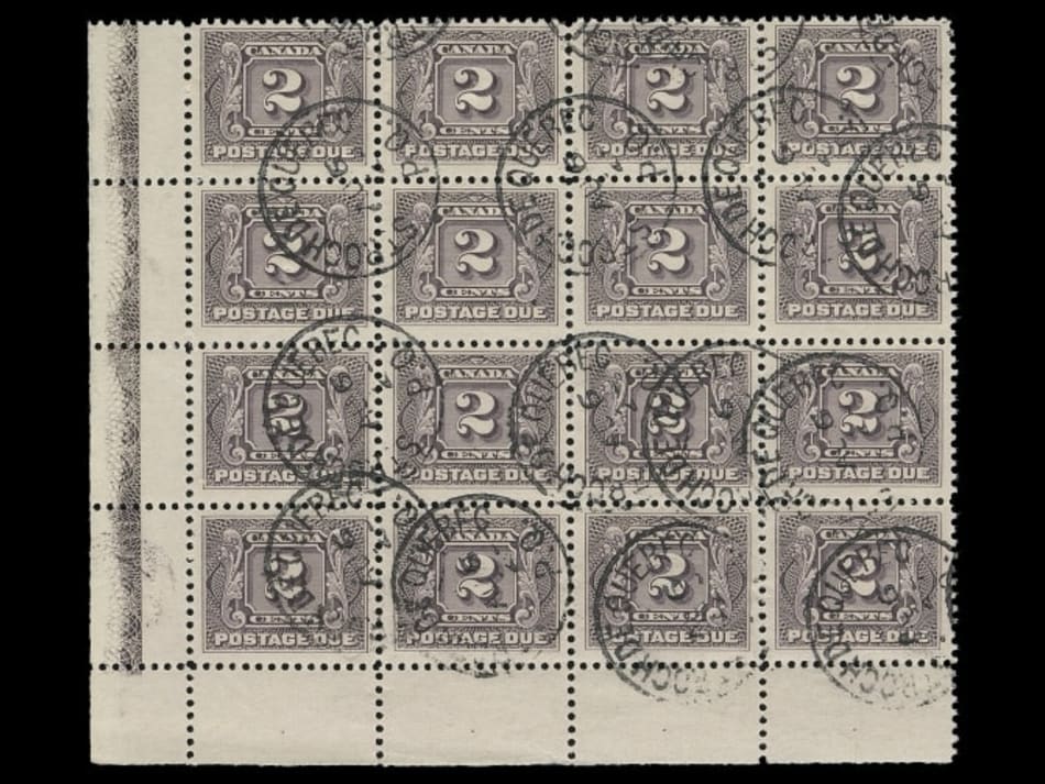
**In my mind this is important for stamp color discussions because collectors typically cares about the different print runs/ink changes. An actual shade difference would be if they change the ink or ink formula by adding more black pigment. It is a hue difference if they added more blue or red pigment. Collectors typically care less about the shade/tint deltas in a single print run but where the ink application has changed from dry prints to heavily inked prints. In the postage due stamps above, a dry print purple would appear to be a different tint (more of the white of the paper showing through) but the actual color of the ink would be exactly the same.