| Author |
 Replies: 187 / Views: 10,217 Replies: 187 / Views: 10,217 |
|
|
|
Valued Member
United States
362 Posts |
|
|
The Gold Coast 1/- violet is not the doppelgänger... 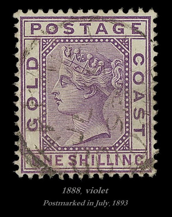 Rather, the bright mauve printing is... 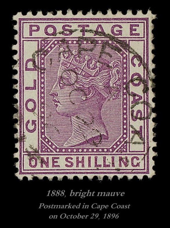 The icon in violet may be the first printing, as it was postmarked three years before the bright mauve. The violet also valuates at over three times that of the bright mauve, but that's never a variable, a higher cost; rarity, scarcity instead being a variable. Then, aesthetics is a variable, the violet being far more attractive a colour. The bright mauve is garish, loud, reddish, and cheap. |
Send note to Staff 
|
|
|
Pillar Of The Community
6326 Posts |
|
|
I prefer the bright mauve. Now what?
I sense this thread got off to an odd start with the use of the word doppelganger in the title and the idea that one stamp could somehow be better than a similar-looking stamp. It called for a personal judgement to relegate one stamp as superior, based on undefined criteria.
I also sense this thread would have received better participation if titled something like "Classic Philatelic Look-A-Likes, Which is Which?" for educational postings rather than guessing games, additionally leaving the judgement portion out of the equation. Just my 2 cents. |
|
Send note to Staff
|
|
|
Valued Member
United States
362 Posts |
|
|
Pillar Of The Community
6326 Posts |
|
|
My point is that, in my opinion, the violet one is the doppelganger. Who is the Grand Arbiter of Doppelgangerness?
Just playing devil's advocate a bit. Enjoy your thread and have a nice day. |
|
Send note to Staff
|
| Edited by John Becker - 07/19/2022 12:55 pm |
|
|
Valued Member
United States
362 Posts |
|
|
Colour actually is not the primary consideration, not even secondary. The violet example is most likely the first printing, as it is listed first within the SG BC catalogue. The first printing is the first time the design appeared on Earth, and that's what makes it special. I feel, I sense, that that is so. I also feel that the violet printings were fewer in number. |
|
Send note to Staff
|
|
|
Valued Member
United States
362 Posts |
|
|
The problem all along has been that both were issued in the same year, 1888.
By the way, Victoria is rather tarted up in bright mauve. The example in violet is far more tasteful, in that soft, creamy, grape-like colour, trust me. |
|
Send note to Staff
|
|
|
Pillar Of The Community
Netherlands
6526 Posts |
|
|
Quote:
The violet example is most likely the first printing, as it is listed first within the SG BC catalogue. The first printing is the first time the design appeared on Earth, and that's what makes it special That is not how it works. It may hold in the majority of cases. But, certainly, it is not always the case. |
|
Send note to Staff
|
|
|
Valued Member
United States
362 Posts |
|
|
It took three separate purchases to assemble that one pair, and glorious. I first bought a pair, one violet, and one bright mauve, however the violet example proved defective during its restoration... 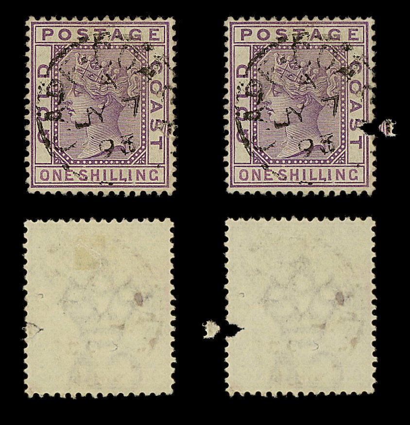 Just look at that... 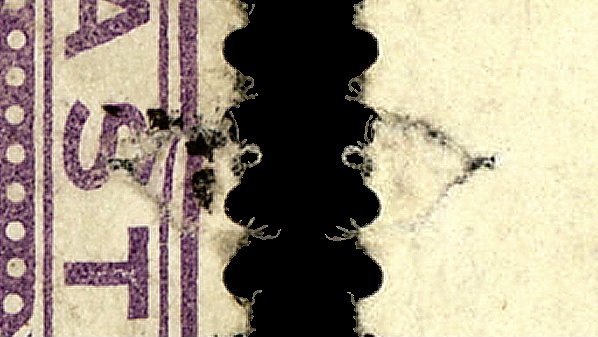 Someone, at some point in time, decided to glue it back together. If you want to do it right, you must instead weave it back together, the paper fibres, under high magnification; and no, that's not something that I exactly excel at, to put it mildly. Then, its companion, the bright mauve of that first pair, was rather paled... 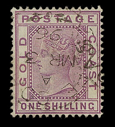 Later, what I thought to be a violet online, turned out to be a bright mauve once it arrived, yet deeper, at right... 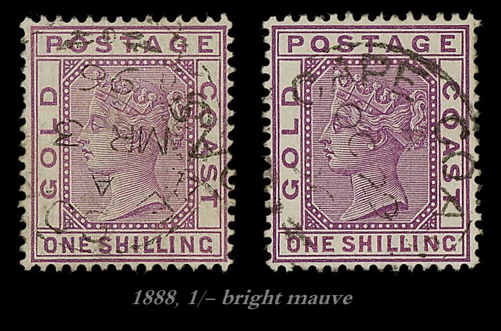 It was on the third purchase that I struck gold, a sound, violet example, at left... 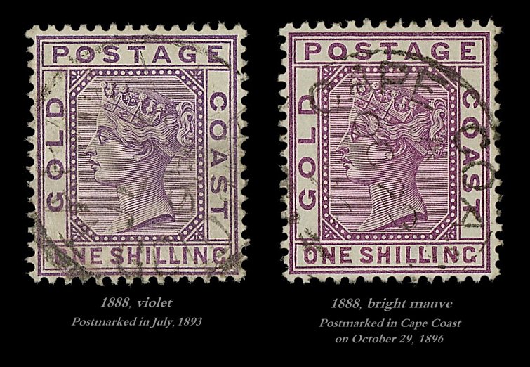 And that, dear readers, is how that pair found its way within this thread. |
|
Send note to Staff
|
|
|
Valued Member
United States
362 Posts |
|
|
"That is not how it works. It may hold in the majority of cases. But, certainly, it is not always the case."
Would you care to share some examples? |
|
Send note to Staff
|
|
|
Valued Member
United States
362 Posts |
|
|
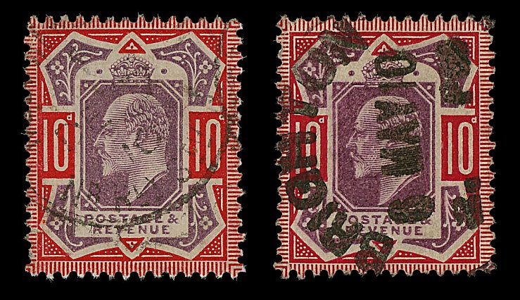
Further, red is a most economical, cheap ink, as we find within this example... 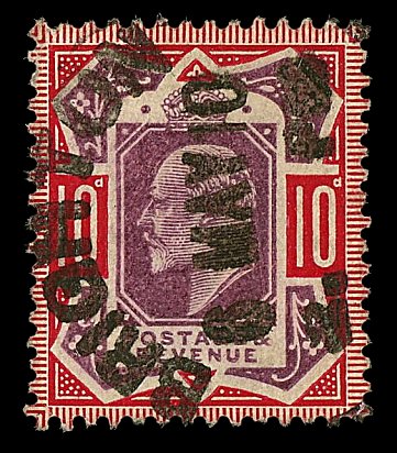 The colour of the portrait contained red as well. 10d was a lot of money when that stamp was printed, and cancelled. To maximise the profit of that 10d spent, red was used, mostly, for the printings. Not convinced? A letter-rate issue of the U.S.... 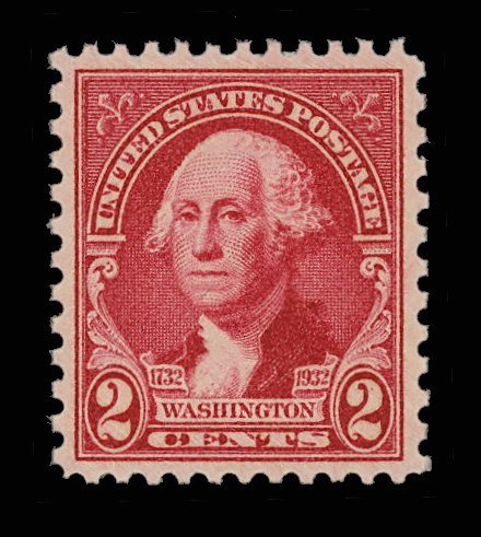 ...and a commemorative to boot. |
|
Send note to Staff
|
|
|
Valued Member
United States
362 Posts |
|
|
Stay tuned, for a new pair will appear to excite and tantalise the eyes and mind, if I can find one, and in the near nigh future. |
|
Send note to Staff
|
|
|
Pillar Of The Community
United States
1017 Posts |
|
|
At least in the USA, the first class rate issues from the 1890s through the 1920s were all red, due to a UPU requirement. I doubt it had much to do with ink costs, the UPU decreed green for first class domestic post cards, red for first class domestic letters, blue for international letters rate, etc.. It was an attempt to better see inaccurate rates for illiterate postal clerks. So a clerk in Papua would know just by looking at it that the letter arriving from the USA was short postage if it had a red stamp, but not if it had a blue... |
|
Send note to Staff
|
|
|
Bedrock Of The Community
12552 Posts |
|
|
I have to confess that I find little of value and lots of conjecture and fantasy in this topics posts. In fact the entire premise leaves me scratching my not very well endowed cranium. Not a problem for me. I read and move on. Lots of empty carbs though and will not provide any component of your daily nutritional requirements. |
|
Send note to Staff
|
|
|
Pillar Of The Community
Netherlands
6526 Posts |
|
|
I suppose then, the maximised margin on that 10d was required to cover the cost of bi-coloured printing.
The colour used for the head plate had a fiscal reason, mixing in red to keep the cost down had nothing to do with that.
I wonder why, within three years, that value would be printed in turquoise and red would be limited to the 1d. Money to burn? |
|
Send note to Staff
|
| Edited by NSK - 07/20/2022 02:23 am |
|
|
Valued Member
United States
362 Posts |
|
|
 Neither is really a doppelgänger of the other, so much. Okay, so one actually is, but let's forget that, and instead concentrate as to the year(s), and the colour(s). |
|
Send note to Staff
|
|
|
Replies: 187 / Views: 10,217 |
|


