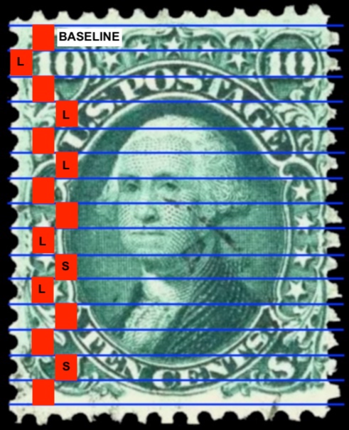
Spacing... This analysis is not as precise as it could be because of the low resolution of the original picture, but it may still prove useful for discussion purposes.
I started by creating a red box at the top that completely spans the top two lines. It's an arbitrary choice but it makes the point. Then I copied the box to all of the other positions, making sure that the top of each box completely covered the top of the line it's associated with. "S" indicates that the distance between the lines is shorter than the baseline, "L" indicates a longer distance. Again, this is coarse resolution. With a 600 dpi scan, some zoom-way-in time in Photoshop, and a nice cup of coffee I could produce a more accurate picture.