| Author |
 Replies: 3,973 / Views: 1,925,269 Replies: 3,973 / Views: 1,925,269 |
|
|
|
Valued Member
Australia
437 Posts |
|
|
Also on page 22 are the set of 1967 Kremlin Buildings. The engraves listed for those are:
4k T. Nikitina
6k L. Mayorova
10k I. Mokrousov
12k A. Tkachenko (How would you pronounce that?)
16k V. Smirnov
Referenced from the above catalogue |
Send note to Staff 
|
|
|
Pillar Of The Community
Czech Republic
623 Posts |
|
|
jjarmstrong47 - The Russian surname Tkachenko derives from the verb 'tku' = 'I weave' and is a variety of the English noun 'weaver'. To pronounce the first syllable, try to insert the vowel typically heard in parts of a word that are spoken without stress, such as the 'a' in 'about', making it sound someting like 'takachenko'. |
|
Send note to Staff
|
|
|
Valued Member
Australia
437 Posts |
|
|
Thanks Florian. We English speakers struggle with anything more than two consonants in a row but it is quite common in many languages so it is good to see how it works. A name that has also made me wonder is the engraver Charles Leclercqz. (I don't have a problem with Charles). I would guess that is English we would spell his name "Leclerks" but that many letters (rcqz) has all sorts of possibilities.
English speakers are generally very lazy with language. I thought I was doing well speaking English and French (and understanding Scottish, no mean feat), until my sister married a man who came from a small village near the Croatian-Italian border. He spoke nine languages fluently and could understand several others. It sure put me to shame. |
|
Send note to Staff
|
|
|
Pillar Of The Community
Canada
5821 Posts |
|
|
@jjarmstrong47 Thank you for providing the names of the engravers for those Soviet Union/Russian stamps. How come it took you 3 years ?   The power of the internet.  |
|
Send note to Staff
|
|
|
Valued Member
Australia
437 Posts |
|
|
I haven't been on this board long. I found it when I was wondering where lithograving and AnthonyUK had gone from the other board where I post. Then I found Anthony's last posts and it all became clear - enough said. I like the friendly good manners here so I've started at the beginning and have answered a lot of questions already in the first fifty pages. I should put some ideas up the front end as well though, just to stay in touch and share the postings. I love it when an engraver is given enough space to really show what he/she can do, Slania's 1000th comes to mind, particularly the uncoloured variety. Even more though, I get really impressed with engravers who are expected to do something with a space that is half the size of a Machin. The only way to really see these is to blow it up on a very high resolution, something that was not possible on this stamp when I bought it back in the 80s. It has lain, almost unnoticed in my album since then and it is only now I am attempting to resort by engraver that I have really seen this stamp. Unfortunately, I've lost my South American catalogue so I have no details.  I'd be interested to see what other miniature gems people can show. |
|
Send note to Staff
|
|
|
Pillar Of The Community
Canada
5821 Posts |
|
|
It's a pleasure to have another engraving aficionado on SCF. I'm sure you will enjoy it here jjarmstrong47This is a very low key board where one doesn't constantly have to watch what he/she says or worry about making grammatical errors in fear of being admonished by the site dictator owner. This thread has been languishing for awhile and we need new blood. Well forget about the blood, just show the stamps. Maybe some of us are running out of material? I know I've shown most of my best stuff as far as single colour engraved is concerned and lately I'm feeling even too lazy to scan anything. Plus I don't really know what has already been posted and I hate to duplicate. |
|
Send note to Staff
|
|
|
Valued Member
Australia
437 Posts |
|
|
Thanks for the welcome lithograving. As I said, I'm catching up on the thread, up to p.63 now where I found some information on my Chilean stamps. On p 63, Nethryk has shown this stamp which I have discussed on another board but it won't hurt to add it here.  Unfortunately, I haven't managed to work out how to link back to a previous image so here is my rather inferior example of this stamp. This was not a freighter as Nethryk suggests, but a luxury liner called the Conte Biancamano. I was researching her sister ship, the Conte Grande, when I found the information on this stamp. Before WWII, both ships were conducting luxury cruises between Italy and various South American ports. When the war started, Conte Grande was in Rio de Janeiro and Conte Biancamano was in Cristobel where she was siezed by US forces. Both were interned as Panama and Brazil both supported the allies. From then on, their stories are a bit different. For two years, the Conte Grande was used as a floating prisoner of war camp. The crew did as they were told and were eventually transferred to a camp ashore when the ship was sold to the United States to be used as a troopship and renamed USS Monticello. Conditions in Brazil can't have been too bad because at the end of the war, many of the crew chose to settle there rather than return to Italy. Aboard the Conte Biancamano, the situation was different. The crew considered themselves at war and sabotaged the ship's turbines to stop it being used by the allies. Because of this, they were considered dangerous and were shipped to high security prison camps in the United States. The turbines were repaired and this ship also was converted to a troop carrier under the name of USS Hermitage. At the end of the war they were given to the Italian government to be used to repatriate Italian prisoners of war. When this was completed, they were given back to the Italian Line. Both were identical to look at but it is the Conte Biancamano that appears on this stamp from Chile. http://en.wikipedia.org/wiki/SS_Conte_Biancamano |
|
Send note to Staff
|
|
|
Valued Member
Australia
437 Posts |
|
|
Pillar Of The Community
Czech Republic
623 Posts |
|
|
jjarmstrong47 - The Rubens and the 15th-century Miniature stamps were printed on the T.D.-6 (six colour taille-douce) presses which can use up to 3 inks in direct plate printing (black, brown, and red on ther first stamp and black, brown, and green on the second) plus up to 3 inks in indirect plate printing or offset-recess (blue and yellow on the first, and blue, red, and yellow on the second as far as I can see).
See also Galeoptix's post of 05/13/2013 3:20 pm on p. 116 of this thread for an example of the printing phases of the impression taille-douce report / indirect plate printing or offset recess and the impression taille-douce / direct plate printing, which can be in up to three colours as well using the Serge Beaune (or Giori) method.
Pity no one competent has specialized in the French stamp printing techniques on the Stamp Production Process Forum as yet, great and significant as their contribution to the stamp art is. |
|
Send note to Staff
|
| Edited by florian - 05/26/2014 10:40 am |
|
|
Pillar Of The Community
Canada
5821 Posts |
|
|
Quote:
Pity no one competent has specialized in the French stamp printing techniques on the Stamp Production Process Forum as yet, great and significant as their contribution to the stamp art is.
I totally agree with you Florian and I was hoping that Galeoptix/Rein would start a thread concerning the STIF process since he is an expert on that subject. |
|
Send note to Staff
|
|
|
Pillar Of The Community
1545 Posts |
|
|
Also on Czeslaw Slania (1921-2005)... 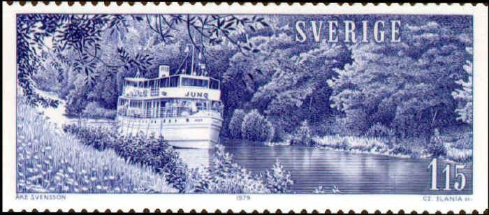 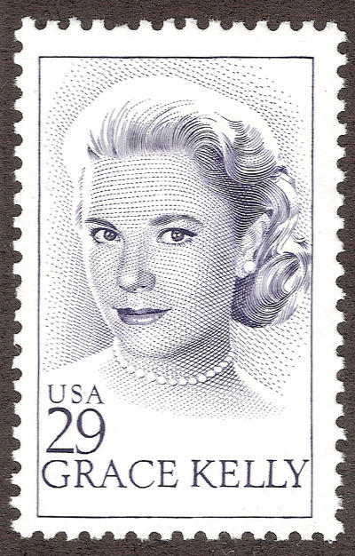 Slania Died just 2 years after the Grace Kelly issue. This was his last design.  -IBFS |
|
Send note to Staff
|
All science is either Physics or Stamp Collecting. -- Ernest Rutherford |
| Edited by I Brake For Stamps - 05/26/2014 7:25 pm |
|
|
Valued Member
Australia
437 Posts |
|
|
Thanks Florian. I was wondering what taille-douce meant. I noticed that the new Marianne et la Jeunesse stamps have been produced in several different ways, one of which is listed as taille-douce. I know there are recess printed versions of the stamp as well as lithographed versions and possibly typographed as well, judging from what I've been able to glean from the advertising.
If ever an issue was manipulated to coerce collectors into buying a thousand different varieties, this one is definitely right up there with the best/worst? of them. It is a nice stamp but since I heard someone comment that she looks like someone is about to strangle her, I've thought it would be better without the hand. |
|
Send note to Staff
|
|
|
Pillar Of The Community
Czech Republic
623 Posts |
|
|
jjarmstrong47 - I am sorry. For taille-douce see james' post on p. 1 of Difference between "Intaglio" & "Photogravure" Printings on the Stamp Production Forum, originally posted on 07/02/2011 10:44 am on p. 25 here.
I quite agree with you on the present general trend towards manipulating collectors into buying a thousand different varieties of a new issue. No moderation whatsoever. What can it lead up to?
That gesture. Things misinterpreted like this do happen with stamps from time to time, especially if people have a down on the issuer. |
|
Send note to Staff
|
| Edited by florian - 05/27/2014 10:01 am |
|
|
Valued Member
Australia
437 Posts |
|
|
I saw all of the contenders for the new Marianne and my opinion was that this was the best and I'm not surprised it won. I like the economy of line and if I met the subject I think I would enjoy her company much more than the bare breasted warrior she was during the revolution. I must admit, I've never really understood why any woman would go into battle half dressed but it certainly seemed to inspire the troops. Then again, if you can believe the Australian newspaper, even this Marianne is based on a woman who bares more than her soul when trying to make herself heard. Perhaps this new stamp is following the old traditions after all. Now for those of you who may not have any idea what we are talking about, here are the pictures.  "Liberty leading the people" by Delacroix (1830) The original Marianne  The latest Marianne stamp.  The model http://www.theaustralian.com.au/new...226680731998 |
|
Send note to Staff
|
|
|
Pillar Of The Community
Canada
5821 Posts |
|
|
To me the Marianne on the stamp appears a lot more sexy than
that Ukrainian activist it's supposed to be based on.
She has that Brigitte Bardot look.
Plus she looks 20 years younger.
BTW who was the engraver of the stamp?
|
|
Send note to Staff
|
|
|
Replies: 3,973 / Views: 1,925,269 |
|


