| Author |
 Replies: 22 / Views: 3,553 Replies: 22 / Views: 3,553 |
|
Pillar Of The Community
Australia
2156 Posts |
|
|
I've just worked my way through the Tasmanian section of the Gibbons Commonwealth catalogue three times and I can't find a 1d pink stamp with this perforation. Mine is 13.5 by 13.75. Gbibbons lists an 1878 issue with perf 14 (SG 156a - 'rose carmine'). Should I assume that this is it? I can't see the watermark, so I can't verify that it's this stamp, while I rather doubt that the colour can accurately be described as rose carmine. 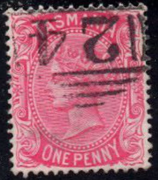 |
|
Send note to Staff
|
| Edited by jimjamtwo - 02/01/2011 03:46 am |
|
|
|
|
Valued Member
Australia
312 Posts |
|
|
I'm no expert on Tasmania, but it does look like the 1878 Perf 14 issue. They mostly appear this pink shade.
Gibbons will round up perf 13¾ to perf 14, although it should be the same all round. Still, it's not uncommon for the era for perf machines to be slightly out.
So I'd go with SG 156 - I'm not sure of the shade though. You probably need to look at a few to determine it and compare.
Balf |
Send note to Staff 
|
Be yourself. Everyone else is taken. |
|
|
Pillar Of The Community
Australia
2156 Posts |
|
|
Yes, Balf, it seems that Gibbons does often round perfs upwards. I'm finding that when I check perfs I quite regularly get results that are .5 below those given in Gibbons. So the question arises: is this stamp to be treated as perf 14 or recognised as a perf 13.5 variety? |
|
Send note to Staff
|
|
|
Pillar Of The Community
Romania
886 Posts |
|
|
Senfs Bros. Catalogue 1914(Postwertzeichen-Katalog) 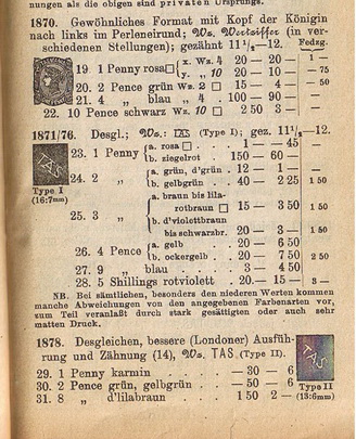 . At first sight it seems it speaks about colours too, but I just can`t find my dictionary. Hope it helps. No track of 13.5 pert. in Yvert, nore in Michel 1935. |
|
Send note to Staff
|
|
|
Pillar Of The Community
Australia
2156 Posts |
|
|
Thanks for the interesting scan, Waldemalatz!
I guess my problem is not knowing when a perf difference is significant or not.
This applies to a great many stamps, not just Tasmanian ones! |
|
Send note to Staff
|
|
|
Rest in Peace
Canada
5701 Posts |
|
|
Here is my copy, Jimjam. It has the same number of holes horizontally and vertically as yours. When I eye-ball it on my guage it seems more 13.75 x 13.75. 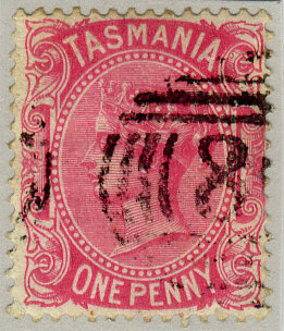 |
|
Send note to Staff
|
|
|
|
Pillar Of The Community
United States
7081 Posts |
|
|
The first stamp has very similar perforations horizontally and vertically, close enough that I don't think they'd be considered compound. Unscientifically, the small variation I see is on the left side.
I think we're within the range of the rounding policies of catalogue editors.
My 2d. |
|
Send note to Staff
|
|
|
Pillar Of The Community
Australia
2156 Posts |
|
|
BeeSee, thanks for the info - it does seem that the stamp is not perf 14 at all.
As for the colour, I think the term 'rose carmine' needs to be replaced by 'hot pink.'
Cjd, I wonder about 'the rounding policies of catalogue editors.'
In some cases, a difference in perf of .5 can be significant. I noticed a German stamp for sale recently on StampsX that had perf 11.5 instead of 12 and apparently that made it relatively valuable.
Something else that's striking is the great attention Germans pay to the various shades of their stamps - a difference between, say. lilac brown and bright lilac brown can translate into hundreds of Euros. This seems hardly the case with stamps from most other countries.
Of course, the Germans tend to value precision - but we Anglo-Saxons don't? |
|
Send note to Staff
|
| Edited by jimjamtwo - 02/01/2011 5:14 pm |
|
|
Pillar Of The Community
United States
7081 Posts |
|
|
On the odd chance you didn't see stampdog's Hungary post a few weeks back, the issue of rounding up and down came up there with odd results. Ryan ends up comparing four catalogues' worth of data to answer the perf puzzle (and it is the oldest catalogue that comes through with what seems to be the answer). https://goscf.com/t/11555 |
|
Send note to Staff
|
|
|
Pillar Of The Community
Australia
2156 Posts |
|
|
Cjd, thanks for drawing my attention to that thread.
Perfs are kind of driving me crazy at the moment. Last night while going through a small pile of duplicates I found two British issues (KGV definitives. 1/2d and 1d) which were listed as perf 15 X 14. However, mine are both perf 14. Neither are listed (with that watermark). Other stamps (from booklets) are listed as perf 14 and are priced highly. But they have a different watermark. So a perf difference is sometimes worth listing - and important in CV terms - and sometimes not. It all seems a little too arbitrary, especially when compared to the meticulousness of the Germans. (That said, at least we don't suffer from the latter's obsession with expertisation, which is over the top to say the least.) |
|
Send note to Staff
|
| Edited by jimjamtwo - 02/01/2011 5:24 pm |
|
|
Pillar Of The Community
United States
7081 Posts |
|
|
Quote:
This seems hardly the case with stamps from most other countries.
Of course, the Germans tend to value precision - but we Anglo-Saxons don't? Oh, I don't know about that...the prices on the KGV Royal Cypher shades can get pretty crazy. Deep Myrtle Green? Deep Orange Vermilion? Ouch. |
|
Send note to Staff
|
|
|
Pillar Of The Community
Australia
2156 Posts |
|
|
Well, I didn't mean that shade is never significant, only that it is so much less often that with the German Empire classic stamps. While looking over my EVII and KGV British definitives last night, I found a whole range of shades which is readily apparent when they're laid down side by side. The differences were in some cases much greater than the subtle differences in shade between some of the German definitives which can lead to differences in CV of hundreds of Euros. In most cases, these British definitives were listed as having only two shades at best. I think the KGV 6d was the exception, with something like six shades mentioned for the two issues of that stamp. |
|
Send note to Staff
|
| Edited by jimjamtwo - 02/01/2011 5:37 pm |
|
|
Pillar Of The Community
Australia
3547 Posts |
|
|
It might be worth making a couple of points on shades and perfs. First shades: the degree of precision of classifying shades will be directly proportional to the degree of interest from collectors in them. If there were as many collectors of late Victorian Tasmania as there are of Imperial Germany, you'd have the shades of Tasmania much more precisely defined. For shades of British stamps, you'd really need to go to Gibbons' specialised UK volumes for the relevant period. I think you'd find enough shades listed there to satisfy. Now perfs: First, if you aren't using one, I'd strongly recommend getting an Instanta. It will help enormously with finer gradations of perforations. More generally, a variation in perforations is only really relevant if there was more than one machine in use. If, for example, there was only one perforator being used, and due to sloppy placement of the pins, it produced gauges ranging between 12 and 13, there's really be no point in classifying them separately. However, if there were two machines, one producing a gauge 12 and one a gauge 13, then that would be relevant, and ought be listed. Once again, though, it comes down to popularity. These ¼ Anna Jaipur Service stamps  exist perf 11, 11½ and 12 and compound, but Gibbons lumps them all together under a single listing. Why? Jaipur Service stamps aren't as popular as many other countries - Imperial Germany for one. Of course, this opens the door for the specialist to make finds. If you care to do your homework on early Jaipur Service stamps, you may be able to find the odd rarity. But this is where popularity kicks in. A rare perf variety of Jaipur isn't going to sell for the same price as an equally rare perf variety from Imperial Germany. Here endeth the lesson. |
|
Send note to Staff
|
|
|
Pillar Of The Community
Australia
2156 Posts |
|
|
Most interesting, tonymacg! I think I understand the perf matter a great deal better now.
Funny that you mention Jaipur service stamps - I just found ten or so in a batch that arrived last week. Very nice looking stamps, I must say! |
|
Send note to Staff
|
|
|
Pillar Of The Community
Australia
3547 Posts |
|
|
Do post up your Jaipur! If they're the early Chariot types, they're full of interest. The later Maharaja portrait types are nice-looking, but no challenges in them. The Indian Security Printing Press did a pretty thorough job of vetting what went out, and a few kiss prints aside, there's really nothing to discover in them. |
|
Send note to Staff
|
|
|
Pillar Of The Community
Australia
2156 Posts |
|
|
No, sorry, they're the portrait types.
I do have a Travancore Anchal stamp somewhere with an overprint that isn't listed in Gibbons Commonwealth. I'll dig that out for you later, if you'd like to see it.
What are 'kiss prints'? |
|
Send note to Staff
|
| Edited by jimjamtwo - 02/01/2011 10:09 pm |
|
|
Replies: 22 / Views: 3,553 |
|


