Stamp Community Family of Web Sites
Thousands of stamps, consistently graded, competitively priced and hundreds of in-depth blog posts to read


Stamp Community Forum
 
Username:
Password:
Save Password
Forgot your Password?

This page may contain links that result in small commissions to keep this free site up and running.

Welcome Guest! Registering and/or logging in will remove the anchor (bottom) ads. It's Free!

Christmas Van Ecyk Revisited

 
To participate in the forum you must log in or register.
Author Previous TopicReplies: 3 / Views: 1,494Next Topic  
Valued Member

United States
488 Posts
Posted 06/26/2011   4:12 pm  Show Profile Bookmark this topic Add LONEDAN to your friends list Get a Link to this Message
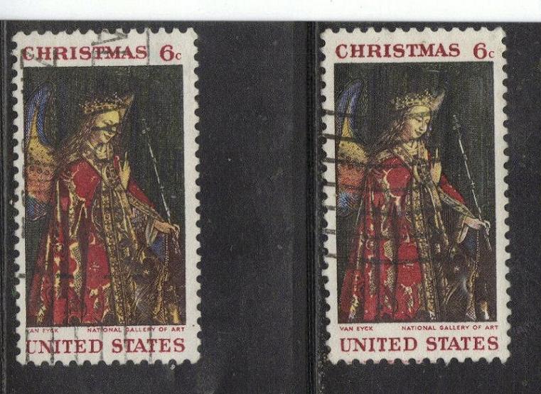
i know this stamp has been talked abouy before but I was just sorting and just saw and noticed a big difference in the detail in the inside of the robe of these two copies.
the left seems to have much more detailed gold as compared to the right stamp.

my scotts does not mention about the differences but it is from 2007.

i just found it interesting

please tell me if I ever bore you all with my questions.

thanks as always

dan


Send note to Staff

Pillar Of The Community
Canada
5821 Posts
Posted 06/26/2011   4:27 pm  Show Profile Bookmark this reply Add lithograving to your friends list  Get a Link to this Reply
This 1968 stamp was the first one printed by the new 9 colour
Huck press and the BEP had problems with colour registration.
Therefore I don't think you have anything unusual.
Send note to Staff  Go to Top of Page
Valued Member
United States
488 Posts
Posted 06/26/2011   5:11 pm  Show Profile Bookmark this reply Add LONEDAN to your friends list  Get a Link to this Reply
i just found it interesting the printing difference.

thanks

i will have to look at my other copies of this stamp

thanks
Send note to Staff  Go to Top of Page
Pillar Of The Community
United States
3568 Posts
Posted 06/27/2011   10:51 am  Show Profile Bookmark this reply Add jhlovell to your friends list  Get a Link to this Reply
Alot of it is in the registration or should I say misregistration. As the presses start up there is a period when the printers are adjusting the registration to make everything line up properly. As they get closer and closer they often get to a point where the registration is not perfect, but what they consider "close enough for government work" (literally). If you notice the words "National Gallery of Art" the one on the right is just a little lower than the left. That's your adjusted registration. Hope I did not bore you, hope it helped. - Jeff
Send note to Staff  Go to Top of Page
  Previous TopicReplies: 3 / Views: 1,494Next Topic  
 
To participate in the forum you must log in or register.

Go to Top of Page

Disclaimer: While a tremendous amount of effort goes into ensuring the accuracy of the information contained in this site, Stamp Community assumes no liability for errors. Copyright 2005 - 2026 Stamp Community Family - All rights reserved worldwide. Use of any images or content on this website without prior written permission of Stamp Community or the original lender is strictly prohibited.
Privacy Policy / Terms of Use    Advertise Here
Stamp Community Forum © 2007 - 2026 Stamp Community Forums
It took 0.16 seconds to lick this stamp. Powered By: Snitz Forums 2000 Version 3.4.05