I can see both fine, although my screen is set to display a bit darker than normal, a video driver software failure that won't go away. Good for most things though.
I regularly use screen resolution 800 x 600 but I know most folks now, with netter monitors and video cards, use 1024 x 768 or even higher.
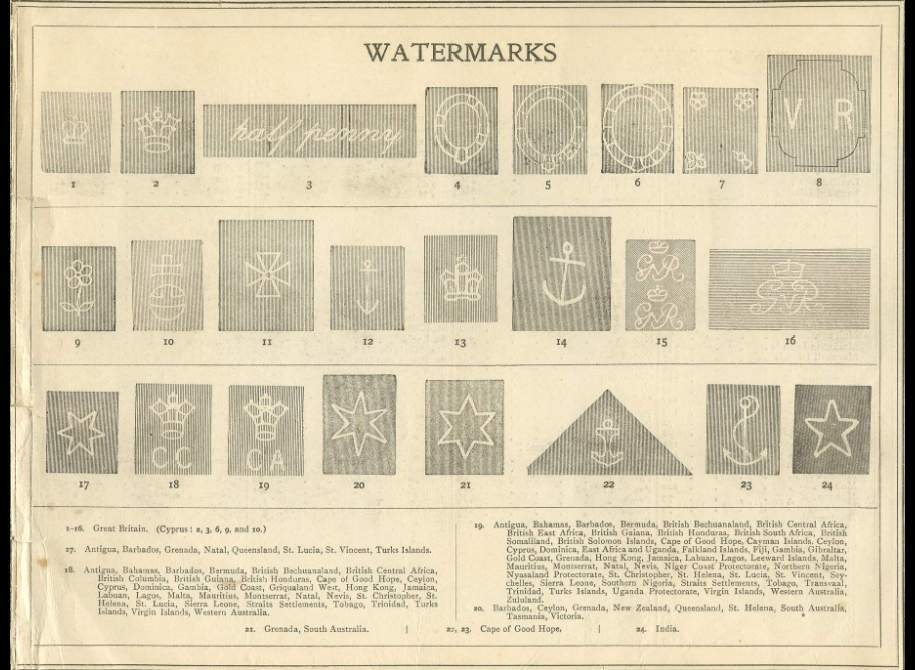
I tried both and I like the first better, even with the moire pattern happening as I can read the text better and the images are bigger.
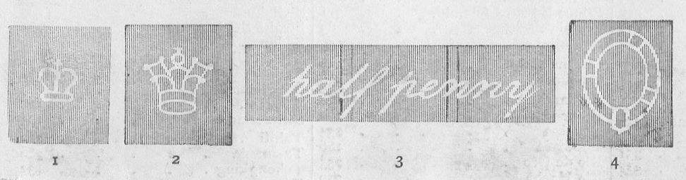
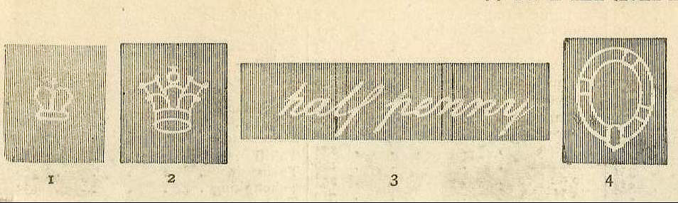
I put the first image in an image editing program and used the sharpen tool to sharpen the image 25%. That makes all the difference in the world. Going higher, say to 50%, makes the background lines go into stripes of black and white.
To get a less sharp image (although it looks grand to me, you can use a darken tool to darken it a bit. This, however, leaves the edges of the watermarks soft and somewhat indistinct.
So, use you front monitor controls to darken your screen a bit, decrease your screen resolution, or just sharpen the image yourself or Rod you could probably do it. I post the first image again, sharpened 25% so you can see the difference.
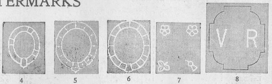
And while reviewing this I noticed that my monitor screen makes the image have lines of dark, more moirey than Rod's original, but only when shrunk to fit my 600 x 800 resolution. When clicked on it is as fine as a hexagon postmark on a hexagon stamp.