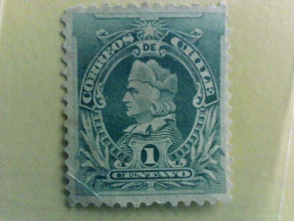
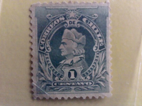
I would agree with wt1 that this is a Scott #51, and we're looking at some major colour distortion. Notice how the white of the paper is decidedly pinkish in tone.
Just for fun (??) I adjusted the colour balance in Photoshop to remove the pink from the white of the stamp. And behold, a much greener image. Of course I don't know what the original green looks like (this is still very bluish), and we take into consideration the vagaries of our scanners and monitors.
But here you have it.





 Posted 04/24/2012 05:52 am


 .
.


