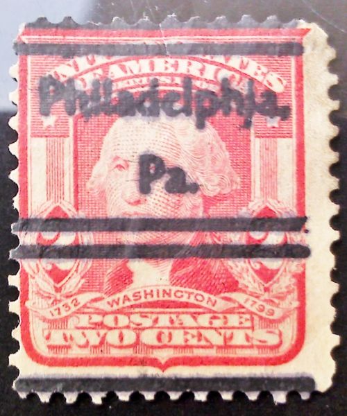
Wow that's kind of weird isn't it? The font doesn't look the time period strangely but it looks legitimate at the same time? Maybe they was using up old stock perhaps or it could be just normal. I'm not familiar with the older precancels so maybe someone will chime in and save the day here?
Actually, the precancel type is common for the period. As for the "i" that looks like an "l": look closely at other letters and it is seen that this is simply a matter of over inking. Over inking means too much ink is on the plate or roller that transfers the impression onto the stamp causing small spaces between letters or design to fill in with ink. Note that two "a"s are also filled in and a number of spaces between letters are filled in with ink. "fill in" is probably not the correct term but it is the best I can come up with at the moment.
Disclaimer: While a tremendous amount of effort goes into ensuring the accuracy of the information contained in this site, Stamp Community assumes no liability for errors. Copyright 2005 - 2026 Stamp Community Family - All rights reserved worldwide. Use of any images or content on this website without prior written permission of Stamp Community or the original lender is strictly prohibited. Privacy Policy / Terms of UseAdvertise Here