| Author |
 Replies: 6 / Views: 1,792 Replies: 6 / Views: 1,792 |
|
|
Valued Member
United States
110 Posts |
|
|
Being somewhat new to the forum I would like to ask your opinions on what may be a possible #64. I've seen some of the other posts on this same topic and I have tried to compare those images to mine but I can't quite decide what mine may be. These colors can be very difficult to distinguish from one another. The one on the right is what I am pretty sure is a 65 and the one on the left is my candidate. Any thoughts/comments would be greatly appreciated. Thanks. 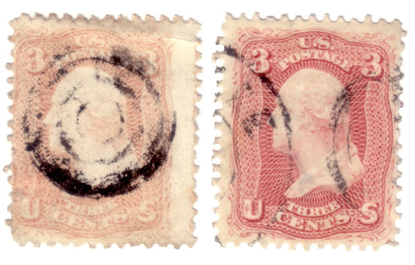 |
|
Send note to Staff
|
|
|
|
|
Pillar Of The Community
United States
1348 Posts |
|
|
tbird--
The stamp on the right is a very pretty rose, maybe even "bright rose" and again, really pretty color.
The first stamp is so faded, it would be very difficult to tell on a screen, and you'd need to compare it with a faded pink or rose pink.
One clue is the darkness under the "3" on the upper right. With the pinks, there is often very little border, and it just kind of runs into the tessellated design below to the right. I'd guess here not 64, just because the border of the upper left 3 is so much darker than the rest of the stamp.
Good luck. You can send it to Bill Weiss for an ID only for as little as $5.00 if you want to know for sure. I've definitely been wrong before-- hope this helps, Ray |
Send note to Staff 
|
|
|
Valued Member
United States
110 Posts |
|
|
Pillar Of The Community
United States
1348 Posts |
|
|
Tbird,
The information on the color in the bottom of the upper left "3" is discussed in an article in "The Chronicle", which is the periodical that I referenced in my post.
However, I've quoted it incorrectly.
On the pinks, there is a line of contrast between the dark and the tessellated (lattice work) area, and in non-pinks there is none. So I've misspoken.
I think it would be really difficult in any case to see this in your stamp, since it is so faded.
The article also mentions that in the pinks, the lattice work is blurred, because the ink is actually so heavy. Also it mentions that on the more heavily inked pinks, that the scroll work on the outside is faint, especially the ball in the lower left corner.
Specifically, the article was: "Pink", Michael C. McClung, Chronicle 144, Volume 41, No. 4, November 1989.
These older editions are definitely available on the USPCS.org website-- that's how I got mine.
Hope this helps, and sorry for my misinformation earlier.
Ray |
|
Send note to Staff
|
|
|
Pillar Of The Community
Canada
2277 Posts |
|
|
Hey folks been away for awhile and just found these sittin on my scanner. Knowing how many potential 64 threads there are I didn't want to start another but my apologies to Tbird for piggy backing on the thread. I have dozens of 65's with a few maybe leaning in the pinkish range but this one in the center really jumps at me. Even the one to the left seems a bright rose at the least but the center alhough somewhat faded is different. Appreciate all opinions and hope everyone is doing well.  |
|
Send note to Staff
|
|
|
Pillar Of The Community
United States
1348 Posts |
|
|
Hey Nitro--
The one on the left, 2 things: shame on the perfs, otherwise nice stamp. With the December cancel, if it's '61, it would have a chance, I think, for rose pink. Really tough unless you can compare it with a known 64b.
I think the one in the middle is just too faded to tell anything.
Sorry-- hope all is well.......Ray |
|
Send note to Staff
|
|
|
Rest in Peace
United States
7097 Posts |
|
|
Nitro, does that stamp on the very bottom have a grill? Looks like there may be one just to lower right of the center. Also, look at the shading under the upper right hand 3 on the middle stamp and then the one on the very bottom stamp..see how they look different? One has sort of a "bulge" (the bottom stamp) and the other does not (middle/center stamp). Weird? At least I never noticed it before? |
|
Send note to Staff
|
| Edited by I_Love_Stamps - 08/18/2012 4:58 pm |
|
| |
Replies: 6 / Views: 1,792 |
|


