Just saw this thread (and the invite about 6 weeks ago to stir the pot).
First thing to ask: What is the number 1 thing you want to show? Is it the pointing hand? The label? The machine cancellation? If you're exhibiting, the subject of the exhibit would dictate that. Reason I say this is that this is the side you'll want to show.
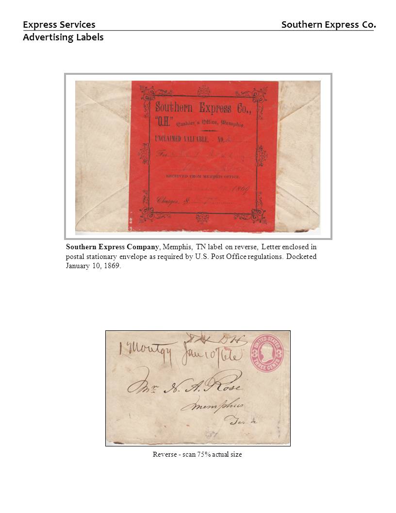
The other side can be scanned and either displayed the same size in B/W or 75% (or smaller) in color. I would not use the same border for the real cover and the scan (I usually don't use a border when I show a scan, just a black line around the scan).
Another thing - if you can read the thing on the cover or scan, you don't need to show it isolated or as a tracing. You can add something to the descriptive text that notes it. (e.g. "returned cover with label designating failed delivery attempt. Boston March 12, 1888 receiving datestamp and April 12, 1888 American Ethridge machine datestamps."
Attached are some examples of how I've dealt with showing both sides or the contents (pardon the large number of images):
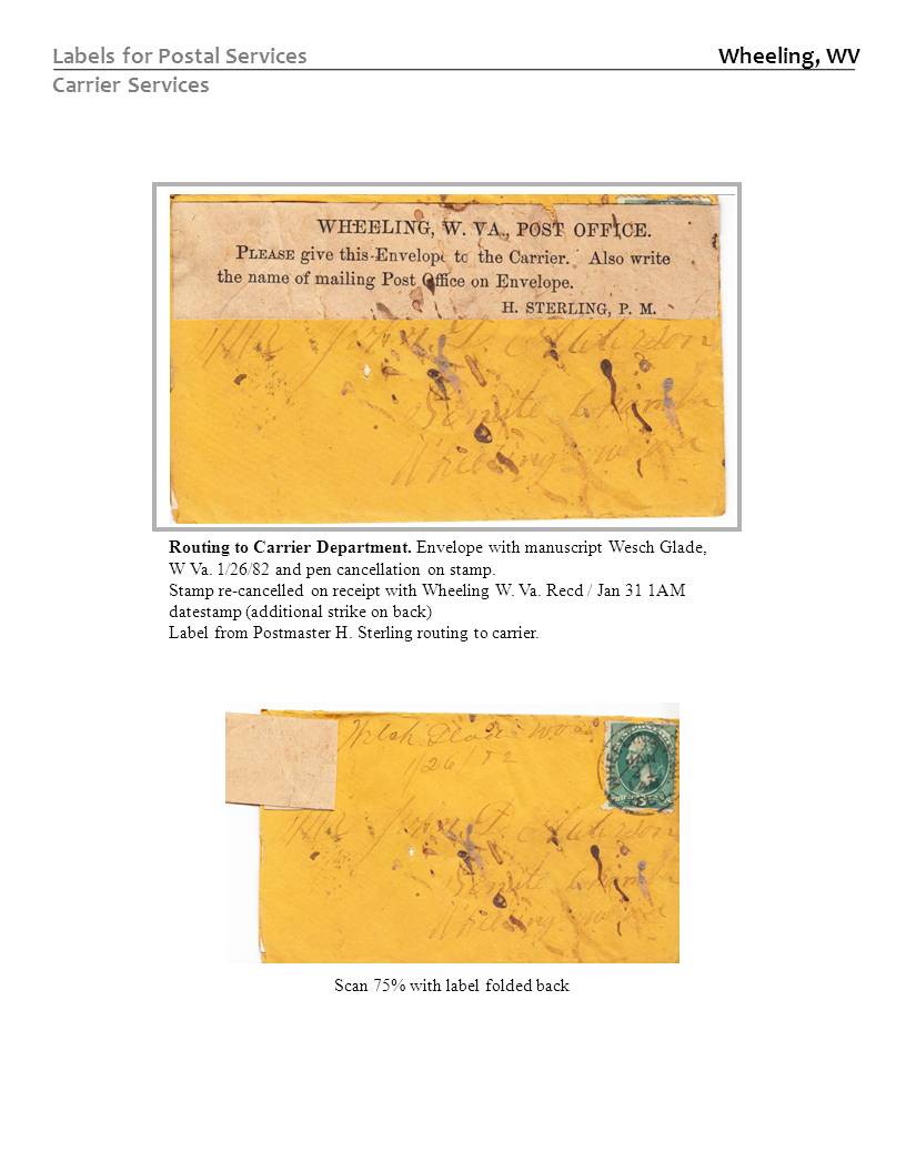
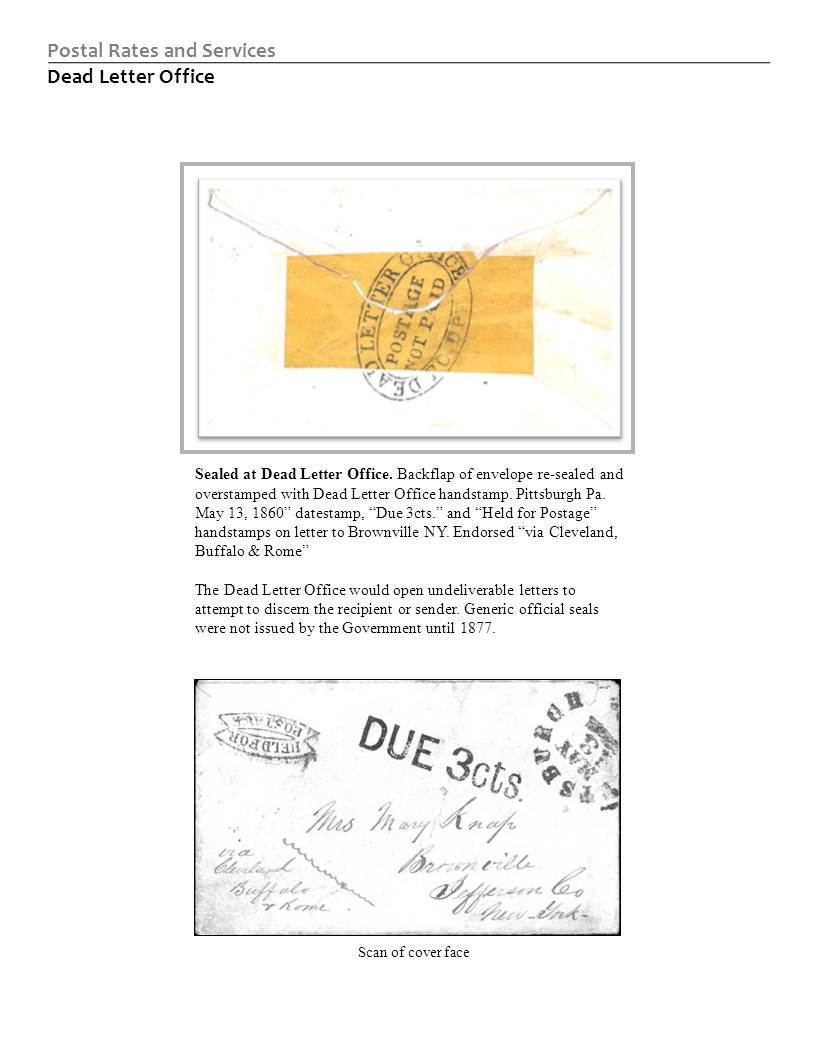
I'm working on an exhibit of early labels. Some were applied to the backs of envelopes. Even though the stamp is on the other side, since it's a label exhibit, I show the label "real" and the face scanned. This one has the face shown in color at 75% actual size:
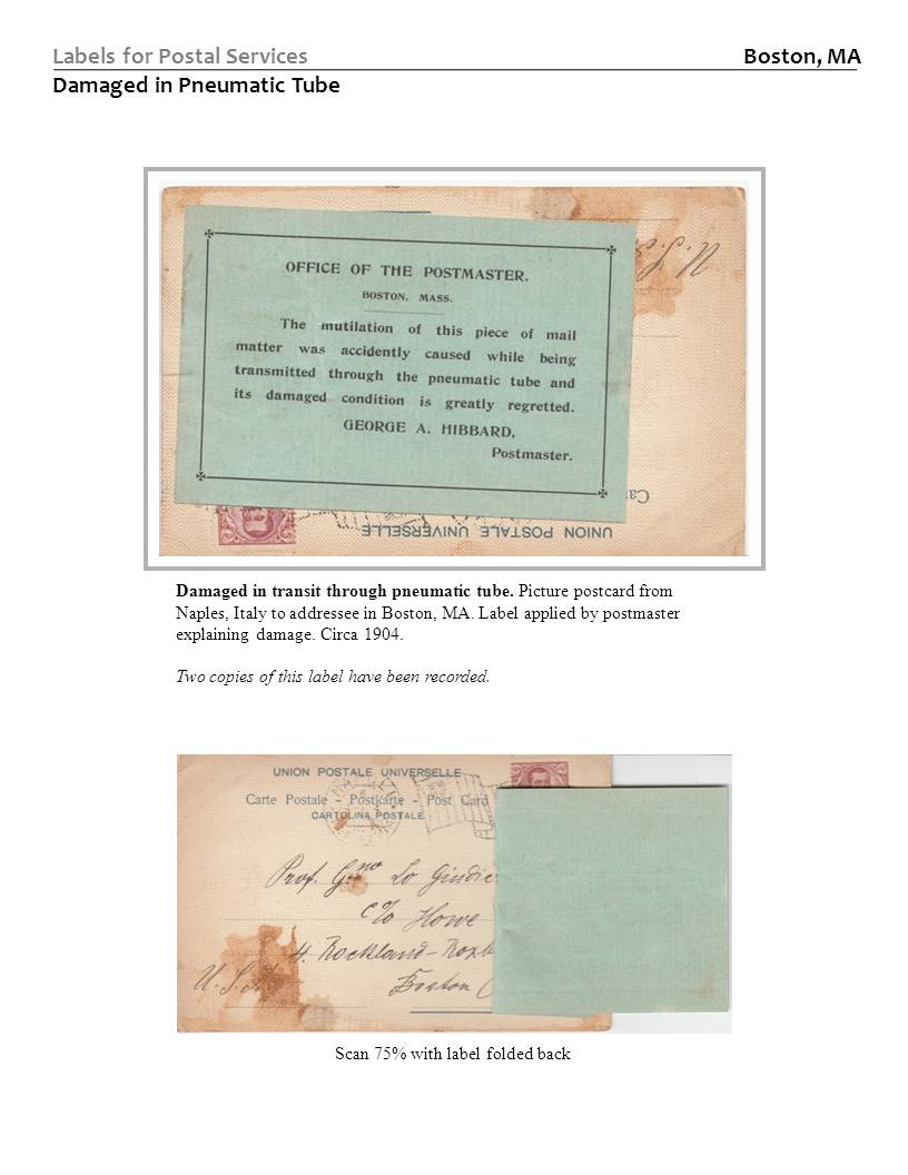
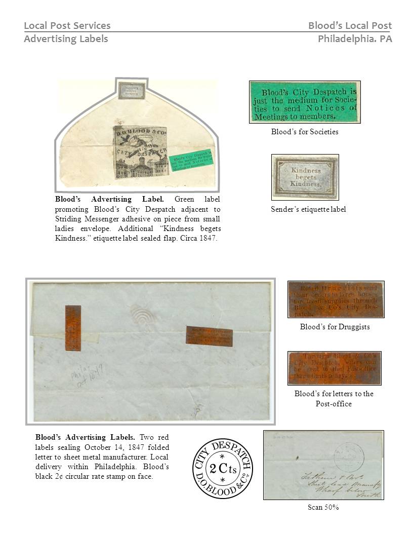
And this one has the face shown actual size, but grayscale (it's a pretty monochrome front). I'll probably end up reducing it and showing it in color for consistency).
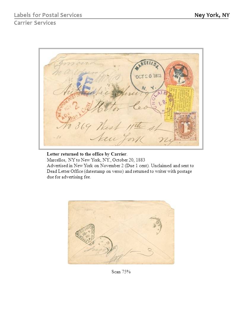
On the bottom cover, I reduced the scan, but put in a "tracing" of the relevant handstamp:
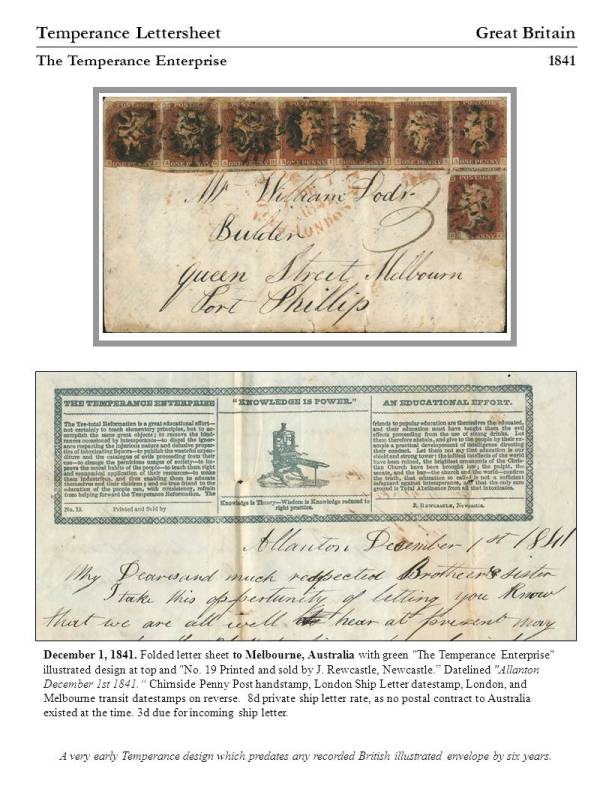
Scan of interior of lettersheet:
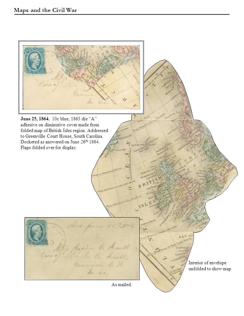
Two turned covers made from old maps (another strange collection of mine). The scans are to show the interiors:
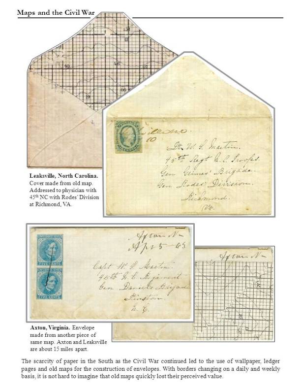
This one violates the "reduce the scan" rule, but I just love this page so much.....
Hope this gives you some ideas.
Chip