| Author |
 Replies: 83 / Views: 12,380 Replies: 83 / Views: 12,380 |
|
|
|
Pillar Of The Community
United States
6447 Posts |
|
|
Pillar Of The Community
United States
4106 Posts |
|
|
Not to belittle anyone's opinion, but I use a Canon MX700 all-in-one and I get fantastic results.. But I also tune my scanner on occasion. |
Send note to Staff 
|
|
|
Pillar Of The Community
1545 Posts |
|
|
I have gotten alot of great help here. I think I'm on my way. It was a really good idea of comparing scans of a common stamp. Thanks much to everyone. Hope the thread continues. Great scans here.
-IBFS |
|
Send note to Staff
|
|
|
Pillar Of The Community
Canada
737 Posts |
|
|
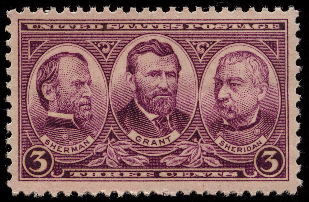
I suppose it ultimately comes down to what the individual considers to be a "good" scan. I prefer to use scanner settings that give me the raw image without any enhancements. No contrast changes, no colour changes, no dust detection, etc. This comparison of earlier postings shows why - the image on the left simply looks more real than the one on the right. I've certainly never seen a stamp this old with paper that looks so white. When I bid on ebay lots, I tend to avoid stamps shown with the types of images seen on the right - you never know what could be hiding behind all that image modification / optimization. Ryan 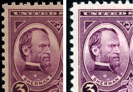 |
|
Send note to Staff
|
|
|
Pillar Of The Community
United States
2480 Posts |
|
|
Ryan,
I agree. While the enhanced scans look great, I feel that "au naturale" provides a more accurate representation of the stamp being scanned.
Steve |
|
Send note to Staff
|
|
|
Pillar Of The Community
United States
6664 Posts |
|
|
Pillar Of The Community
Canada
5821 Posts |
|
|
Quote:
I tend to avoid stamps shown with the types of images seen on the right - you never know what could be hiding behind all that image modification / optimization. I believe the one on the right is my scan. Contrary to that quote above I made no modification, optimizing, tweaking or whatever. I do agree that my scan is a bit brighter (whiter?) than revenuecollector's which actually happens when you isolate the stamp on the preview and then zoom in. I rescanned the stamp again and you can see from the screen shot that there was no tweaking.   I do agree that revenuecollector's is a bit more natural even though when I compare it with my actual stamps it looks a bit dark and the colour is off. Neither scan is true to the original but closer than any of the other ones shown here so far IMHO. The difference might also be in the fact that his Epson V500 being a later model performs better than my 4490 |
|
Send note to Staff
|
|
|
Pillar Of The Community
United States
6447 Posts |
|
|
Too many variables to know for certain where the differences lie.
Monitor calibration, the ambient lighting when viewing the image, etc.
Also, there is variability in the ink shades and paper color of that stamp.
As far as the auto-contrast changing when you crop the stamp in the preview, you should be able to disable this, either permanently under "Configuration", or for that image by hitting the "Reset" button. |
|
Send note to Staff
|
|
|
|
Pillar Of The Community
Canada
5821 Posts |
|
|
Quote:
As far as the auto-contrast changing when you crop the stamp in the preview, you should be able to disable this, either permanently under "Configuration", or for that image by hitting the "Reset" button. Thanks for the advice. One thing I've noticed on your scans and especially nethryk's (he also uses a V500 I believe) is that the texture of the stamp paper is usually visible but not so on mine. I believe the bright scan eliminates this quality as does an increase in contrast. But I've noticed that some scans here show too much texture which is not evident on the actual stamp. So we are left with imperfections. |
|
Send note to Staff
|
|
|
Pillar Of The Community
United States
6447 Posts |
|
|
That's one of the things I love about the V500: capturing surface texture of paper and ink. The more you blow out highlights the more surface detail is lost. |
|
Send note to Staff
|
|
|
|
Pillar Of The Community
United States
1352 Posts |
|
|
I bought the V500 this past summer, and it's fabulous. When I posted some images of the 3c 1861 shades, I found that when I turned auto-exposure down as far as possible to the left, I got a better scan-- the auto-exposure tended to make everything brighter than it actually was, and when the shades can be subtle to begin with, it really helped to be able to make that adjustment. Here's a nice pink example at 600dpi:  Ray |
|
Send note to Staff
|
APS #145389
USPCS R.A. #4350
Member, Nashville and Knoxville Philatelic Societies
Member, Crossville Stamp Club |
|
|
Pillar Of The Community
United States
1352 Posts |
|
|
Litho, I think if you turn down the auto-exposure, the stamp won't be as white.....and isn't that white in reality. Should get a better scan.
Hope this helps, Ray |
|
Send note to Staff
|
APS #145389
USPCS R.A. #4350
Member, Nashville and Knoxville Philatelic Societies
Member, Crossville Stamp Club |
|
|
Valued Member
United States
183 Posts |
|
|
It has been a while since I used Epson Scan S/W but the circular icon with the two red arrowheads pointing in ... is that not the setting for automatic image adjustment using the built in scanner profile? Don't you have to hit "Reset" (icon circle and arrowheads separate) to disable automatic adjustments? I believe, in fact, you have done automatic optimizing, tweaking, and whatever. Also, from what I can remember, the high setting on Unsharp Mask is pretty extreme and may also impact contrast. |
|
Send note to Staff
|
|
|
Pillar Of The Community
United States
1352 Posts |
|
|
I'm not a pro at this by any means, but I went to the bottom in "configuration" and turned the auto-exposure as far left as I could.
The only other difference in my settings is under "Unsharp Mask", mine is "medium". I didn't set that, though, so it may be the default.
Hope this helps.
Ray |
|
Send note to Staff
|
APS #145389
USPCS R.A. #4350
Member, Nashville and Knoxville Philatelic Societies
Member, Crossville Stamp Club |
|
|
Pillar Of The Community
United Kingdom
1361 Posts |
|
|
Quote:
Don't you have to hit "Reset" (icon circle and arrowheads separate) to disable automatic adjustments?
Also, from what I can remember, the high setting on Unsharp Mask is pretty extreme and may also impact contrast.
I agree with this Litho  I always do any adjustments in software as you have more control over them. You just don't know what 'high/medium/low' are. |
|
Send note to Staff
|
|
|
Replies: 83 / Views: 12,380 |
|