| Author |
 Replies: 7 / Views: 3,869 Replies: 7 / Views: 3,869 |
|
|
Valued Member
87 Posts |
|
|
As I was sorting, this one caught my eye. I believe it is a 806-71, but the N. Y. spacing is different, and not listed in my Bureau Cat. I know there are wide and narrow spacing differences on the 4th Bureau issues but I find no reference to spacing differences for the prexie issues. Any guesses? 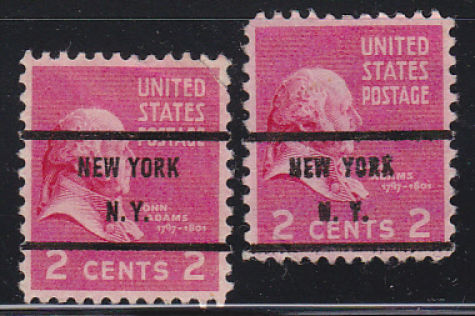 |
|
Send note to Staff
|
|
|
|
|
Pillar Of The Community
United Kingdom
544 Posts |
|
|
Good spot! The only one I have is wide; though I don't think the statistical significance of a survey of one is very high!
I'll start looking out. |
Send note to Staff 
|
|
|
Bedrock Of The Community
United States
12128 Posts |
|
|
Although the stamp is damaged, here are two precancels from my collection that also show different widths in the printing of "N.Y.": 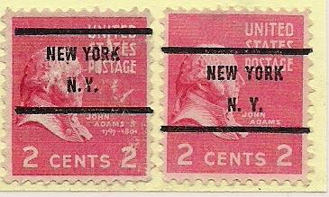 |
|
Send note to Staff
|
|
|
Valued Member
87 Posts |
|
|
wt1 - Thanks for finding another one. I still wonder why the PSS Catalog has no mention of these on the Prexie issues. Time for another page for these in my album!
Now to go back and look for more in my dup's on other denoms - uggg |
|
Send note to Staff
|
|
|
Bedrock Of The Community
United States
12128 Posts |
|
|
Since we've had a lot of precancel questions lately, I thought I'd give this thread a "bump", to see if someone may be able to explain the width varieties in the State name as shown in the above scans, and why it is not mentioned in the PSS Catalog. |
|
Send note to Staff
|
|
|
Valued Member
87 Posts |
|
|
wt1 - Thanks for the bump, I have found a bunch of other ones with this spacing. My guess is, there is something about them in the book "Specialist Guide to Bureau Precancels", a book I'm trying to get my hands on. I'm beginning to think they are pretty common based on the amount I have found, both on the Prexy and Liberty issues. |
|
Send note to Staff
|
|
|
Valued Member
Russian Federation
197 Posts |
|
|
In the initial picture not only does the spacing strike the eye, but a lot of other details suggest independent origin of the two cliches used. Compare the dots after Y (rectangular vs. round) and the size of those, plus the difference in thickness. Also the outlines of some letters in the words demonstrate visible differences: in the right stamp the slanting 'Y', small break in 'O', forked 'R' and lifted 'K' in YORK (the last two letters do not resemble their counterparts in the stamp on the left), alongside with the pointed middle stroke in 'W' and slightly differing 'E' in NEW. |
|
Send note to Staff
|
|
|
Valued Member
United States
100 Posts |
|
|
Interesting thread on the spacing of the NY 71's. Looking thru my small stash of Prexies, I have the following wider spaced: 1¢ 804-71, 4½¢ 809-71 & 5¢ 819-71. The distance between the left upright of the 'N' to the 2nd period is just under 5mm on the wides and just under 4mm on the narrows. It looks like the wider spaced Prexies have the same spacing as most (not all) of my Liberty 71's too. |
|
Send note to Staff
|
|
| |
Replies: 7 / Views: 3,869 |
|


