I have a box of hundreds of pictorial cancels. From browsing through them, my only tiny piece of advice is to consider the width of the line(s) depicting the subject matter, as well as the saturation of the font. Too wide a line, when transformed into an imaged cancellation, makes for a blurry often-overinked mess. The type of ink probably matters too; some spread out, others make a crisp clear imprint. Others look great on bond-paper envelopes, but blur on cheap slick envelopes.
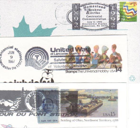
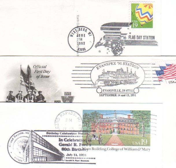
Here are (in my opinion) some bad examples: