In the first picture below, the item on the left* is interesting to us in two ways. First it is a progress essay toward the creation of a design by Continental for a tax paid revenue stamp covering the tax on 8 ounces of tobacco. It is listed in the essay-proof catalog for revenue stamps by George Turner, and there identified as T-23. It is also interesting because as you can see, this specimen has been mounted on Kraft paper. That is because it was pasted onto the outside of a file folder in the archives of the American Bank Note Company. With the dispersal of those archives in the early 1990s a large amount of this kind of material became available to collectors for the first time.
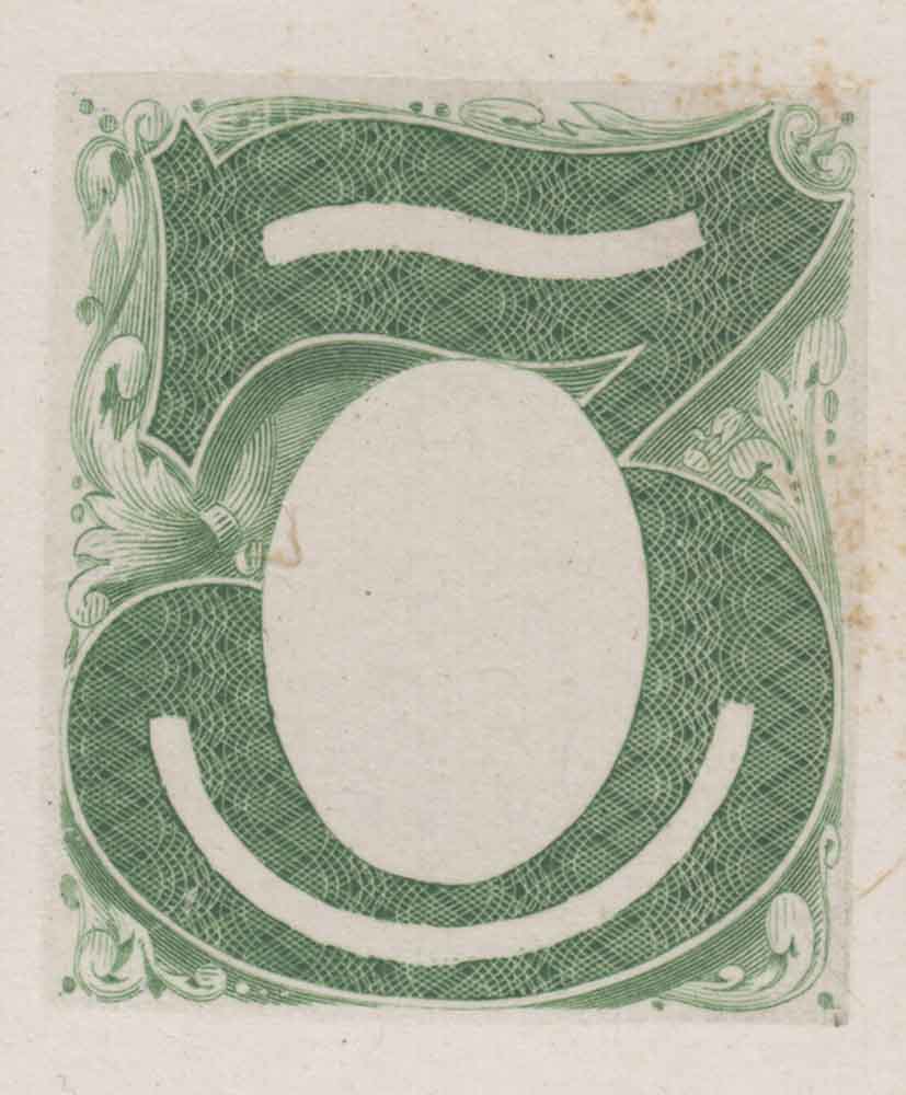
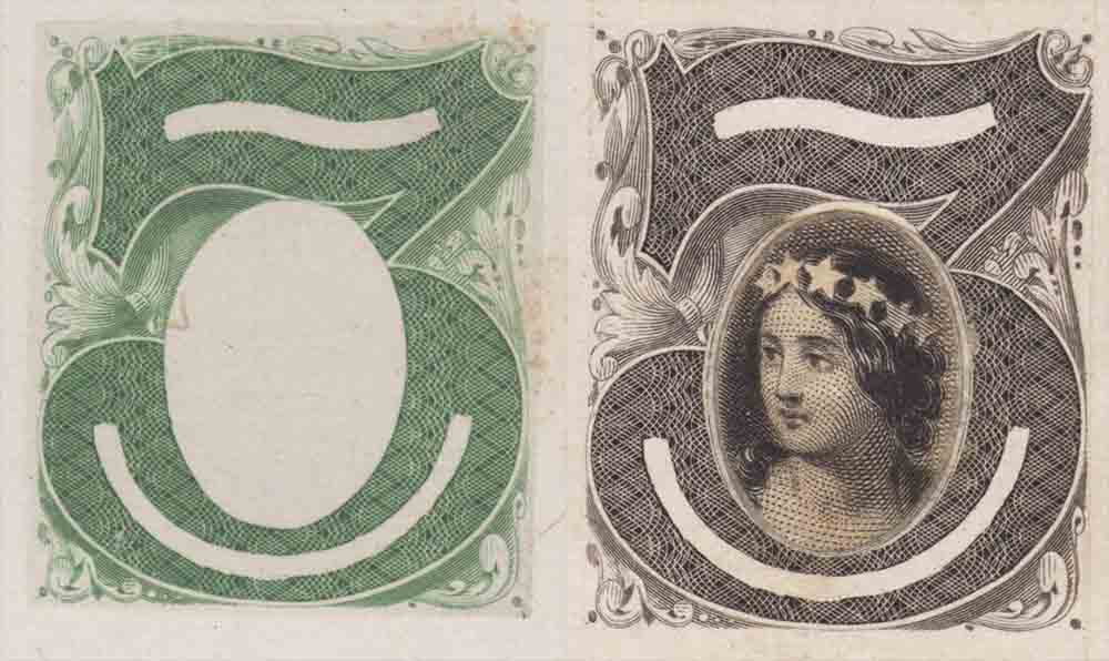
Comparing this essay to the essay on the right, you can see that the contours of the figure "8" in this design were the inspiration for the shape of the figure "3" in the first 3-cent essay type Continental was proposing for postage stamps. This is only true in a general way, for if you look carefully at the bases of the two figures and follow the forms up the right side, you will see that they differ in curve and proportion as they outline their respective numerals. So in this case Continental was not merely modifying a laydown from an existing die, but was re-engraving and adapting an existing form of numeral to a new use. This is as close as the connection gets between the series of tax paid revenue designs and what Continental was preparing as its first design for the three cent postage stamp.
*left image from Kelleher sale 625 lot 1303
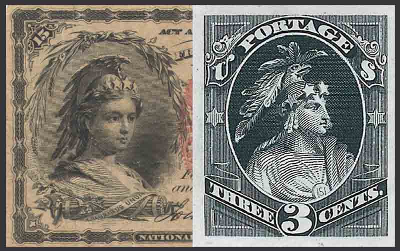
Scott lists this three cent design as 147-E1. As before, the contour lines of the numeral form a boundary line between the styles of decoration inside the numeral and around it. Inside the numeral rose engine swirls create complex patterns as a groundwork for inlaid patterns of stars of various geometries. Outside the numeral the use of banner ribbon and acanthus scrollwork with its shells, balls and beads dominate. Taking a close look one cannot help but be impressed by the intricacy of the design work, especially where the decoration outside the numeral swirls into the region of interior decoration.
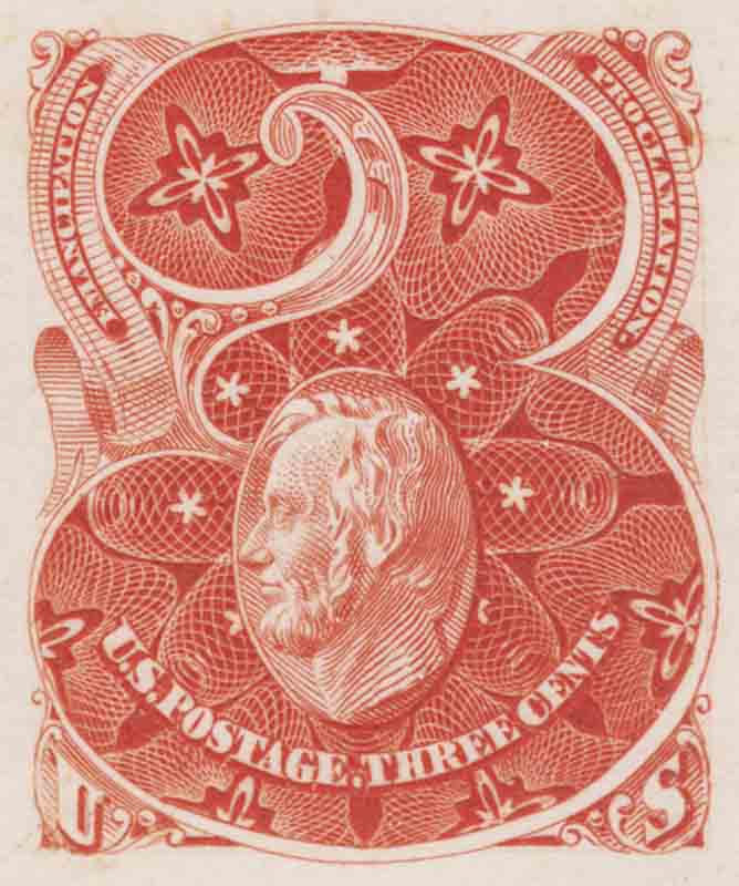
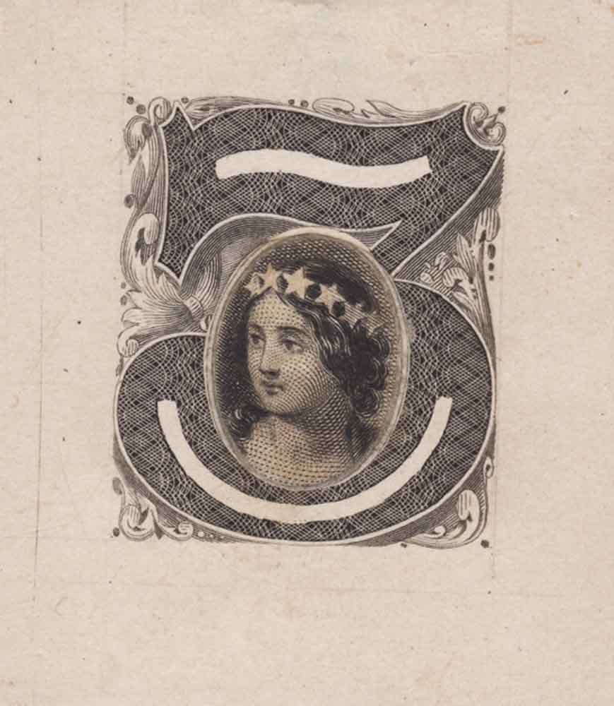
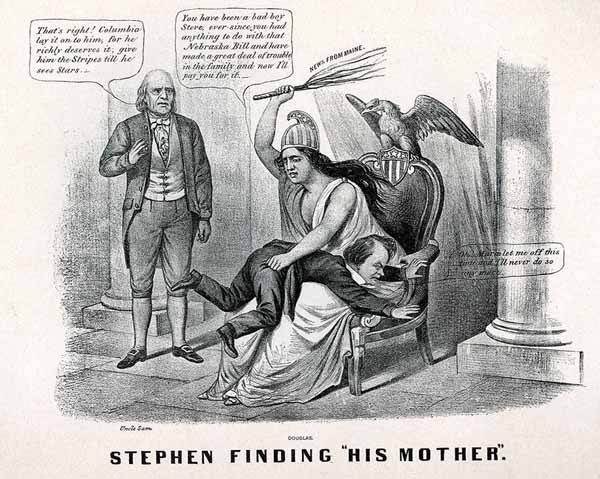
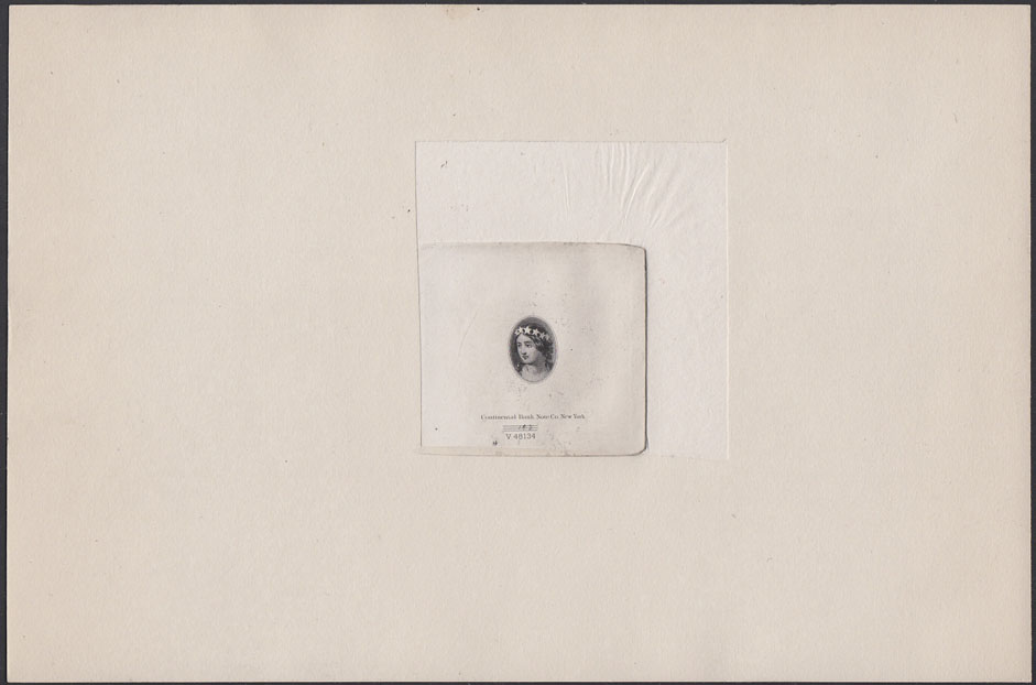
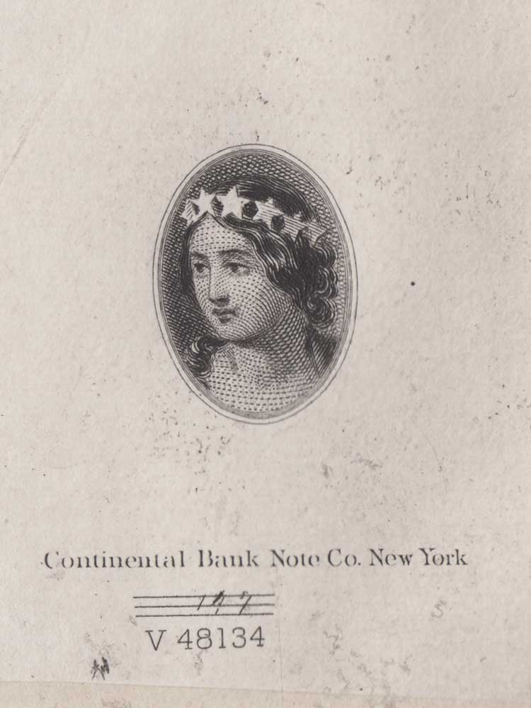
Thematically we must ask if this design continues or alters the pattern we have seen in the first two denominations which named a critical point of dispute in a major U.S. military conflict. Independence in 1776 and Impressment in 1812. Here the Emancipation Proclamation is featured, but without reference to a year date. Does the artist mean to disassociate it from the Civil War by omitting the date, or imply causality by its inclusion in the series? Was the Proclamation fundamentally the reason for the civil war, or was it an outcome? The design invites reflection by its ambiguity, which is a desired goal in all fine art. However the thematic connection to Abraham Lincoln is not at all ambiguous as a cameo portrait figures prominently into the design as the vignette. Below this, in another departure from the design style, the words "U.S. POSTAGE" and "THREE CENTS" appear continuously in a single curved entablature and are separated by a mark of punctuation. In all this is a most remarkable design.
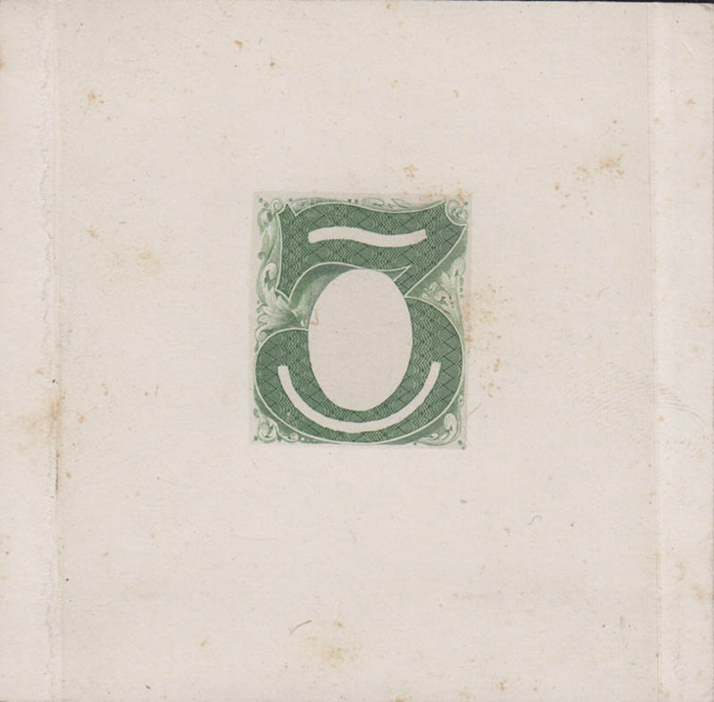
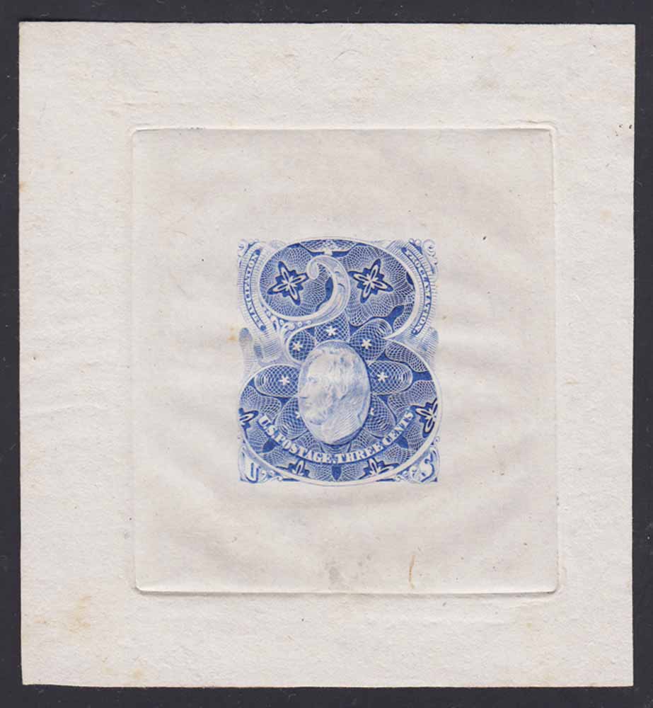
The normal form for this engraved essay is printed on India die sunk on card, although the original full size card is exceptional. It is also know as a hybrid die essay printed on India paper, cut close to the design and block sunk on card. This format is known for all the denominations of this series, but none are yet listed in Scott.
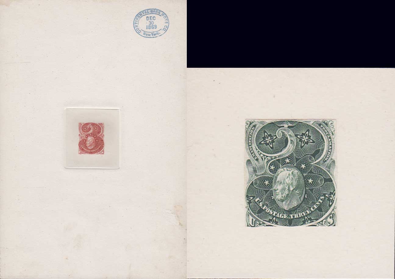
There is one other format for this denomination which is somewhat anomalous and not yet Scott listed for this denomination. This is printed on proof paper, die sunk, but not on card and is only known by the item pictured below so far. Something like this was listed by Brazer for both the 1c and 2c designs, and Scott preserved the listing for the 1c only. However, nothing quite like this for those denomination has come to market for the last 20 years, and it is uncertain whether they are of the same character or not. The whole matter is under investigation.
---------------------------------------------------
Those who are following along with these posts using the listings in the Scott Specialized Essays section will note that there are several more three cent essays listed. Those are from a second series of designs for the three cent, and I am going to skip them for a bit so I can finish off the first series.
---------------------------------------------------
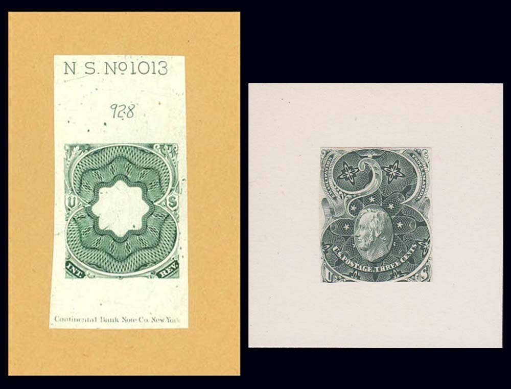
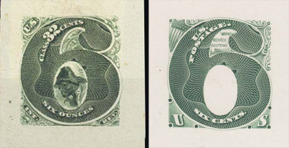
The first series ends with a six cent essay also directly derived from the tobacco tax paids. The image on the left* shows an essay for a 32c stamp that paid the tax on six ounces of tobacco. The design features a vignette with the image of a Black field hand, presumably an emancipated slave, inside a numeral "6" with significant rose engine interior background decoration. This is framed in filagree with the insignia US in an oval at upper left and abbreviations for "Internal Revenue" in small tablets at bottom left and right.
The picture on the right shows 148-E1, Continentals design proposal for a six cent postage stamp. As you can see, the same central numeral "6" with its rose engine work has been taken over unaltered, but the words "six cents" have replaced "six ounces" and "US Postage" no fills ths space the original numeral of value occupied. The framing decoration around the "6" has been simplified, and a stars and stripes shield has replaced the US insignia.
*left image from an H.R. Harmer sale
The figure of an open scroll with the words "Monroe Doctrine" situated in the upper curve of the numeral announces the theme behind the design, but it is clear from the absence of a vignette, as well as the bare simplicity of the design that it is not yet developed. At the time of this design's creation the Monroe Doctrine had not yet been put to the test of war, which breaks the war motif as the linking theme for the series. That further calls into question the connection between the Emancipation Proclamation and the civil war on the three cent, but both these two denominations are also without a year date association to the theme.
In addition to the normal India paper die sunk on card, usually reduced, the six cent essay also appears in hybrid form as you can see from the telltale marks of a mounted reduced die print.* None of these have yet been listed in Scott.
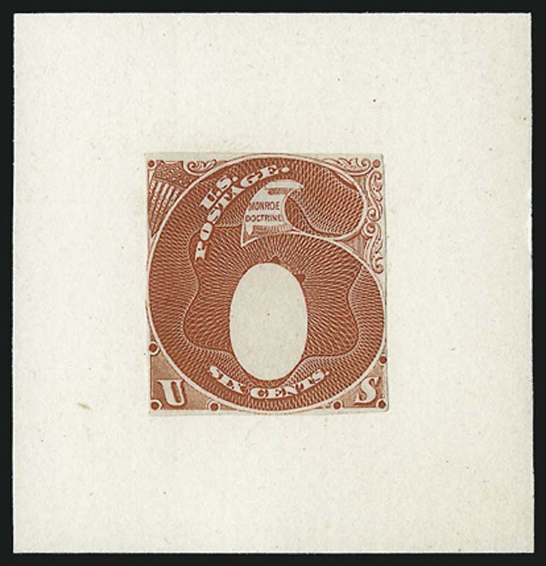
*image from Siegel sale 1040 lot 1066