Stamp Community Family of Web Sites
Thousands of stamps, consistently graded, competitively priced and hundreds of in-depth blog posts to read


Stamp Community Forum
 
Username:
Password:
Save Password
Forgot your Password?

This page may contain links that result in small commissions to keep this free site up and running.

Welcome Guest! Registering and/or logging in will remove the anchor (bottom) ads. It's Free!

Introducing The Continental Large Numeral Essays

Previous Page
 
To participate in the forum you must log in or register.
Author Previous TopicReplies: 39 / Views: 7,618Next Topic
Page: of 3
Pillar Of The Community
United States
898 Posts
Posted 07/25/2013   11:54 am  Show Profile Bookmark this reply Add Philatarium to your friends list  Get a Link to this Reply
This is an extraordinary presentation, Essayk! Terrific information and amazing illustrations! This belongs on a webpage somewhere in a more permanent setting.

Amazing stuff!

-- Dave
Send note to Staff  Go to Top of Page
Pillar Of The Community
United States
1942 Posts
Posted 07/25/2013   4:13 pm  Show Profile Bookmark this reply Add essayk to your friends list  Get a Link to this Reply
I'm glad you're enjoying it. Thank you for the affirmation! As for website, please read on...

This is an early draft of an article that will be given to the US Philatelic Classics Society for the Chronicle. What they publish on paper they archive electronically in a fully searchable format online. So, please do not migrate or repost anything without my prior consent, or they may refuse to take it. I am in regular correspondence with the section editor, who is a personal friend too, and will be able to monitor his interest. But some of you guys are "young" in the hobby and I wanted you to have a shot at learning about something before the rest of the pack gets wind of it. I'm holding out some technical aspects of the story so I still have something unseen to give them, but you are getting the layman's view of the picture.

If the Chronicle nixes it, I have other places, but will look at web placement too.

In the meantime, please help me.
I need feedback on how this might become a one-frame exhibit. What I need from you particularly has to do with understandability.

1. Can you follow the story?

2. Does it make you want to know more?
If so, can you put your finger on what that feeling came from?

3. Shortly you will learn of a gap. After you see that, how would you bridge it?

4. Those of you who exhibit, would you try to run it as "Traditional" without collateral material, i.e. ephemera, or would you go for display class and key on that?

Please! Pick any or all of these questions and let me hear from you! I have to decide on the exhibit, by Aug 17.

Please?

Thanks.

Send note to Staff  Go to Top of Page
Edited by essayk - 07/26/2013 10:24 am
Pillar Of The Community
Canada
4648 Posts
Posted 07/26/2013   12:53 pm  Show Profile Bookmark this reply Add Bujutsu to your friends list  Get a Link to this Reply
I understand your concerns essayk. I can also understand why you want this not to be copied anywhere else and I for one certainly will respect this.

With the research you have done, I would say you have great information for a publication / exhibit.

While I do not collect this type of material, I do find it quite interesting and do look forward to seeing more as your time permits.

This thread is very informative and well done, plus the illustrations are fantastic.

Chimo

Bujutsu
Send note to Staff  Go to Top of Page
Pillar Of The Community
United States
898 Posts
Posted 07/28/2013   2:55 pm  Show Profile Bookmark this reply Add Philatarium to your friends list  Get a Link to this Reply
Essayk: I don't think I'm the right person to answer your questions, and that's why I was holding off in replying.

I'm old-school enough to know that I cannot absorb detailed, technical information by reading directly off of a screen, especially in the font used here. (It's not the board's fault -- I don't think it was meant for a serious presentation.) I learn best by an article, laid out correctly, on a printed page.

I'm also not a US collector at all and don't follow it, even though I like this era of US stamps very much. (I've been more of a Japan specialist.) So I don't think I have the background that the reader of the publication you're considering would have.

I've also got to say that, although I have some accomplishment in my career to think I might sometimes be a sharp fellow, I've never very well understood what the exhibiting community (or perhaps I should say the judging community) needs in developing the story-line of an exhibit. I think I must just look at things too differently to ever exhibit. (And I've been approached to exhibit by others who exhibit and are judges, so it's not that my collecting interests have been too casual -- I just seem to approach presentations and conveying information differently than the norm in philatelic exhibiting.)

I'm hoping there are others who've been reading this thread that could provide you better feedback than I've been able to.

However, I will say that, if you draft an article, and it's in .doc or .pdf format, please feel free to email me a copy. (Email address is in my profile.) I'll even sign a non-disclosure agreement. But again, I may not have sufficient background to be representative of your target reader.

Having said all that, I really, really enjoy the material!

-- Dave
Send note to Staff  Go to Top of Page
Edited by Philatarium - 07/28/2013 3:02 pm
Pillar Of The Community
United States
1942 Posts
Posted 08/08/2013   01:15 am  Show Profile Bookmark this reply Add essayk to your friends list  Get a Link to this Reply
Thank you for your words of encouragement Philatarium, and all the rest of you folks. It has been a rather challenging week and a half for me, which kept me away for a bit. But now it's time to wrap this up. Here is the rest of the story on the alternative three cent design series.


FIRST ALTERNATIVE DESIGN; DIE STATE II

At this point we come to our first real roadblock to a complete illustrated story.

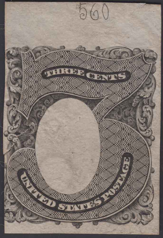
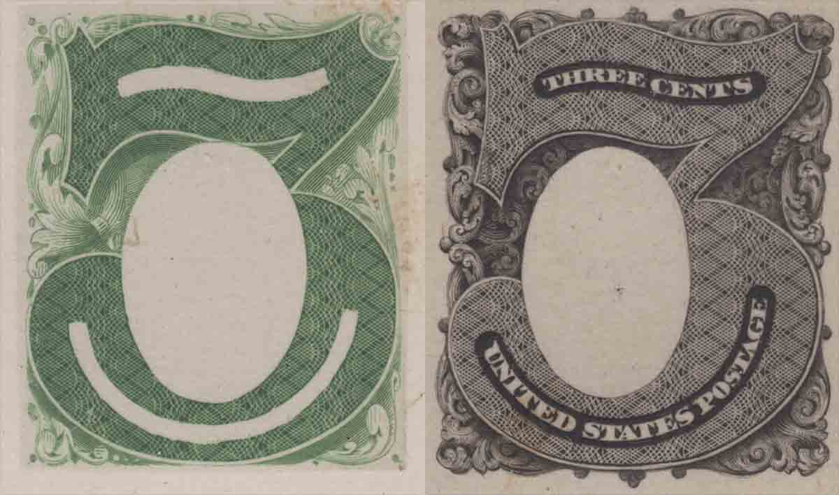
In 1941 Brazer included a listing in his Essay catalog for what is logically Die State II, which differs from the first die state by the addition of lettering to the blank entablatures as "THREE CENTS" above and "UNITED STATES POSTAGE" below. The listing for his 147E-B acknowledges two forms, both on India paper, with and without the vignette of Columbia pasted in. For this listing he provides a photo illustration of the paste-up model. On inspection, to the limits of what a halftone may show, it appears that the surrounding ornamentation is identical to that in die state 1, and the paste-up vignette appears to be the same vignette of Columbia we have been seeing.


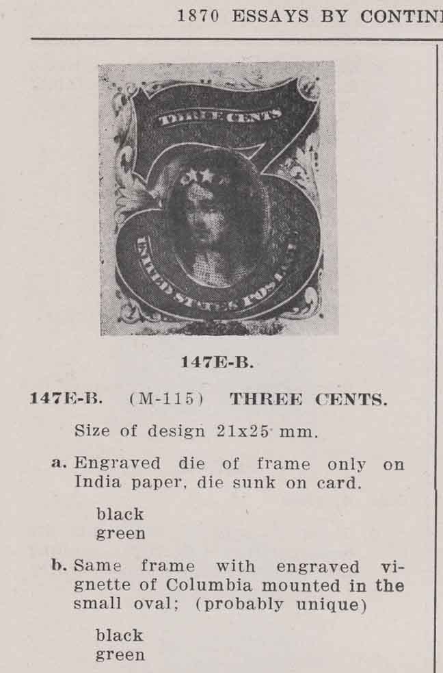
Unfortunately, neither form of this essay has come to the market in the past 25 years, and I cannot report on their present existence or on the details of their fine engraving, such as the rose-engine fill in the numeral. We can be reasonably assured that the item illustrated in the Brazer catalog exists, or existed in his time, but its whereabouts are unknown. As for the item only described in words, we have no solid evidence that it exists except for the fact that Brazer gave it a normal listing. For these reasons, Scott only lists this die state with the vignette paste-up in place, which has been given the number 147-E4. Scott follows Brazer in listing this in two colors, black and green, and even gives pricing that is in accord with the other essays in this series. But these are so far unsupported suppositions by the catalogers, and need to be verified. After this gap in the story, the chronological sequence of the remaining material is less certain.
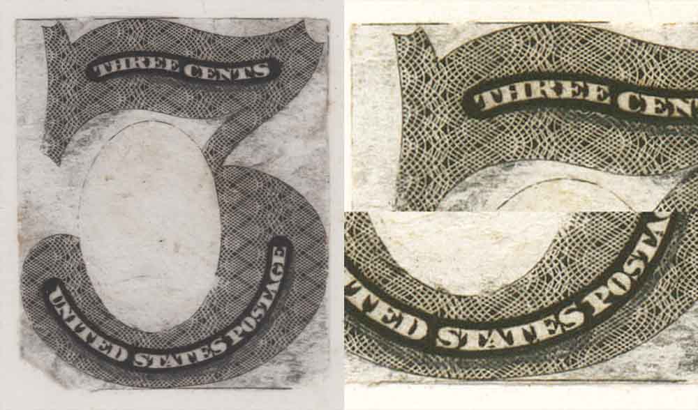

ALTERNATE DESIGN II

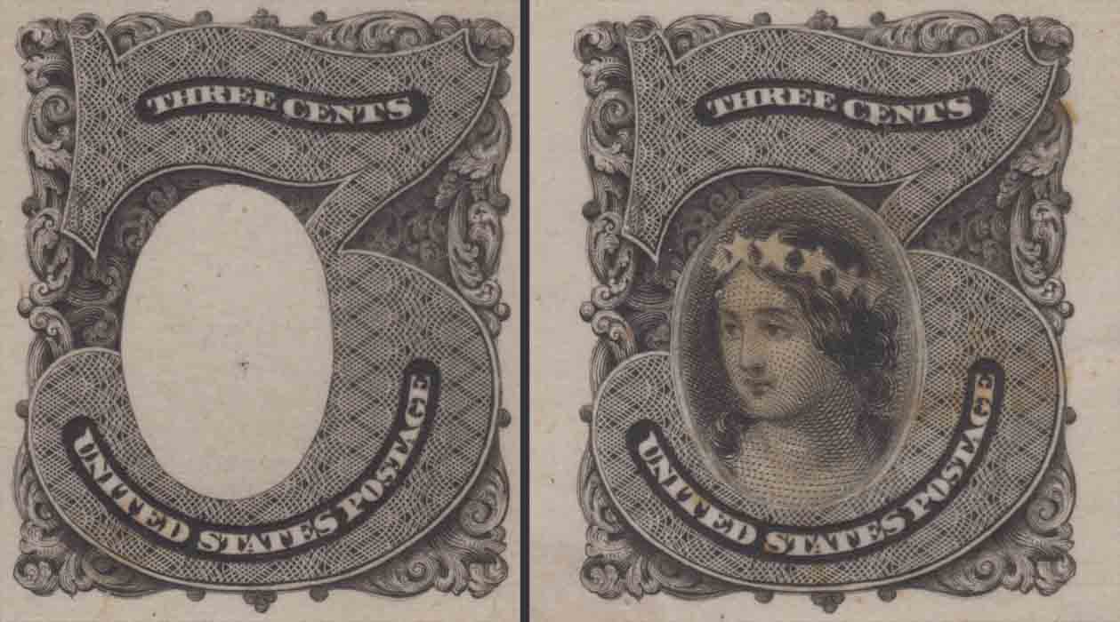
Continental produced a second style flat top numeral design utilizing the same outline large numeral three but with different ornamentation. The example on the left is a die print on India which was die sunk on card and reduced to about 45x45mm. This is the only example known in this format in black, but the example on the right* is the same style in hybrid format printed in green. These are Scott listed as 147-E5 but without differentiation of the format.
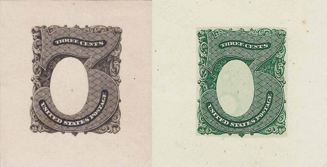

*Siegel auction 1010

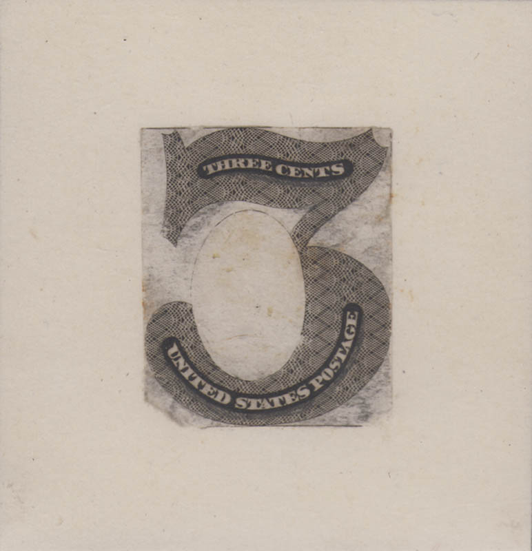
This is an example of this essay type in green on India reduced to stamp size and not card mounted, a third format but not listed as such. The unusual "ghost bubble" shading in the vignette frame of the hybrid above also appears in this example off card, and is now known for the prints in black (see below).


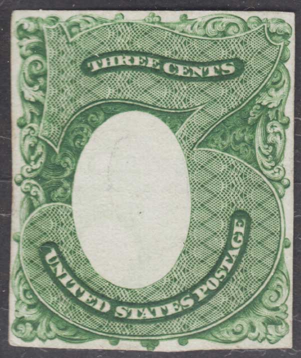
The numeral has the full lettering for denomination and country, paralleling the second die state of the first alternative design, but which is not available for comparison at present. (Comparison here will be made with the first die state known for both essay types.) Note in this comparison that the contours of the large numeral "3" around the location of the vignette frame are not the same for the two designs. The frame in the example on the right is narrower than in the other design, and it is shifted somewhat to the left, thereby changing the thickness of the numeral, with less on the left of the vignette, and more on the right. In addition the Rose-engine work in this second design is not identical to that of the other style. Perhaps the greatest difference between the two, and the feature noted by the early catalogers, is the replacement of the comparatively light foliate ornamentation with a darker ornament of tightly scrolled acanthus shells.


As with the first alternative design, this one also appears as a paste-up model with the same vignette of Columbia mounted in as we saw before.


ALTERNATE DESIGN III

The item in this picture was never listed by Brazer and may never have been seen by him. This die print was pulled on India paper which has been cut to the size of the design, then mounted on India block sunk on card. It is presently listed in Scott as 147-E2, but it's actual position relative to the other styles of this flat-topped numeral is presently unknown. Although it is listed in both black and green, so far this is the only example that has surfaced. The listing in two colors as well as the pricing may be attributed to "paradigm pressure" based on conformity with the listings in the series around it.


Comparing this with the other two designs, we immediately notice the absence of surrounding ornament. The disposition of the oval vignette frame is more like style two (on the right) than that of the first alternative design. Similarly, the details of the rose-engine fill in the numeral resembles that of the second design type. In all, this appears to be a stripped down version of the second design type. But these three are all from distinct dies.


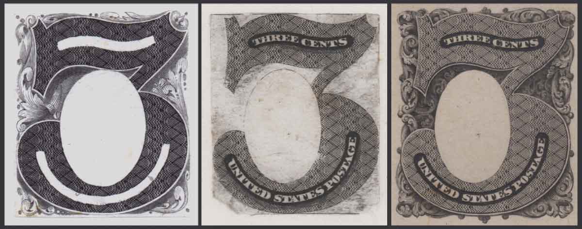
When we take a closer look at the new die print itself, we can see that its condition is atypical for a die print from this series. Significant remnants of printed horizontal framing lines appear at top and bottom, and short line fragments can be observed left and right too. This all around frame-line hints that some kind of rectilinear frame was being considered, in addition to the foliate ornamented frame. In the case of this print we also note that there is a shadow arching beneath the upper and lower lettering. The close-up on the left shows that this was not engraved into the design but was added to the die print to show where some additional engraving was desired. Most of the discoloration of the white areas in this print is from pencil as well.


What makes this essay such a conundrum is that it is not yet possible to tell whether it preceded the second alternative design type or followed it. It was not formed by the removal of the surrounding ornament from the first alternative design, but it may have come from a reduction of the second design type with a circumscribing frame added. Or it may have been an early stage in the development of the second design type. Here I may add the note that we cannot yet be sure which of the two series of essays came first, the study of three cent designs or the sequence of "round figure" denominations.

For now, these are all the large numeral essays known to exist from the 1869 effort by the Continental Bank Note Company to win away the contract for postage stamp production. No plates are known to have been made for any of them, and the entire effort was discarded by the Government who preferred to keep the contract with the National BNCo, and have them produce new designs for new postage stamps. This they did with their profile bust series, and ushered in the era of what we today call the Bank Note Issues.

Send note to Staff  Go to Top of Page
Edited by essayk - 08/23/2013 4:51 pm
Pillar Of The Community
United States
898 Posts
Posted 08/09/2013   3:37 pm  Show Profile Bookmark this reply Add Philatarium to your friends list  Get a Link to this Reply
What a lot of effort Continental went to, and what stunning designs these are. Had they gotten the contract, this would have been a very compelling series to collect and specialize in.

Thanks again for sharing this!

-- Dave
Send note to Staff  Go to Top of Page
Pillar Of The Community
United States
1942 Posts
Posted 08/11/2013   4:23 pm  Show Profile Bookmark this reply Add essayk to your friends list  Get a Link to this Reply
I was able to add one more item to the group from a dealer at Stampshow, but I had left my checkbook at home and he wouldn't take a card. I tried taking a few shots with my cell, but it was too close or came out too small. So when it arrives I will scan it and show it to you. It's kind of special, you'll see.
Send note to Staff  Go to Top of Page
Rest in Peace
United States
7097 Posts
Posted 08/11/2013   5:31 pm  Show Profile Bookmark this reply Add I_Love_Stamps to your friends list  Get a Link to this Reply
Oh man I can't wait! lol
Send note to Staff  Go to Top of Page
Pillar Of The Community
United States
1942 Posts
Posted 08/23/2013   4:50 pm  Show Profile Bookmark this reply Add essayk to your friends list  Get a Link to this Reply
As promised, here is the item I picked up at Stampshow. The design is clipped LL and there is a significant tear in the mid-left margin into the design. Not a great beauty, but the only one known so far.


It is a 147-E5 in black on proof paper, not India, which shows the "ghost" bubbles in the vignette area as above. It also shows a die number just a few millimeters above the design area. The presence of this number so close to the design might explain why all the examples so far known with the "ghost bubbles" on India are reduced to stamp size, save for this one. Since the number is not visible in the example in black without the bubbles and with a larger paper area, this would seem to indicate that the prints with and without bubbles represent different die states or different dies altogether. This will give rise to a new catalog listing in 2015. Meanwhile the search for answers continues.
Send note to Staff  Go to Top of Page
Page: of 3 Previous TopicReplies: 39 / Views: 7,618Next Topic  
Previous Page
 
To participate in the forum you must log in or register.

Go to Top of Page

Disclaimer: While a tremendous amount of effort goes into ensuring the accuracy of the information contained in this site, Stamp Community assumes no liability for errors. Copyright 2005 - 2026 Stamp Community Family - All rights reserved worldwide. Use of any images or content on this website without prior written permission of Stamp Community or the original lender is strictly prohibited.
Privacy Policy / Terms of Use    Advertise Here
Stamp Community Forum © 2007 - 2026 Stamp Community Forums
It took 0.3 seconds to lick this stamp. Powered By: Snitz Forums 2000 Version 3.4.05