| Author |
 Replies: 13 / Views: 2,694 Replies: 13 / Views: 2,694 |
|
|
Rest in Peace
United States
7097 Posts |
|
|
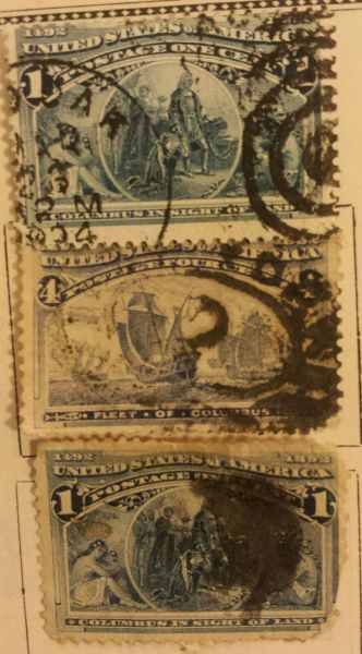
Condition aside, do you think that the #233 is the blue error? It just keeps nagging at me so I thought I'd just post it.  |
|
Send note to Staff
|
|
|
|
|
Valued Member
United States
62 Posts |
|
|
I was told to compare the color to the 1 cent, and if they were the same, then it's the color error stamp. From the pics, that's what it appears to be, but I'm certainly no expert. |
Send note to Staff 
|
|
|
Pillar Of The Community
United States
1121 Posts |
|
|
Moderator

United States
5102 Posts |
|
|
Quote:
To me the 4c does not look like the 1c. Looks more ultra than blue. Agree. I don't quite see the similarity ... does not look like the blue variety. |
|
Send note to Staff
|
|
|
Valued Member
United States
261 Posts |
|
|
Scott #233 comes in Ultramarine, Dull Ultramarine and Deep ultramarine.
The Blue Error #233a comes in two shades, it is valued at $16,500 used and $17,500 MNH
Almost all the used verified copies have faults.
I guess if you feel that strongly about it you should have it expertise. |
|
Send note to Staff
|
|
|
Pillar Of The Community
United States
1945 Posts |
|
|
I'm sure Jeff does not need to go to the expense of getting a cert., since the guys here have pretty well called it IMO. If the two 1c stamps were placed closer together in the pic, and the 2c stamps removed, it would be easy to see that the shade of this 4c is not near to either of them. It has the light "milky" appearance of ultramarine. |
|
Send note to Staff
|
|
|
Rest in Peace
United States
7097 Posts |
|
|
No I'm not getting a cert for it...lol I was just moving some stuff I haven't seen in awhile and it looked like the color of the 1 center so, just thought I'd ask? I can scan them closer together if you want.  edit: BTW, these are my "junk" doubles and does NOT represent my actual collection that I have taken painstaking care to assemble. I was buying up collections and these was just some of the doubles I was moving to make room. I wanted to make that clear..  |
|
Send note to Staff
|
| Edited by I_Love_Stamps - 08/08/2013 05:42 am |
|
|
Rest in Peace
United States
7097 Posts |
|
|
essayk I must confess that at first I thought you was very brazen and rude but the more I read your posts I realized that you are just a very passionate collector that seems to know his stuff so my sincerest apologies for having thought that. Your a good person on a great forum and I'm sorry. -Jeff |
|
Send note to Staff
|
|
|
Pillar Of The Community
United States
1945 Posts |
|
|
Thanks for the comment, Jeff. Passionate collector who may go overboard a bit too much is about the size of it. But I am what I am, and nasty I ain't. No need to feel sorry, apology accepted. Anywho - mind if I share a tip on seeing the shade difference for these two? DON'T look at the frames. They tend to be rather dense and so the subtleties of shade difference may be missed if you key on them. Instead look at the rendering of the sky in the 4c and one of the ships, and compare that to the rendering of the sky on the 1c either inside the vignette frame or, better, outside the vignette above the seated figures of the Native Americans. The color density of the ship and that of the "Indian" woman seated left with baby is about the same. The range of these comparisons will show you that the 1c is consistently deeper in tone, and that means the colors are noticeably different. A bad sign for what you want to see. The difference shows up on my monitor, so I am sure you can see it in real life.
BTW I remember seeing that image of the woman and baby in larger size on a Confederate note from Alabama, which leaped out at me from having seen it here on the one cent. It opened up a whole new world of appreciation for how stamps get designed, and I have been at that ever since. |
|
Send note to Staff
|
| Edited by essayk - 08/08/2013 08:33 am |
|
|
Rest in Peace
United States
7097 Posts |
|
|
Thank you for the tip! Would I be wrong to compare the fields where the denominations are since they seem to be solid? |
|
Send note to Staff
|
|
|
Pillar Of The Community
United States
1945 Posts |
|
|
Not wrong, really, but it is doing it the hard way if you start there. The difference is not so great there. |
|
Send note to Staff
|
|
|
Rest in Peace
United States
7097 Posts |
|
|
Valued Member
United States
6 Posts |
|
|
Rest in Peace
United States
7097 Posts |
|
| |
Replies: 13 / Views: 2,694 |
|