| Author |
 Replies: 16 / Views: 4,071 Replies: 16 / Views: 4,071 |
|
Moderator

United States
5094 Posts |
|
|
|
|
Bedrock Of The Community
United States
12128 Posts |
|
|
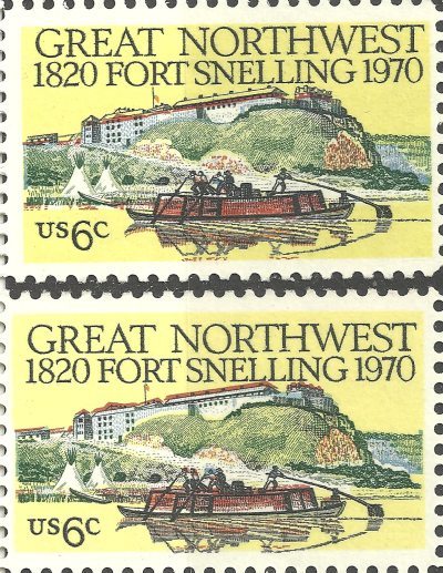
Another of the infamous Giori Press color misregistrations. I have found that a lot on the stamps of the late 1960s/early 1970s, although I must say I never looked close enough to notice the color misregistration on this particular issue.
|
Send note to Staff 
|
|
|
Rest in Peace
United States
7097 Posts |
|
|
Pillar Of The Community
United Kingdom
1187 Posts |
|
|
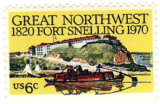
A flag halfway down the flagstaff is the correct position for a flag flown at half staff in the USA. So the position shown in the first stamp would be correct for half staff. (in the UK a flag flown at half staff would be one flag's height down from the top of the staff). This flag etiquette was originally meant to symbolise the invisible 'flag of death' flying above the country's flag.
Terry |
|
Send note to Staff
|
| Edited by Terence Collins - 09/18/2013 06:06 am |
|
|
Bedrock Of The Community
United States
12128 Posts |
|
|
Pillar Of The Community
United States
2758 Posts |
|
|
This is very cool. it is a red color shift as you see the roof lines are lower, the boat is more fully colored and the wake is below the reflection of the boat.
From the angle shown on the stamp the boat is in the Mnnesota River not the Mississippi river as many wwould believe. The channal is larger than it really is, also the river bottoms are currently wooded, however, trees may have been cleared for their resources.
|
|
Send note to Staff
|
|
|
Valued Member
United States
151 Posts |
|
|
What a great observation!  You all never cease to amaze me with your keen insights and wealth of information. This forum is all about why stamp collecting is so cool!  I'm going to check my copies of this stamp right now. |
|
Send note to Staff
|
|
|
Moderator
United States
5094 Posts |
|
|
I should point out that wt1 is completely correct in that many of the US 1960's/70's stamps show significant color shifting due to the Giori press. Most of these shifts are annoying, to say the least, but don't produce anything of interest. In this case, the Half-Staff version was noticed and didn't really affect the overall look of the stamp.
In some cases, the shift is such that an extra door or window may be created or moved significantly. Not really an error, per se, but, hey, a cheap way to collect interesting items on common stamps. |
|
Send note to Staff
|
|
|
Moderator
United States
5094 Posts |
|
|
Pillar Of The Community
Canada
1084 Posts |
|
|
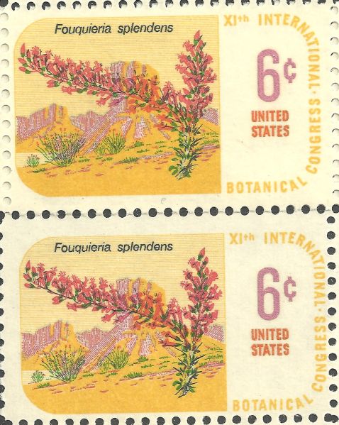
Going out on a limb here given my somewhat dated resources but isn't the stamp showing the Ocotilla plant/flower US Scott#1378 |
|
Send note to Staff
|
| Edited by cynical - 09/19/2013 09:47 am |
|
|
Moderator
United States
5094 Posts |
|
|
I think you are correct. My reference was to the Plate Block of which this is one part. |
|
Send note to Staff
|
|
|
Pillar Of The Community
Canada
1084 Posts |
|
|
Pillar Of The Community
1545 Posts |
|
|
Interesting Fort Snelling variety since the flag appears to be exactly at half mast, almost as if it were done on purpose. Mine is not at half mast. Almost makes me want to get one that is. Almost.
-IBFS |
|
Send note to Staff
|
All science is either Physics or Stamp Collecting. -- Ernest Rutherford |
|
|
Valued Member
191 Posts |
|
|
Bedrock Of The Community
United States
12128 Posts |
|
|
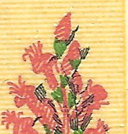
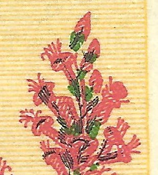
I found this interesting (an excerpt from the stamp poster that announced the stamp at post offices) ... that the stamp had to be put through the presses three times to realize the six color printing technology that was used back in the day -- first, yellow and brown; then, red and blue; and finally black and green: 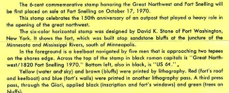 |
|
Send note to Staff
|
| Edited by wt1 - 09/19/2013 8:07 pm |
|
|
Moderator
United States
5094 Posts |
|
|
Excellent information everyone. Even my First Day Cover is "almost" half-staff. 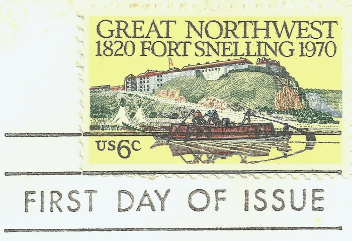 Oh well ... on to the next item ... |
|
Send note to Staff
|
|
|
Replies: 16 / Views: 4,071 |
|