| Author |
 Replies: 70 / Views: 12,926 Replies: 70 / Views: 12,926 |
|
|
|
Pillar Of The Community
United States
1942 Posts |
|
|
tbirdfour
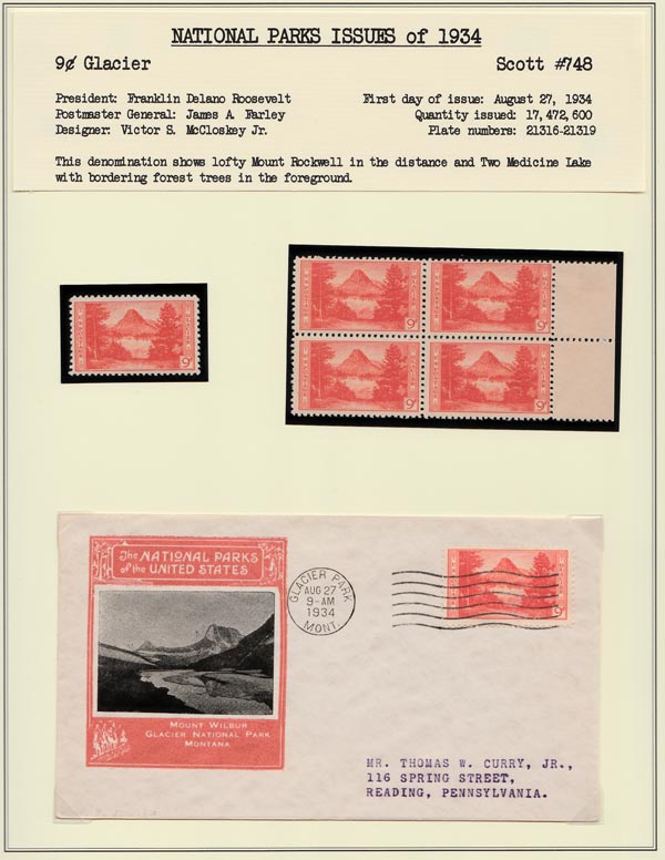
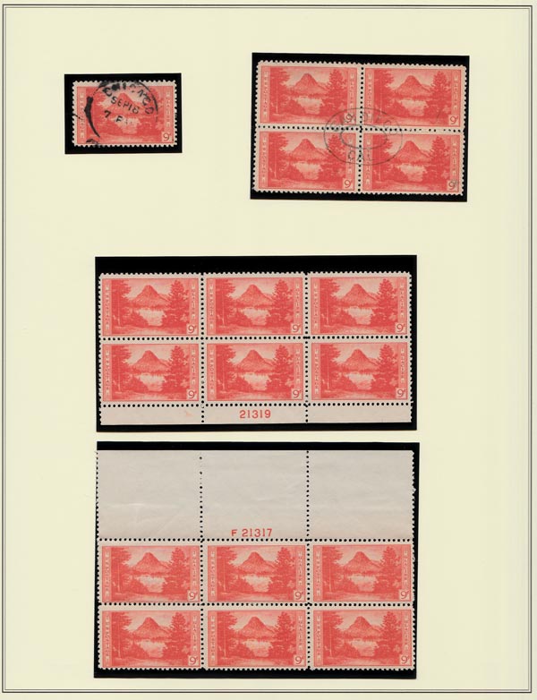
I see you have developed a standard pattern for displaying each denomination: page 1 header, mint single, mint block, FDC, [p.2] used single, used block, mint upper and lower PBs. It's a little curious that you mixed mint and used on each page, and I'm guessing that the header forced that by cutting the space available for the PBs. I realize you are rather far into the mounting, but may I make a suggestion?
Consider going to three pages per stamp, keep the mint and used separate on respective following pages, and use the first page to introduce each denomination with your writeup and the appropriate Harry Peckmore print. Another way to regain space lost to the writeup is to split it up and print it right on the pages as a header and as captions around/near the material.
Oh, and if you used the promotional flyers you seem to have for each stamp as a fourth page, you would have a display ready to be mounted in exhibition frames, one denomination per row (with accommodation for the title page in row 1). 2 1/2 frames just with the 1934 basics.
Just a few thoughts.
|
Send note to Staff 
|
| Edited by essayk - 09/01/2014 2:46 pm |
|
|
Valued Member
United States
110 Posts |
|
|
essayk,
I appreciate the suggestions but I am not looking to exhibit these at all but rather just for my own enjoyment. While I don't mind the mixing of used and mint on these pages I have kept my 1935 parks separated and in its own album.
I do, however, like your idea about using the poster print as the forth page and the Peckmore as the first of each denomination. Thank you. |
|
Send note to Staff
|
|
|
Pillar Of The Community
Canada
6525 Posts |
|
|
Well I know I'm going to sound like everyone else, but I love that issue! And you have displayed them beautifully. Well done, sir! |
|
Send note to Staff
|
|
|
Valued Member
United States
202 Posts |
|
|
Peter's words are echoed from my mouth as I type."..one gorgeous collection."
Thanks again tbirdfour!
|
|
Send note to Staff
|
|
|
Valued Member
United States
110 Posts |
|
|
Valued Member
United States
110 Posts |
|
|
At the suggestion of essayk, here is my first attempt at a new page using the Peckmore etching as the intro to the denomination. I am still not sure if I should use a mount or use the corners as I have here. Suggestions?? 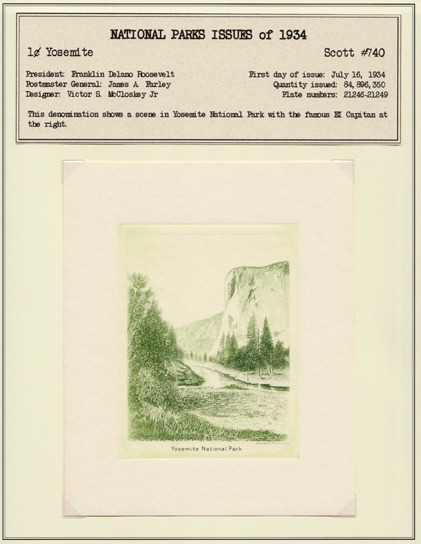 Also, as I view the pages here I can see where I need to adjust the alignment of a few items since the pages do not have any guides and I have been doing it by eye.  I guess it will just be something else to do to keep me busy with this collection.  |
|
Send note to Staff
|
|
|
Pillar Of The Community
United States
3166 Posts |
|
|
I like the Peckmore prints with the corners, gives an uncluttered look. It seems that we're never quite finished arranging pages, does it?  Good looking pages, keep up the great work! |
|
Send note to Staff
|
|
|
Pillar Of The Community
United States
987 Posts |
|
|
I think it is a matter of personal choice. One thing for sure. The corners are much cheaper than using mounts. I like the stamps in the mounts but the etching looks nice using the corners. |
|
Send note to Staff
|
I collect U.S. Singles, Se-Tenants, Souvenir sheets and Canadian Singles. |
|
|
Valued Member
United States
110 Posts |
|
|
OK, you talked me in to it! I also like the uncluttered look the corners give the page. So now the rest will get this same treatment.
Thanks. |
|
Send note to Staff
|
|
|
Pillar Of The Community
United States
1942 Posts |
|
|
The corners look fine, so if they work well holding the print in place, then stay with them. However, unless you are putting your pages into some kind of plastic sleeve, the surface of the print needs to be protected with something. When I mount die proofs I run into the same problem, and for those I use two opposing jumbo corners and with my x-acto knife I cut up a page protector to get a film of plastic the same size as the proof. This I slip into the corners on the proof/print once it is mounted on the page. That gives it just a bit more abrasion protection. Not needed perhaps if you are putting your pages in Mylar sleeves, but very important if you are not. For long term keeping the use of the plastic insert will get around the problem of "corner burn."
By the way, those Peckmore prints look like they were just made for your method of presentation. Looking good!
Oh, I almost forgot to mention: the reason I use jumbo corners is that they are deeper and help keep the plastic insert from slipping out. You need a heavier gauge of plastic if the prints are very large. |
|
Send note to Staff
|
| Edited by essayk - 09/03/2014 6:54 pm |
|
|
Pillar Of The Community

United States
856 Posts |
|
|
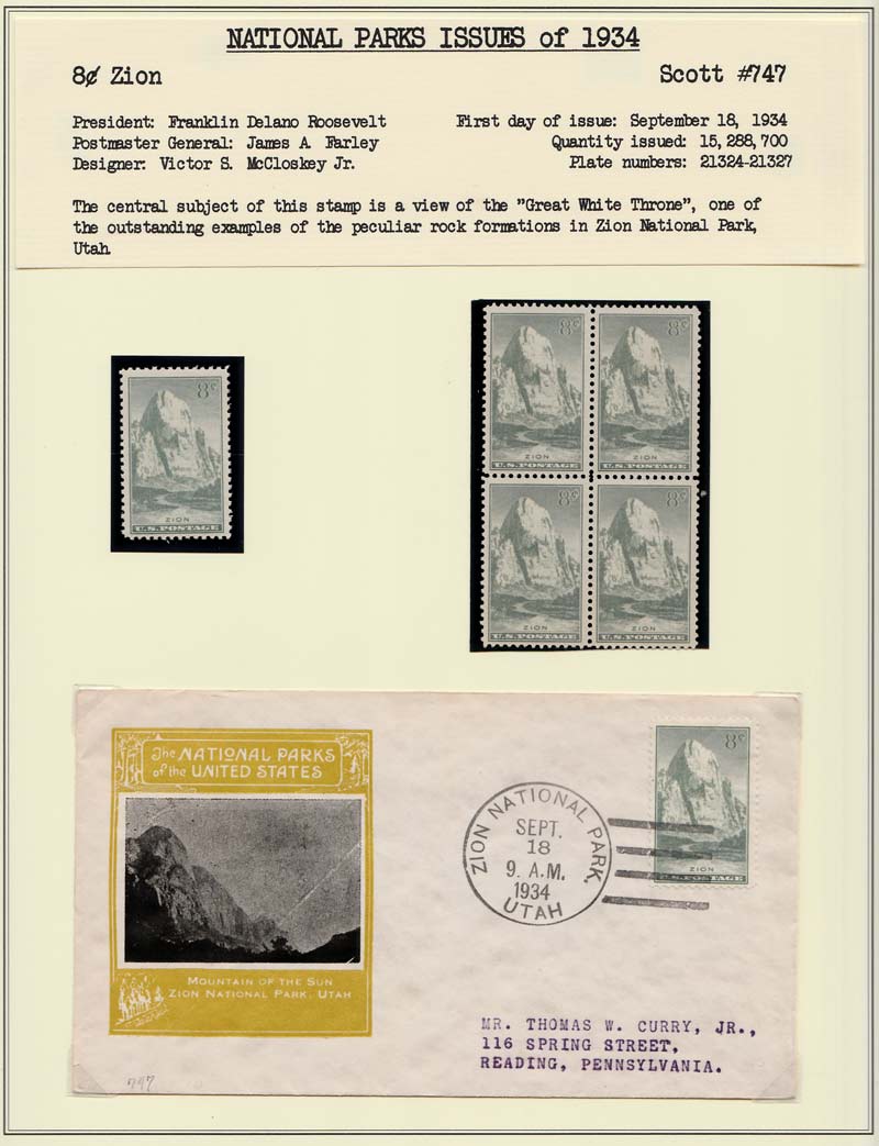
tbirdfour, your 1934 Parks collection is marvelous. Add my name to the list of admirers. I love how you've taken a set that almost everyone has and taken it to a new level. They're all great, but my favorite page is the opener, with the whole set on one beautiful cover. |
|
Send note to Staff
|
|
|
Valued Member
United States
110 Posts |
|
|
Thanks rustyc, and everyone else for the kind comments. While it has been not quite a year since I decided to have an extended 1934 National Parks collection, as well as the1935 set, it really has been a lot of fun hunting everything down and then figuring out how I want to display them. The only other set of stamps that have been as much fun is the Overrun Countries set I put together last year. But then these are never really done, are they?  |
|
Send note to Staff
|
|
|
Pillar Of The Community
1918 Posts |
|
|
Perhaps you could also include information about the engravers :
Vignettes :
Joachim Clarence Benzing (1880-1970) : 1ct - 3cts - 7cts
Louis Sartain Schofield (1868-1936) : 2cts - 6cts - 10cts
Carl T. Arlt (1889-1958) : 4cts - 5cts - 8cts - 9cts.
Lettering :
William B. Wells (1874-1942) : 1ct - 2cts - 3cts - 5cts - 9cts.
Edward H. Helmuth (1891- ?): 4cts - 10cts.
Donald R. McLeod : 6cts - 8cts
7cts stamp : Lettering engraved by Edward H. Helmuth and Donald R. McLeod |
|
Send note to Staff
|
|
|
Valued Member
United States
110 Posts |
|
|
Quote:
Perhaps you could also include information about the engravers I knew there was going to be more work to do!  Thanks for the info Jorge, it will really add to the presentation. |
|
Send note to Staff
|
| Edited by tbirdfour - 09/05/2014 8:07 pm |
|
|
Valued Member
United States
110 Posts |
|
|
Replies: 70 / Views: 12,926 |
|