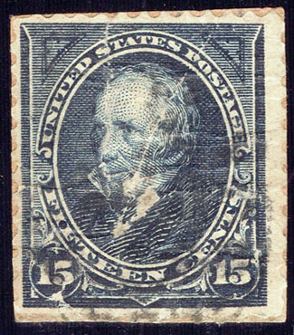
The only 15 cent Andrew Clay, dark blue 259 I have. It has seen better days, I imagine, but after looking more closely, I wonder were it's better days not so good due to a poor print job?
I'd like to learn more about ink flaws, folds (as I did on the wrapper thread posted earlier), etc. I see this 259 as an opportunity to do that.
What I think I see is the white line of creases, after it was put on the cover. The perfs are mostly there, and the alignment isn't
too bad. The cancel is difficult to make out, with the naked eye, and I will spend time attempting to bring it out more, when I get the chance. It does not appear to be part of the possible ink flaws, I see.
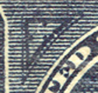
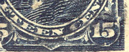
Right above the top line of the upper left triangle, are two dots. In the lower right corner, near the number 15 there's is a very dark line of ink. This appears in a couple of other places on the stamp, as well.
Those are the most obvious, there are other flaws, and I don't know if it was because this stamp, it appears, might have been left in the rain, due to a hole in the recipients mailbox, before the cover was brought in the house, or if the flaws happened, before it left the printers.
Being new to stamp collecting, I have concentrated on identifying the stamps and the cancels, in order to organize what I have. I would appreciate any help, links, or other similar photos of these type flaws, to learn more about what it is, what it matters, and how to discern the flaws that do matter, as opposed those that don't, if that makes any sense.
Thank you for taking the time to read, and offer any comments.