chipg's stamp with the black and white levels adjusted (not much of a change) is in the middle. My #10 identified by date from it's attached letter is on the left. Original, non-adjusted chipg stamp on the right:
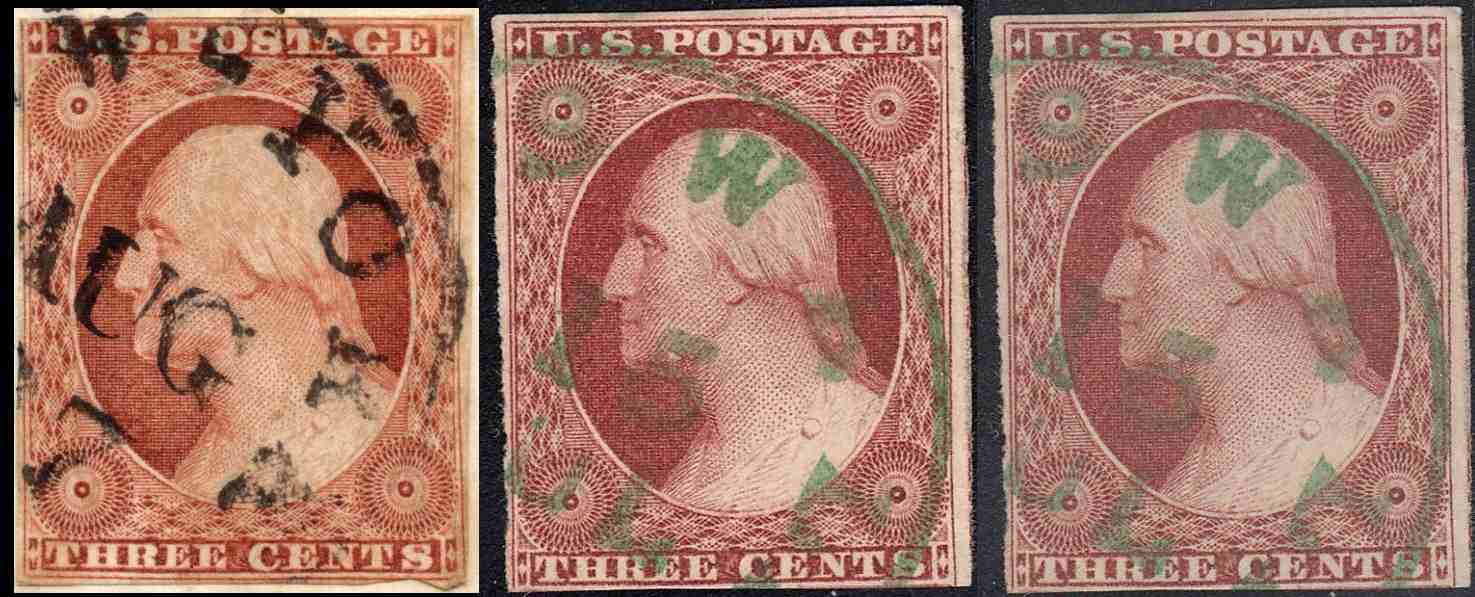
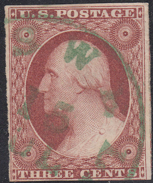
People much better at these than I am tell me that mine is an unusually pale printing. To me,
the color is close enough and has the detail necessary to make it a #10. Setting the color levels will make an image more accurate to true color, but isn't as accurate as scanning the two stamps at the same time.
I'm still not educated enough to give a plate that it likely came from. It is a beautiful stamp and I do love green CDS.
-Edit: Ignore my color comments above. I sometimes work with my monitor's brightness turned down very low. Now that it's at a more appropriate setting, it does appear to be the wrong color. However, it is a very detailed printing.