| Author |
 Replies: 24 / Views: 5,701 Replies: 24 / Views: 5,701 |
|
|
|
Rest in Peace
United States
763 Posts |
|
|
Well, a quick look of those listed on ebay is very interesting, bacause I can see how the colors are very deceptive. For example, there are several with my own certs that do not look even remotely dark blue! Then I see a number from sellers that I know manipulate their scans to lighten or darken a stamp as they think needs to be done. But the one that looks the closest (there are actually a few others that might be real 63b) is this one, which is a real bargain despite the awful condition if the real color looks like it does on this scan; http://www.ebay.com/itm/US-1860s-Ci...em5406784ee7 |
Send note to Staff 
|
| Edited by Bill Weiss - 01/12/2015 8:08 pm |
|
|
Pillar Of The Community
United States
1945 Posts |
|
|
So, which of these is a #63b? The two at the ends are the same stamps as in my earlier post, the one on left being ultramarine, and the one on right normal blue. Of the two in the middle, the left stamp is the one in the ebay post Bill linked us to. I think the seller was convinced it is a 63b and had set the tone a bit low to make it appear so. What do you think these are? Should I return the stamp sold as 63b? Should I send the stamp in question (2nd from left) to Bill Weiss for an okay? 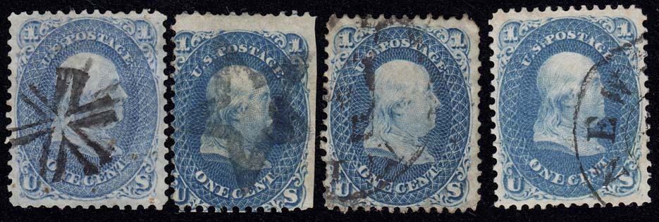 |
|
Send note to Staff
|
|
|
Pillar Of The Community

United States
1272 Posts |
|
|
I'm a bit confused. The 63b you've posted (2nd. image), same as the one Bill posted, but definitely not the same shade/tone on the two images (your posting and the sellers posting), isn't as dark blue as the one I posted (on my monitor, the color is pretty much exact to the actual stamp), which Bill says isn't a 63b? It would be good to see what his opinion is with that 63b in hand I suppose. If Bill says it isn't a 63b, I'd send it back. And, I'm still not completely sure of what ultramarine is on this issue.  |
|
Send note to Staff
|
|
|
Pillar Of The Community
United States
1945 Posts |
|
|
Here is a one cent page from an 1861-68 exhibit by Rich Drews at the Collectors Club of Chicago website.  This shows you the shades side-by-side in a single scan, so the comparisons are relative to one another rather than to an external standard. That is as good as we can do when not looking at the same screen. Here's a larger view of the top row: 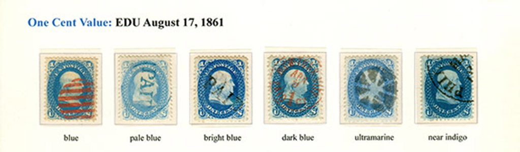 |
|
Send note to Staff
|
| Edited by essayk - 01/21/2015 12:11 am |
|
|
Pillar Of The Community
United States
1945 Posts |
|
|
Al, the confusion you speak about seems to come from Bill W's comment that he has yet to see a 63b in the thread. But note that in his next post he admits that trying to judge these by the scans is a road to deception. As you observed, if he had the stamp in hand he could be sure. I've been suggesting that is true for the item he liked, which I bought and posted here, and for your item as well.
That said, I am also inclined to wonder what he would make of the "dark blue" versus "near indigo" shades that Rich Drews exhibits. Given the catalog descriptor "dark blue," are both of these shades versions of 63b? To my eye the "near indigo" shade has a tad more green in it than the "dark blue," and in both cases the paper itself appears slightly toned. My hunch, based on his earlier comment about the "almost indigo" nature of the real 63b, is that Bill was looking for something with a bit more green in it than what was appearing.
As for ultramarine versus pale blue, note that the pale blue has less color density (chroma) than the ultramarine. Also make note that for Scott 63a the catalog also lists a "dark ultramarine" variant, so that on stamps this hue is not entirely uniform in its value. Nonetheless, there is a difference between the hue of ultramarine and that of the kind of blue most typical of the one cent of 1861. Some have said that ultramarine, which was originally derived from ground lapis lazuli, has a bit more violet in it that a more basic "Prussian" blue. To me it presents a more "milky" appearance than blue of the same color intensity.
Ach -- trying to write this is convincing me yet again of the futility of trying to reproduce a sense of color in words. Study the shades on Rich's page and tell me how you would describe these relative to one another. |
|
Send note to Staff
|
|
|
Rest in Peace
United States
763 Posts |
|
|
Quote:
What do you think these are? Should I return the stamp sold as 63b? Should I send the stamp in question (2nd from left) to Bill Weiss for an okay? Now it does NOT appear to be dark blue - one of the big dangers of buying stamps by color shade from online scans. If it really looks like it appears here, I would return it. And on Rich's page I do consider both the "dark blue" he shows and the "near indigo" as being "dark blue". I do not consider "near indigo" to be a valid word description of that shade by an expert service because the color "indigo" has been removed by Scott as a #63 variant shade. And I could be wrong, but I suspect that it was concluded that the "near indigo" is really a variant of "dark blue" rather than deserving of it's own listing, so was removed. Now that doesn't mean that a specialist shouldn't be interested in the "near indigo" as a legitimate variant that he wants for his collection and identifies it as he sees fit, which is what Rich has done. |
|
Send note to Staff
|
|
|
Pillar Of The Community
United States
1272 Posts |
|
|
Stephen, I pulled up the exhibit on the Collectors Club site and studied it and this is how I would describe what I'm seeing (not the least bite scientific in terminology):
1.) I'll assume, for the images posted, that this is the "control" example for a standard blue #63. 2.) Pale Blue: I'd say its sort of a washed-out blue, more of a "sky blue" color, as if its on the opposite end o the blue spectrum for the control blue 3.) Bright Blue: More intensely blue in color, very dominate, brighter blue 4.) Dark Blue: A much darker blue that the "control", but less intense in pure "blue" than the Bright Blue #3, as if perhaps some other color has been added to darken the ink mixture? 5.) Ultramarine: Darker than the Pale Blue #2,but still somewhat muted, duller, or yes, milkier in appearance. A much "lighter" but duller blue shade 6.) Near Indigo: Very rich, deep, dark bluer shade than the Dark Blue #4. On the image shown, the paper outside the design appears to have a bluish tint as if the printing was over-inked. To me, this is more true to Dark Blue, but certainly can just be a different "shade" in the "Dark Blue" family.
You are very much correct in you assessment about putting color perception as one see it into words. I've tried, but it still doesn't seem quite adequate. Thanks for your help!
Dave
|
|
Send note to Staff
|
|
|
Pillar Of The Community
United States
4111 Posts |
|
|
"the paper outside the design appears to have a bluish tint as if the printing was over-inked"
This will have an effect on your perception of the ink color.
"and in both cases the paper itself appears slightly toned"
Again, this will have an effect on your perception of the ink color.
Also the fact that some of the stamps have red cancels, one has a blue cancel and others have black cancels will affect your color perception. |
|
Send note to Staff
|
|
|
Pillar Of The Community
United States
1945 Posts |
|
|
As long as we are mentioning the intricacies of the perception of color, let me note something that Rich Drews told me in my recent chat with him about some color examples I had him eyeball. He said that when he is doing serious color matching, he keeps an 18% grey card (Kodak used to make and sell) at hand so that he can "zero set" his eyes between peeks. That might seem a bit extreme to some, but "color memory" can wreak havoc with the comparison of close shades unless something is done to break up the pattern.
The color temperature of the lighting also matter a great deal. The engravers of the 19th century had windows in their studio for North lighting in their workspace. It became a standard, and that carried over into photography to establish the "daylight" standard at 5600 degrees Kelvin. Tungsten lighting (remember that) was 3200 degrees Kelvin, and light sources and film emulsions were designed according to these two standards. Today the bonds of film have been broken and light sources are all over the chart when it comes to color temperature. So when making comparisons of stamp color, do everything you can to quantify your data, starting with a light source having a color temperature close to what was used in making the stamp(s) in the first place. North light on a clear day - 5600K. |
|
Send note to Staff
|
|
|
Replies: 24 / Views: 5,701 |
|


