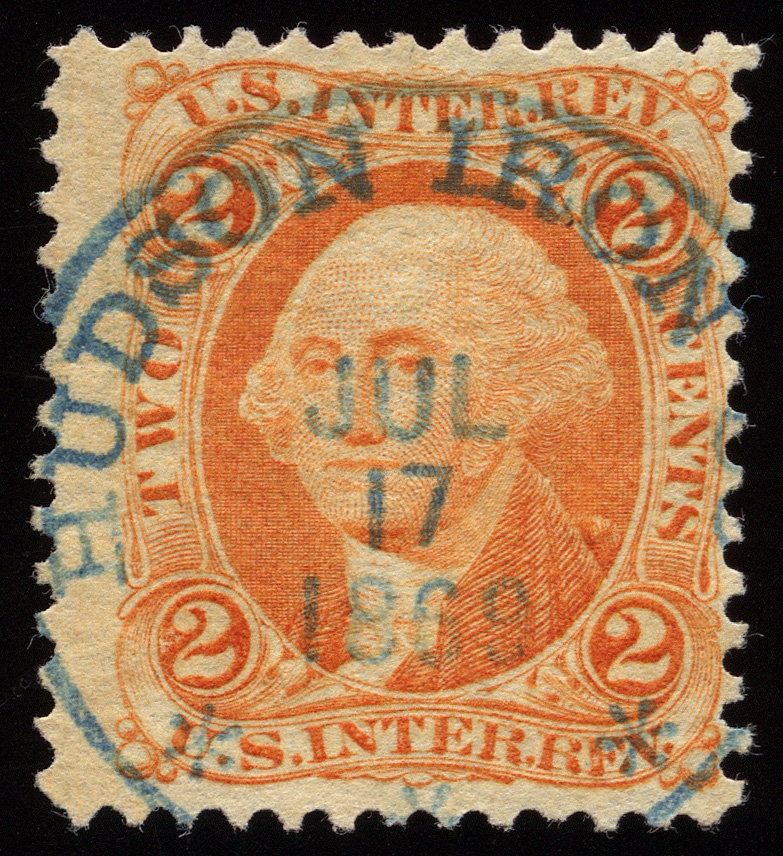
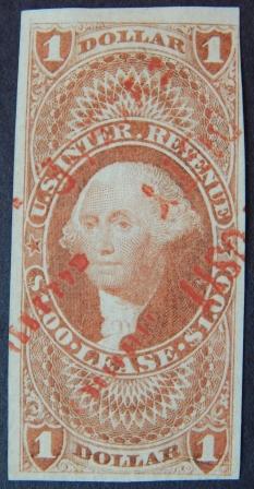
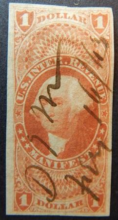
A bit late to the party, but yes, that R89 set all sorts of alarm bells in my mind when I first saw it. Narrow margins, late cancel, vivid red-orange color. It takes a while, but you learn to recognize which ink colors are indicative of early vs. late printings.
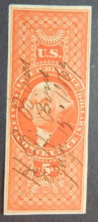
Regarding scanning stamps, I always scan the stamps for my site against a solid black non-textured background. Not gray, and not a stock card with texture.
In fact, for expediency purposes, I took a black plastic approval card and taped it to the back of a block of wood. I put the stamp face down on the scanner glass with the block on top and the scanner lid open.
This accomplishes a number of goals:
1. No plastic or glassine between the stamp and the scanner glass. Every layer between optics and the stamp potentially produces distortion, glare, or skews color.
2. Stamp is weighed down by the block to be made perfectly flat. In my experience, this does a better job than the scanner lid, which can have padding.
Example: