| Author |
 Replies: 9 / Views: 1,750 Replies: 9 / Views: 1,750 |
|
|
Pillar Of The Community
United States
791 Posts |
|
|
Since these tests seem to be popular, let's do another one. Rather common RD25 but................ 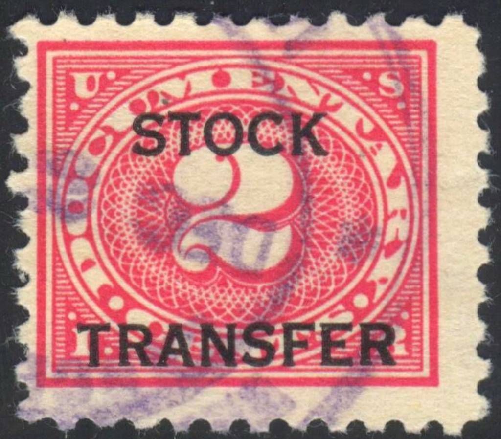 *** Edited by Staff to clarify topic title. Titles are important! *** *** Edited by Staff to clarify topic title. Titles are important! *** |
|
Send note to Staff
|
|
|
|
|
Pillar Of The Community
United States
3212 Posts |
|
|
Although I can find no listing for it, this appears to be an overprint variety, a dropped S in STOCK. |
Send note to Staff 
|
|
|
Pillar Of The Community
United States
791 Posts |
|
|
Pillar Of The Community
United States
3212 Posts |
|
|
Took the hint and looked at the rest of the 1928 Offset Printing, #'s RD27a is an inverted overprint and RD28 has an un-lettered variety, a double impression of the stamp. But am still unable to see anything except the dropped S in the overprint of RD25. |
|
Send note to Staff
|
|
|
Pillar Of The Community
United States
791 Posts |
|
|
Answer: The lines are 9.5 mm apart.
Unlisted on RD25.
Others that are listed by Scott are:
RD3d 10 mm apart
RD4a 7 mm apart
RD27b 9.5 mm apart
These are listed by unpriced.
Which brings us to the next question...how important are these minor listings? I'm sure if they were postal issues as opposed to revenues, collectors would be actively seeking such varieties.
Any thoughts? |
|
Send note to Staff
|
|
|
Pillar Of The Community
United States
3212 Posts |
|
|
I thought about the spacing between the lines, but had no way to measuse the image, or any visual reference as I don't collect Revenues.
I do have a small collection of the 1875 Special Printings of Departmental Stamps. There were several errors in the overprintings of those stamps with the word SPECIMEN, which are listed as minor numbers and I do actively seek out those varieties, just as I do with the U.S. Banknote varieties.
The SPECIMEN overprint has a dropped S like I noted on your stamp, also not listed. |
|
Send note to Staff
|
|
|
Bedrock Of The Community
United States
10669 Posts |
|
|
There were billions of these stamps issued, minor differences in spacings are to be expected and I seriously doubt that any are uncommon. Also, that is not a "dropped S" All the letters of "stock" are even at the bottom, it is simply marginally thinner than some other S letters on other stamps. This series was used from 1917 to 1940 and there were many millions of transactions needing revenue stamps every year. Anyone with a decent quantity of any of the low values and a 10X glass will find very minor differences if they look for them. |
|
Send note to Staff
|
|
|
Pillar Of The Community
United States
791 Posts |
|
|
Revcollector,
That is true. The real question though -- do they warrant an actual separate catalog listing?
And how much of a variation would justify a "listed variety"? |
|
Send note to Staff
|
|
|
Bedrock Of The Community
United States
10669 Posts |
|
|
No listing unless the difference is at least one full letter height, perhaps 2mm. With all the plates needed for the lettering over the decades minor differences are sure to occur, so unless it's a major difference it has no importance in my opinion.
|
|
Send note to Staff
|
|
|
Pillar Of The Community
6341 Posts |
|
|
The Scott Specialized catalog is certainly not the end-all list. Minor varieties like this show the value of the specialty societies through their journals and detailed catalogs. This is the type of variety I would expect to see written-up in the American Revenuer with much more research on othe measurement differences on this and the other denominations - a thorough study of the entire issue, rather than one lone stamp. Then it might make it into Scott. |
|
Send note to Staff
|
|
| |
Replies: 9 / Views: 1,750 |
|


