| Author |
 Replies: 13 / Views: 298 Replies: 13 / Views: 298 |
|
|
Valued Member
145 Posts |
|
|
As shown in the photos, it's clearly the same blue green found on the Victoria & KEVII 1/2d, and not a mere "dp green" found on the sg238. Is the 238 also know to have a "dp blue green" variety? The paper is also quite opaque. I normally have no problem spotting the wms on GB, but for this one I can't even see it when held to the light. 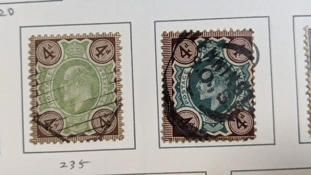 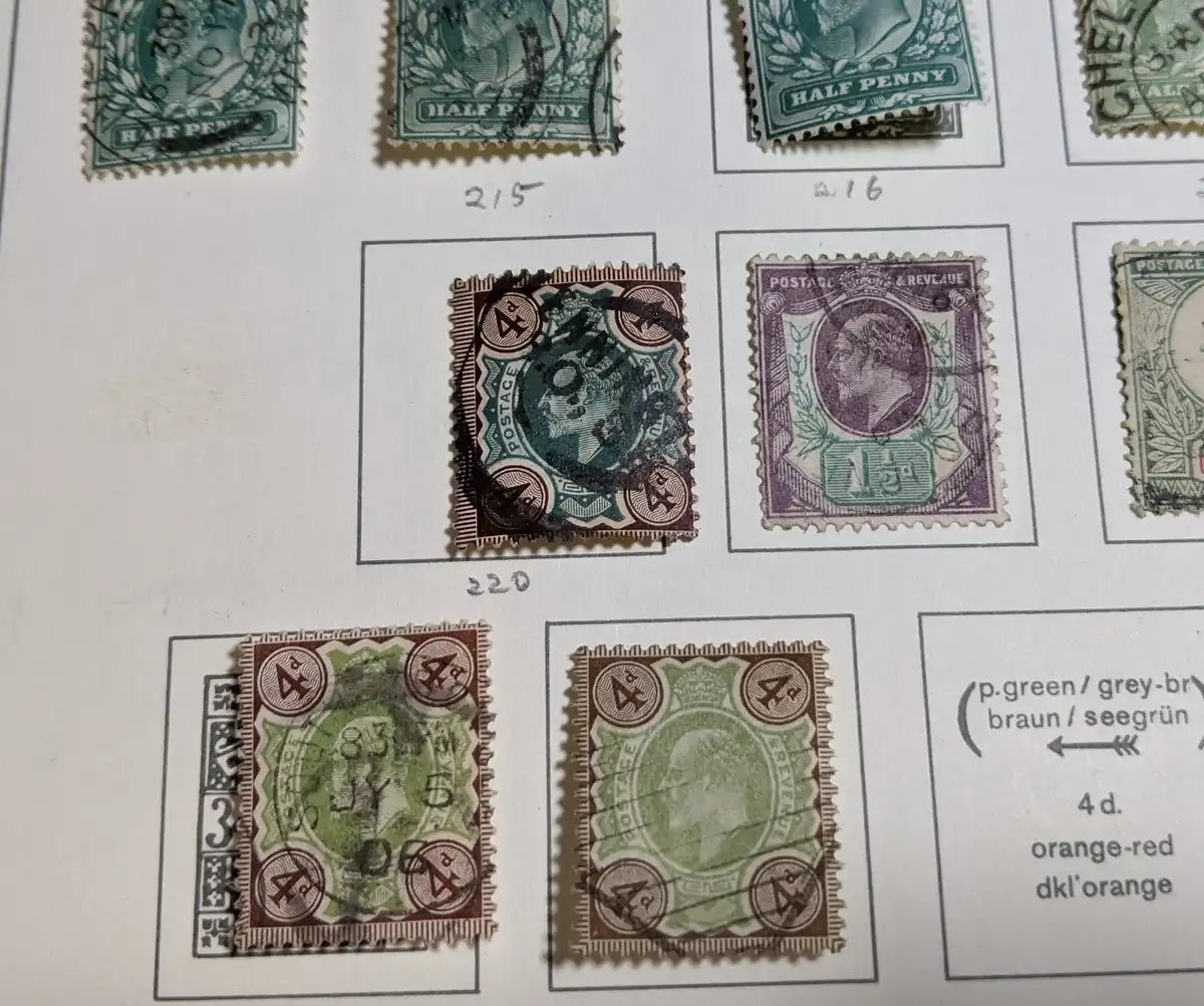 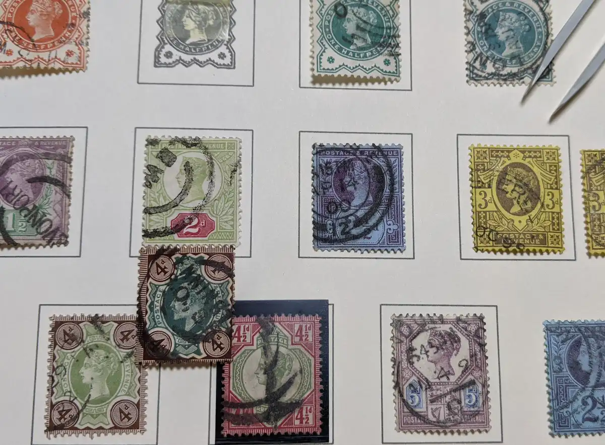 |
|
Send note to Staff
|
| Edited by solomons_prayer - 08/25/2026 11:53 am |
|
|
|
|
Valued Member
145 Posts |
|
|
For reference, the second photo shows #235 and #236 underneath, and #224 on the right which is bluish green on chalk surfaced paper. |
Send note to Staff 
|
|
|
Pillar Of The Community
Netherlands
6626 Posts |
|
|
It is a very deep green within the SG 238 shade band. Not even close to the Jubilee one. |
|
Send note to Staff
|
| Edited by NSK - 08/25/2026 12:41 pm |
|
|
Valued Member
145 Posts |
|
|
Thanks as always NSK. Yeah I shouldn't have included the Jubilees. Their shades don't come close to the complexity found in the KE series. But man, I've been comparing this with my ½d's, and the color (rather than the shade) looks way closer to the blue/green variants than any kind of deep green shade I could possibly imagine. At this point, I don't see how this shade variant "very deep green" couldn't also fit into the blue/green category. 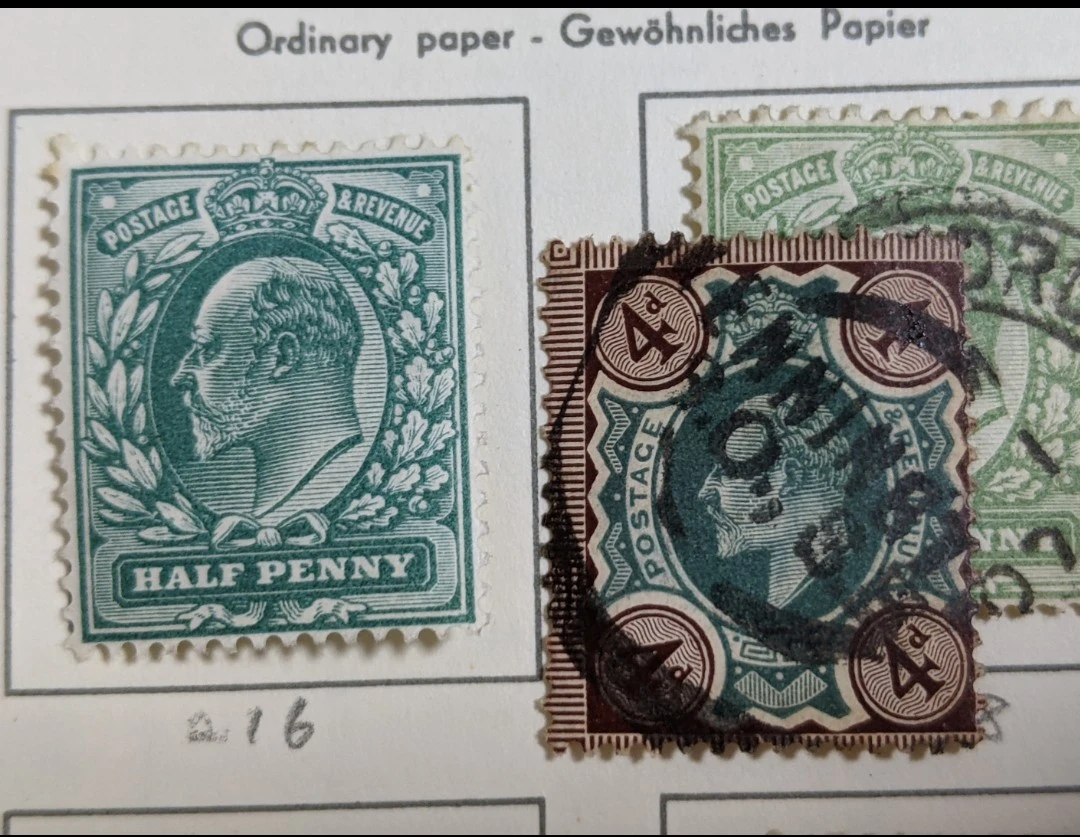 |
|
Send note to Staff
|
|
|
Pillar Of The Community
Netherlands
6626 Posts |
|
|
It is not a bluis-green shade at all. You are comparing the deep green colour to the yellowish green colour and concluding it must be bluish green. It, in fact, is truly green. It is very different from the bluish green of the 1/2 d. that is much more bluish. Here are two DLR greens 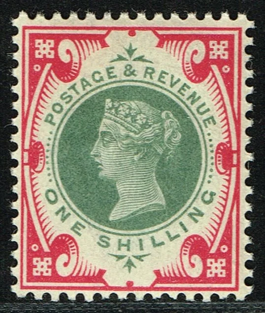 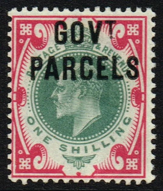 |
|
Send note to Staff
|
|
|
Valued Member
145 Posts |
|
|
Very nice! I'm not familiar with the DLR acronym. I'm assuming it's "Deep" something or other? And I certainly trust your judgement on GB, but the shade on yours and others I've seen still seem more yellowish/lighter in comparison, whereas this one looks more like a dark green on top of it being very "deep", which refers more to saturation. 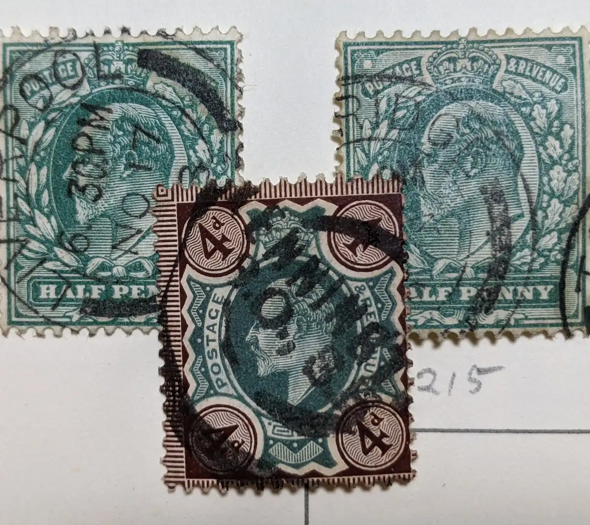 I can see how there might be slightly more blue in them as you say.. but only slightly. A difference in color isn't so obvious at all, and from a distance they're practically indistinguishable. Perhaps I'll try to locate some GBs that have a dark green color rather than a deep, intense shade of green. |
|
Send note to Staff
|
|
|
Pillar Of The Community
United Kingdom
8619 Posts |
|
|
DLR = De La Rue, the printer. Unless you're travelling around London, in which case it's the Docklands Light Railway. |
|
Send note to Staff
|
| Edited by GeoffHa - 08/26/2026 09:49 am |
|
|
Valued Member
United Kingdom
354 Posts |
|
|
DLR= De La Rue printers. The name of the colour is possibly Myrtle green- possibly! |
|
Send note to Staff
|
|
|
Valued Member
United Kingdom
354 Posts |
|
|
If you're travelling around London and you're on the DLR, you're about to lose hope in humanity. |
|
Send note to Staff
|
|
|
Pillar Of The Community
Netherlands
6626 Posts |
|
|
Deep is caused by deeper etching giving the colour a deeper appearance. And ink mixes that appear similar also are called deep. Quote:
The name of the colour is possibly Myrtle green- possibly! No!, No blue-green. |
|
Send note to Staff
|
|
|
Valued Member
145 Posts |
|
|
Quote:
DLR = De La Rue, the printer. Unless you're travelling around London, in which case it's the Docklands Light Railway. De La Rue... Of course! My mind was on the "hue" and not the "Rue" Quote:
If you're travelling around London and you're on the DLR, you're about to lose hope in humanity. Honestly, hard to use expressions like "faith in humanity" anymore, especially when humanity's wants and desires have strayed so far from what's important, true, and actually good for culture. But Western cities are in a pitiful state all around, not only London. The DLR does look like a nice piece of infrastructure though! |
|
Send note to Staff
|
|
|
Valued Member
145 Posts |
|
|
Quote:
Deep is caused by deeper etching giving the colour a deeper appearance. And ink mixes that appear similar also are called deep. That's interesting. So there are two reasons a color could be attributed as "deep". I never thought about it that way, but the level of etching can also make a color appear deeper than as normally seen. Kind of like a computer monitor: the higher the pixel density the deeper the color. |
|
Send note to Staff
|
|
|
Valued Member
145 Posts |
|
|
And you were right about the lack of blue NSK! I pulled out this US Sc#434, which only comes in "Dark Green", and I always mistook it for a "bluish dark green". That was my mistake. The 11c has a higher density of ink (since it shows less "static"), but I think the color fits perfectly. "Dark" and "deep" could be interchangeable I suppose. 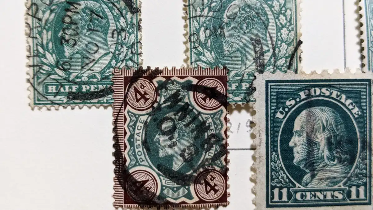 |
|
Send note to Staff
|
|
|
Valued Member

United Kingdom
217 Posts |
|
|
There's no question of depth of etching in any of the King Edward VII stamps, because they were printed by letterpress. In such cases, "deep" is just a variant of "dark". But even when "deep" would be meaningful, as in the intaglio Penny Black, in the catalogues we see "intense black", "black" and "grey black", not "deep black", "black" and "shallow black". The only case I can think of in GB stamps where the catalogues' "deep" definitely means "deep" is the photogravure 4d ultramarine / deep ultramarine, 1952-1967, where the cylinders were intentionally engraved more deeply from 1965 onwards, without any change in the ink. Similar changes to the depth of engraving in DLR definitives between 2003 and 2010 result in consistent, recognisable differences in shade, but the cataloguers don't give the shades names at all.
To determine whether a change in shade is caused by a change in the ink or by some other factor, ultraviolet light sometimes helps.
By the way, I think all your 4d Jubilees and KEVIIs except the one we're discussing are affected by water damage, which has made the fugitive green ink yellower than it ought to be. |
|
Send note to Staff
|
|
| |
Replies: 13 / Views: 298 |
|




 Posted 08/25/2026 11:52 am


