That flag with blue stripes
on each side
and the wacky tree branch-like trio of maple leafs is not very easy
on the eyes.
I, too, agree, they made a nice choice.
You can find the history of the flag adopti
on in this link:
http://canadianaflags.tripod.com/ca...roposals.htmSeems the blue stripes but resurrect itself to apease the Quebecois. Doesn't look too bad mixed with the red.
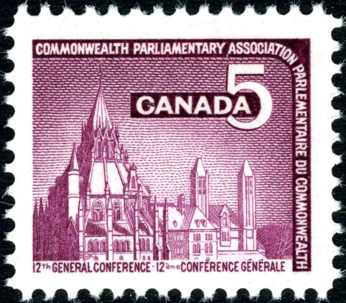
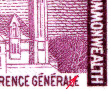
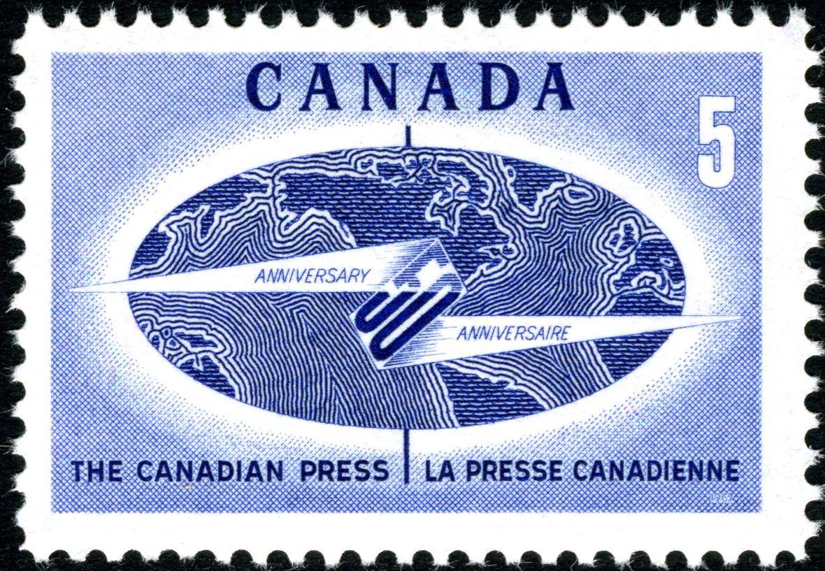
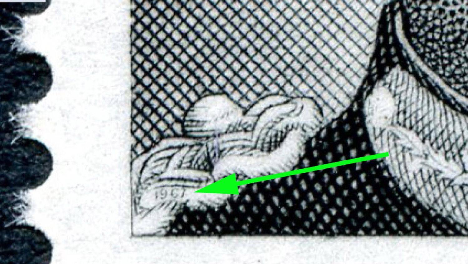
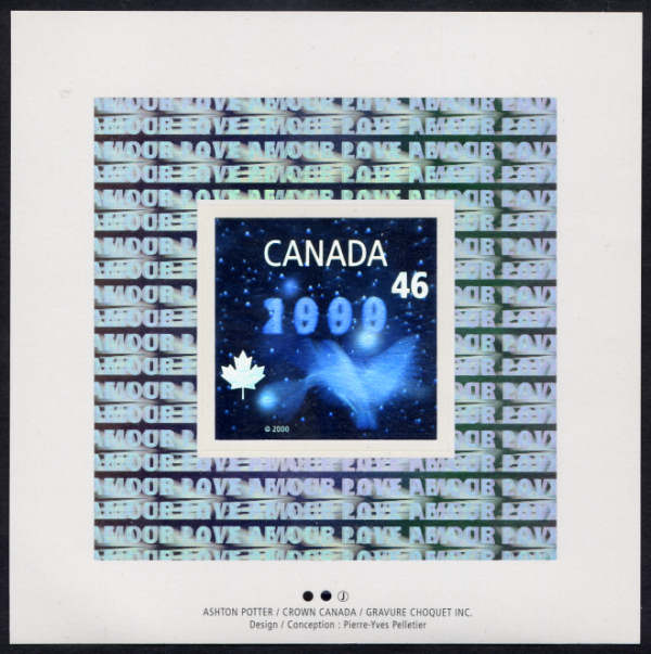
Is there any special reas
on why Canada never advertised the
designer on the lower part of the
stamps like other countries?
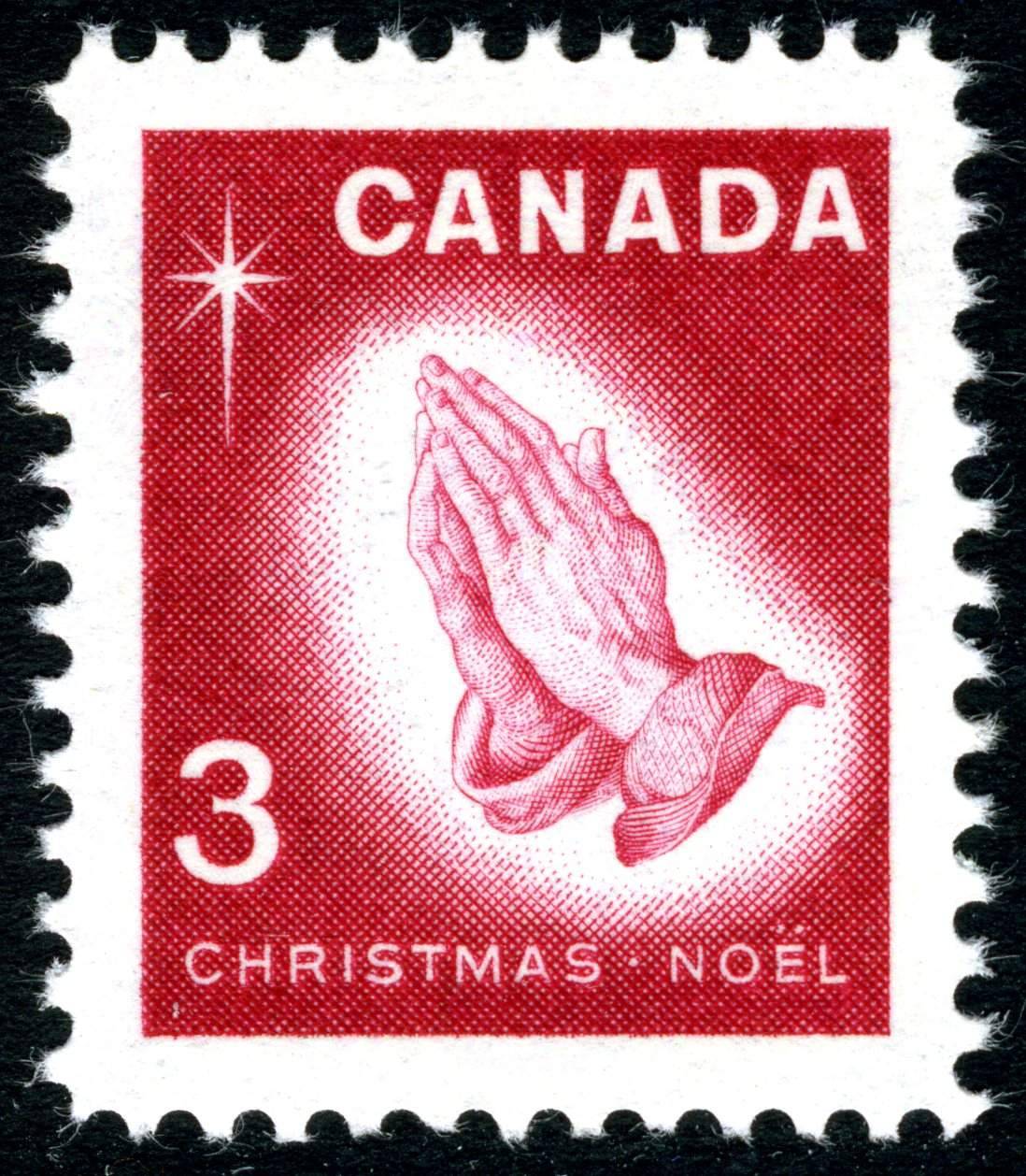
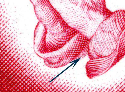
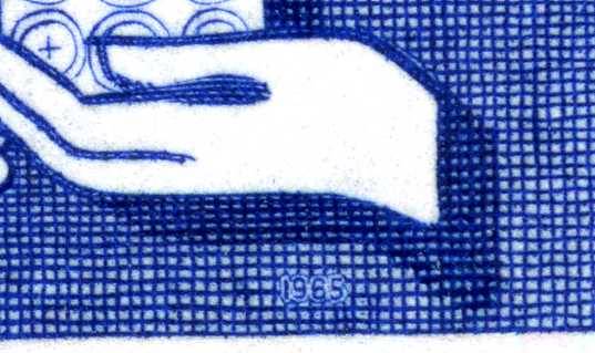
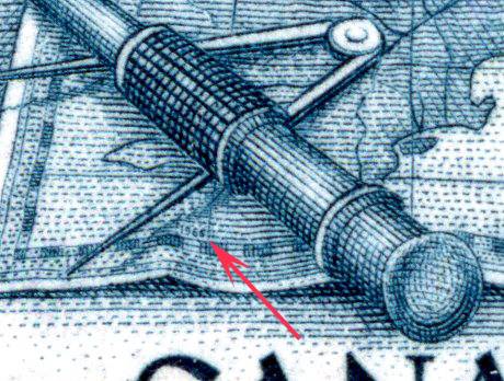
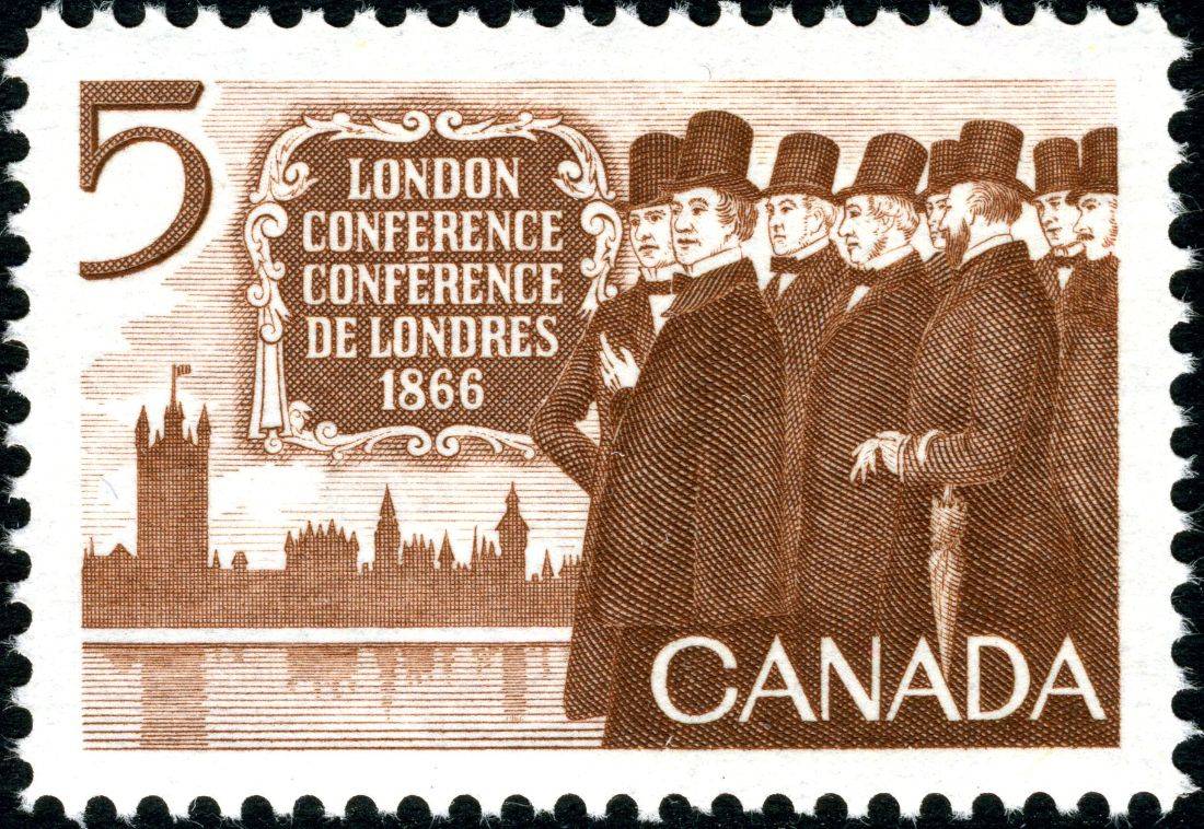
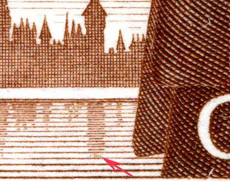
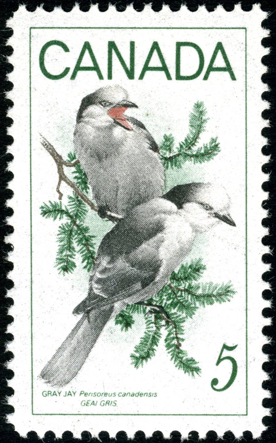
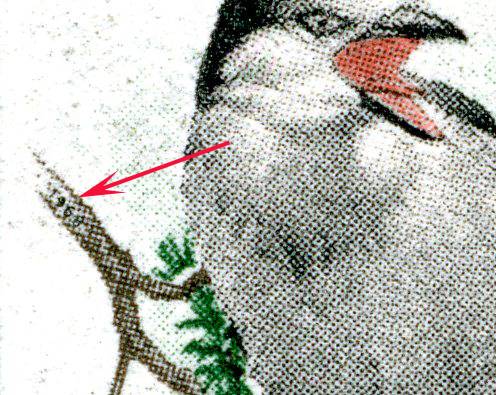
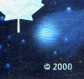
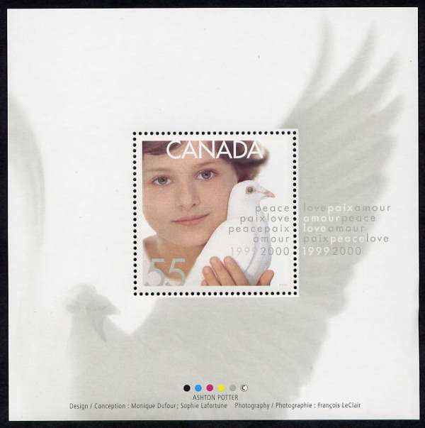
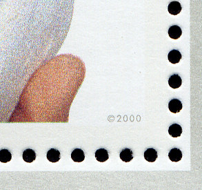
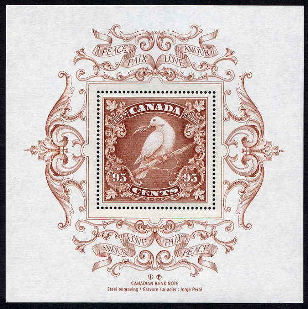
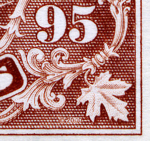
Edit: I just tried to look at the stamp Anth
ony posted in my album
and it just amazed me how big the scan can get
and how crappy my magnifiying glass is. I can't see anything with it
and even felt dizzy after trying hahah





 Posted 11/21/2010 1:57 pm