I'm frequently asked how I create the greyscale images on my site, that I have for many stamps that give a clearer rendering of the cancel itself.
In most cases I simply convert the image mode from RGB to CMYK and then isolate the channel that has the most cancel information. I then delete the remaining channels and convert to greyscale. Then I adjust the levels, brightness, and contrast, in order to arrive at the most stark representation of the cancel I can find.
However, that doesn't always work, especially if the cancel ink and the stamp ink have channels in common. For example, look at the stamp below.
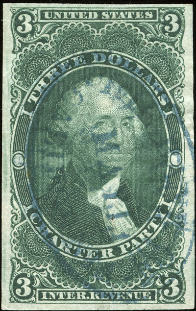
Both the green and blue have heavy cyan and yellow components. Neither CMYK nor RGB channels, or combinations of channels, really do any good. What to do?
Try converting to LAB color. Sometimes the LAB channels will pull out different information. Isolating the b channel, converting it to greyscale, and adjusting the brightness and contrast resulted in the following image:
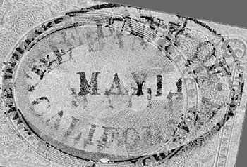
Not perfect, as the cancel was somewhat muddy to begin with, but sufficient to glean two separate strikes of "THE BANK OF CALIFORNIA".