Q: stamperix
Quote:
... but in Scott I only find "carmine", so it is still a U429 ?
Answer: Simple answer is Yes, if you are a "General Collector." No, if you are a "Specialist Collector." Scott Catalog's policy has always been to cater to the "General" Collector and leave the "Specialist" to the "Specialist Society", or in this case the UPSS.
http://www.upss.org/index.phpColor is even more complex than paper plus the paper color effects the appearance of ink (color)as. Inks always dry "darker looking" when printed on a colored paper.
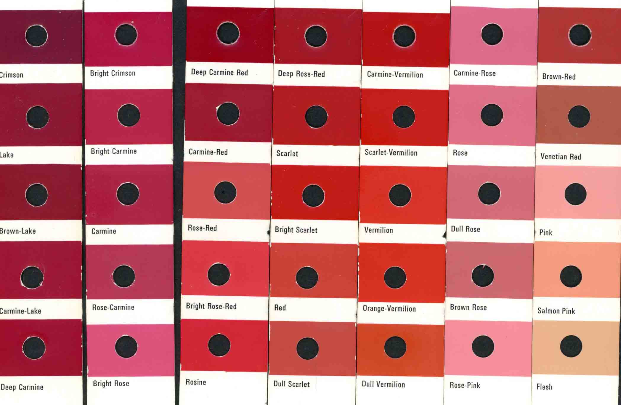
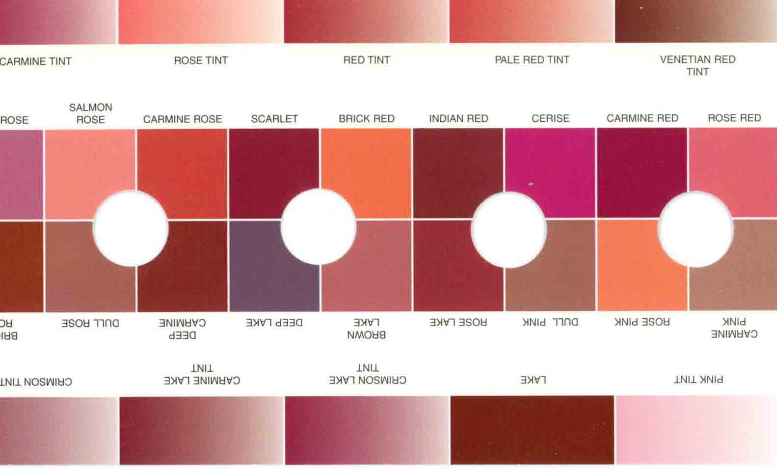
Collectors normally use color charts of the type shown below to match and ID color. The first example is the "Stanley Gibbons Stamp Colour Key" and then the "Wonder Color Gauge." . Printers use a Color Guide (see Pantone Guide) to mix and match inks. Making a "color" is like cooking. It's part C-color, part-Y color, part-M and part-K color. All color inks are made-up of a % of these color pigments: C=CYAN (BLUE), Y=YELLOW, M=MAGENTA (Red), and K=BLACK. Stir the color mix thoroughly and pour the final ink-mix into the press. This works fine in today's computerized ink creation process. However, computerized ink mixing is recent and one hundred years ago inks were made and mixed by hand and eye -- humans aren't perfect.

Quote:
Also about the manila it's more complicated than thought, as always :). So it's not enough to say "manila", but it can be wrapper or not. Could I do any research to decide if it is a wrapper or not (under loupe, watermark, if it's ribbed, paper thickness and so on)?
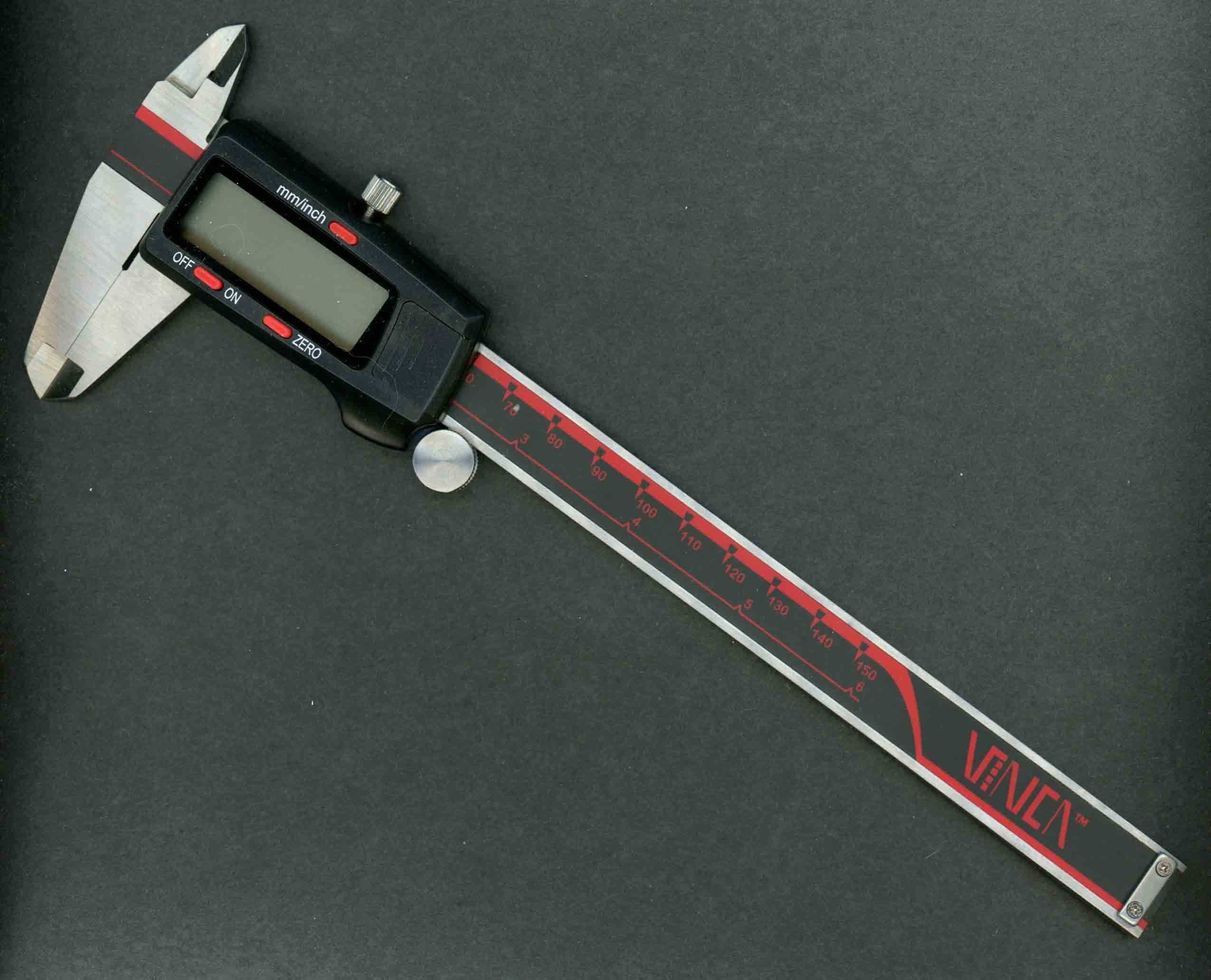
Answer: It should be the paper thickness. You will need a micrometer if I am correct. I believe the Manila Wrapper was a heavier pound-weight paper (which will mic thicker) than the Postal Stationary, however someone with samples of both would have to provide the confirmation. Sorry, I do not have samples to compare for you.
Quote:
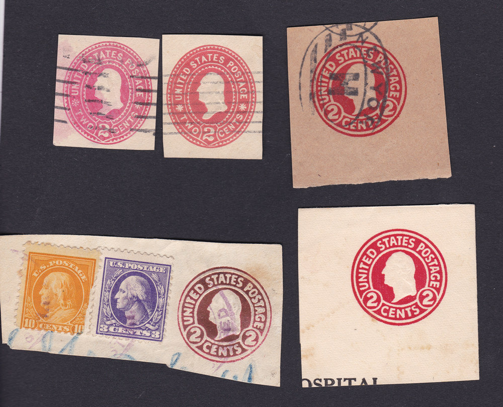
I just made a scan of those cut squares (above were photos) to get all paper types and colors in one scan. And I added another cut square which is not clear to me about the color.
The left 2 Cents is more pink or salmon than the right one?
Answer:
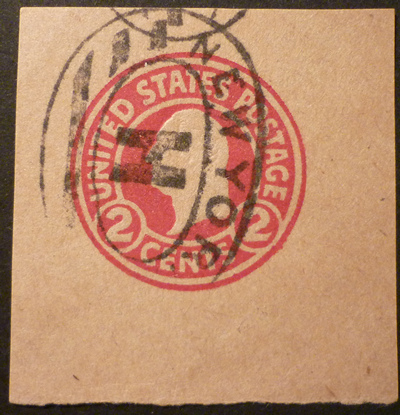
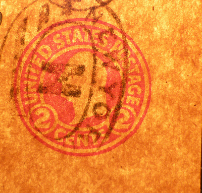
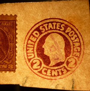
On Items I on the top line: I believe The UPSS differentiates the two colors you show in their catalogue as two different colors; I don't remember the color names but you are close in your description. The top row, middle die cut is carmine, as defined by Scott. Far left is Carmine on Manila - unglazed paper.
Here's a quick test: Hold the cut square, at the edge, between two fingers of one hand and give it the "flick test" with your finger of your other hand. Now, do the same with a different cut square. Compare several different - several times. If the Manila feels different, that makes it a heavier gauge or a wrapper. Make sure you use all "Circular Die" types when you do the test. BEST test is to mic the paper, if you have numerous cut squares.
The top row, middle die cut is carmine. The three "Circular Die" cut squares are all what Scott and defines as "Carmine". The lower left die cut color has "oxidized".
Personally, I have to shake my head over people's naming of color at The US Post Office or the Bureau of Engraving & Printing, which is where Scott's get their names for color.
Hope that helps.