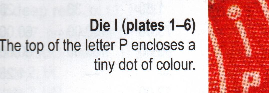
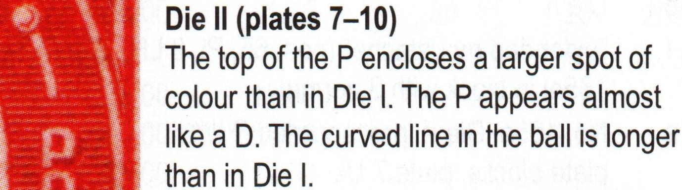
Scott says that the center of the "P" is tiny in Die I and larger in Die II. (They go so far as to say that the "P" looks more like a "D" on Die II.)
Gibbons takes a different tack: In the left-side arch, immediately above the "P" look for three horizontal lines (Die I), or four horizontal lines (Die II). Also, in the ball ornament just above the same lines, look for a line inside the main circle...it will look like a "c" on the four-line stamp, and a bit like a backward comma (,) on the 3-line stamp.
See what you can make of that...post pics, if need be, especially a detail shot showing the left arch. Someone can help.
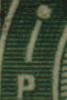
Here's the Die I & II photos and descriptions "borrowed" from Unitrade, plus a Die I closeup from my collection to show the 3 lines above "P". I have very few of the KGV stamps and no Die II's.
Hi Kirk, the easiest way that I have found is to count the horizontal lines above the head. If you don't have good eyesight, like me, you need a good magnifying glass or loupe. I also have a microscope that I sometimes use for things like that and for distinguishing typograph versus lithograph printing techniques. There are other differences, but the 4 vs 3 lines above the head is a dead giveaway. Once you have one of each type the other minor differences are noticeable. HTH Randy
Disclaimer: While a tremendous amount of effort goes into ensuring the accuracy of the information contained in this site, Stamp Community assumes no liability for errors. Copyright 2005 - 2026 Stamp Community Family - All rights reserved worldwide. Use of any images or content on this website without prior written permission of Stamp Community or the original lender is strictly prohibited. Privacy Policy / Terms of UseAdvertise Here





 Posted 04/24/2011 11:34 pm