| Author |
 Replies: 17 / Views: 3,606 Replies: 17 / Views: 3,606 |
|
Pillar Of The Community
Australia
2156 Posts |
|
|
Can anyone account for the difference in appearance between the following two Swedish stamps? Both are 10 ore stamps from the 1891 definitive series, same perf, and both were used postally in the mid-1890s. (This makes me doubt that they could have been different issues.) The first stamp, the one with the more intense colour, is coloured pink over the entire surface. What's more, the outer area contains faint lines that form an extra border or frame and so seem to be an intentional part of the design. (My scan is not hi-res enough for them to be seen clearly, but I think you will be able to tell that they're there.) The second stamp, by contrast, seems a regular issue on plain white paper. So were these two distinct issues or is the first some kind of freak? This is the two stamps I'm talking about shown side by side: 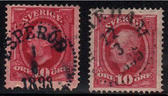 This is the first stamp on its own: 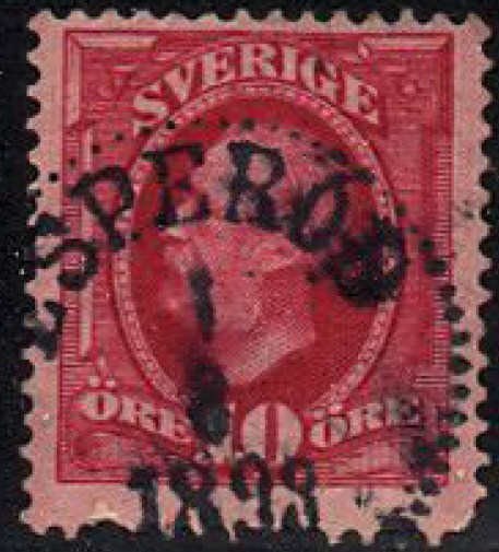 All comments and observations are greatly appreciated! |
|
Send note to Staff
|
|
|
|
|
Pillar Of The Community
Australia
2156 Posts |
|
|
I should add that the website of Swedish seller, Lars E. Ohlson, which, in the absence of a catalogue, I've been using as a guide to Swedish stamps, does not list any varieties of this issue (Facit 54). Ohlson normally lists varieties, but perhaps does not do so in the case of varieties he does not have in stock. Anyway, you can view the relevant webpage here: http://www.scand.net/en/1855_1944e.html |
Send note to Staff 
|
|
|
Pillar Of The Community
United States
2547 Posts |
|
|
jimjam, First, I know very little about Swedish stamps as I specialize in early U.S. Is the back of the stamp clean or does it show signs of in bleed? Some inks can react and bleed or run from the wrong watermark fluid and signs of this can often be seen on the back.
The next observations are based on my knowledge of U.S. printing methods and may not be completely applicable to the Swedish print methods.
1. The shade differences would be consistent with batch to batch variance.
2. The deeper color could be from over inking in the plate.
3. The margins have a motted appearance with is consistent with improper cleaning/polishing of the plate after inking. The inks used were normally oil based and had a tendency to separate into very small "droplets" on the top surface of the plate.
Regardless of the cause(s), it is a very vibrant color.
|
|
Send note to Staff
|
|
|
Pillar Of The Community
United States
6756 Posts |
|
|
Yes, it appears Mr. Ohlson only lists the varieties he has in stock. Only makes sense that way.
The FACIT catalog lists numerous color shades for Sweden #54.
The possibilities are:
54 red
54a pale carmine
54b dull brownish carmine
54c light carmine
54d rose carmine, blurred print
54e bright carmine
54f bright brownish carmine
54g carmine, strongly toned
Unlikely 54f or 54g, as they were printed in the 1900s.
54d was printed in 1894. If the cancel date is 1898, then 54d is a possibility.
There are also numerous plate varieties, including a partial set-off and a double set-off. The pic is of insufficient resolution to make a determination.
Regarding the paper, I don't know of any paper color varieties. On stamps printed with red color/shades, it would not surprise me to see color leaching through the paper during printing or during soaking of these early issues. |
|
Send note to Staff
|
| Edited by khj - 12/16/2010 02:00 am |
|
|
Pillar Of The Community
United States
6756 Posts |
|
|
I agree with the 3 points Russ has made. The batch to batch variance is well-documented. I did not include the year of printing for the color shades I listed. |
|
Send note to Staff
|
|
|
Pillar Of The Community
United Kingdom
3212 Posts |
|
|
I assume that "set-off" is just Facit's way of saying "off-set". The Swedish is "mirror print" which fits. |
|
Send note to Staff
|
|
|
Pillar Of The Community
United States
6756 Posts |
|
|
That's what I assume as well, Nigel. But I wasn't sure so I kept the FACIT term. |
|
Send note to Staff
|
|
|
Pillar Of The Community
Australia
2156 Posts |
|
|
Thanks for the contributions, everyone!
Russ, the back of the stamp is clean.
I'd call your attention to a small tear at the bottom-left of the stamp, just over the perfs, which exposes white paper underneath. The conclusion I draw from the tear is that there's a coloured layer of paper on top of a plain white one. There is no colour at all on the back and in that respect both stamps look identical.
khj, I thought the date of cancellation was 1893. I'd be surprised if the last digit was an '8' but of course it's possible. Thanks, also, for the list of varieties, though I note that there appear to be no paper varieties listed.
Anyway, I wonder if it could be a double print - that would account for the intense colour, wouldn't it?
|
|
Send note to Staff
|
|
|
Pillar Of The Community
Australia
2156 Posts |
|
|
I'd like to add that several examples of the same stamp that I've managed to find on the net have a distinctly pinkish tinge to the outer area of the stamp. Here's one I found on tradera.com: 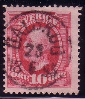 The ones I'm talking about all seem to have been cancelled in the mid-1890s. However, I haven't yet found another example of this stamp with as intense a colour or any lines in the side borders like those on my stamp. |
|
Send note to Staff
|
|
|
Pillar Of The Community
Australia
3547 Posts |
|
|
From the range of shades listed in Facit, I'd say the stamp in question appears to be the bright carmine, 54e, with some bleeding of the colour into the margins. This might be due to the mixing of the original ink or the soaking of the stamp at some point in its career. The colour in the margins looks to me to be due to the improper cleaning of the plate, as suggested by Russ.
We do need to remember that the stamp was printed in the 1890s. These chemical inks were still new, and the printers were less experienced in using them, and, who knows, the Norwegian printers may perhaps have been less scrupulous then in maintaining their printing surfaces. |
|
Send note to Staff
|
|
|
Pillar Of The Community
Australia
2156 Posts |
|
|
I found an article in The Posthorn (1954) on the new techniques used to make the Oscar II definitives. It doesn't say anything about the use of new inks, but it points out that this series of stamps was the first series to be printed by recess engraving. Excerpt: 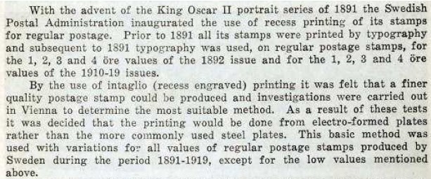 So problems with inking could have followed on from the adoption of a new, unfamiliar method. |
|
Send note to Staff
|
| Edited by jimjamtwo - 12/16/2010 07:22 am |
|
|
Pillar Of The Community
Australia
3547 Posts |
|
|
Well, there we are then. In 1890, the new coal tar-derived synthetic inks were still fairly new, and the specific inks for recess printing would have been completely new to the Swedish printers. Combine that with the new printing process, and it's hardly surprising the printers had the odd quality control problem.
Wonderful the odd corners philately leads you into! |
|
Send note to Staff
|
|
|
Pillar Of The Community
United States
6756 Posts |
|
|
Quote:
khj, I thought the date of cancellation was 1893. I'd be surprised if the last digit was an '8' but of course it's possible. I thought it was 1893 at first glance, also. So my original post stopped the list at 54c. Then I looked closer, and wondered if it was a poorly stamped 8. I checked my SON Sweden for that time period. On all my cancels, the 3 is very very clear while some of the 8's and 9's tend to be a bit chubby and incomplete, similar your cancel. That is why I put "If the cancel date is 1898". I probably should have broken it up into 2 posts instead of editing the original posts. If the cancel date is 1893, then the only color shade possibilities are 54-54c. |
|
Send note to Staff
|
|
|
Pillar Of The Community
Australia
2156 Posts |
|
|
Pillar Of The Community
United States
6756 Posts |
|
|
Looking at a sampling of the Sweden cancels I have for the 1890's, the shape of the 3 varies among the different city cancels. However, in general, the lower up-curl of the 3 doesn't go up that high. I see variations in the 3 and the 8 in which the top "oval" can either be the same size or smaller than the bottom oval. However, I am not a cancel collector, so those are only my subjective observations. Again, that is why I said "If the cancel date is 1898". In general, however, all the "3" cancels I see are pretty clearly 3, whereas the 8's and 9's may either be clear or of varying thickness/completeness. This is from one of my earlier stage WW collection; it is a smaller sampling of cancels. The Sweden pages from my current WW collection are missing -- I remember pulling them to do some major sorting a couple years ago. I must have not put them back and they are hidden in one of my "working on" boxes.  |
|
Send note to Staff
|
| Edited by khj - 12/16/2010 6:30 pm |
|
|
Valued Member
United Kingdom
278 Posts |
|
|
I've got 8 of these stamps in my album, in a range of tones. Two look like the "white paper" one on the right of Jimjam's scan, while the other 6 have an overall pinkish tone to the paper - including one clearly cancelled 1898. (Sorry, can't scan as I have a technical problem.)
I did my album page using the SG specialised from the library, but don't have it here - but I think that SG did not include any colour diffs (which is crazy, as there are clearly several!).
But I am sure that SG would have listed different paper types.
So I agree that it's probably from limited quality control, with the combination of a new printing method (recess) and early use of synthetic inks. |
|
Send note to Staff
|
|
|
Replies: 17 / Views: 3,606 |
|


