| Author |
 Replies: 45 / Views: 7,374 Replies: 45 / Views: 7,374 |
|
|
|
Rest in Peace
Canada
6750 Posts |
|
|
Regarding the Nova Scotia spray cancel, I usually can get a pretty good, readable cancel here. Some mail has that 'speedy' cancel, the pushing the envelopes through the machines too fast type of look that I get but most from Canada are readable. Perhaps that is mor ephilatelic mail though.
It does seem that the cancel has been printed on with less ink but also seems to be skewed sideways due to moving too fast through the printing machines.
perhaps the whole processing line's speed is turned up a notch so that everything is still readable by the optical character readers but the printers are not fast enough and they don't care as much about the readability nowadays.
Sad looking I agree. |
Send note to Staff 
|
|
|
Pillar Of The Community
United States
2480 Posts |
|
|
Valued Member
United States
61 Posts |
|
|
I agree, the spray cancels ARE ugly. Just leave them on cover and place them well out of sight. I'm sure they will be highly sought after in ??? years. |
|
Send note to Staff
|
|
|
Rest in Peace
Canada
6750 Posts |
|
|
Perhaps some of this new Facial Recognition software will be able to decipher the cancels with acceptable accuracy? |
|
Send note to Staff
|
|
|
Pillar Of The Community
United States
3222 Posts |
|
|
Pillar Of The Community
United States
3222 Posts |
|
|
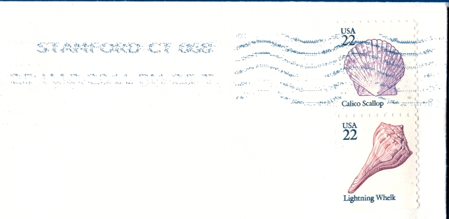
Thought I'd share this potentially nice group of cancelled stamps... if not for that NASTY cancel!!  |
|
Send note to Staff
|
|
|
Bedrock Of The Community
United States
12128 Posts |
|
|
Actually that previously posted cancel isn't too bad (as far as spray-ons are concerned). It gets much worse, as shown here: 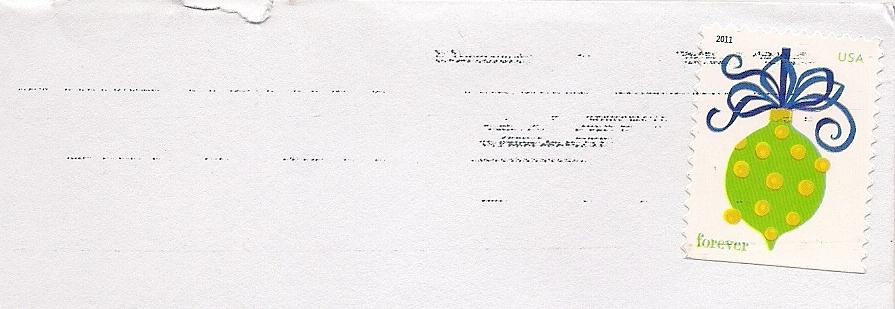 I'm sure glad this was on a Christmas card and not on a piece of mail where the postmark date was critical! |
|
Send note to Staff
|
| Edited by wt1 - 12/20/2011 5:01 pm |
|
|
Pillar Of The Community
United States
3222 Posts |
|
|
Valued Member
United States
302 Posts |
|
|
I agree with everyone that spray on cancels are nasty things.
Although, if you think of it in terms of a certain type of used stamp collector its likely a boon as the cancels today are more unobstructive to the overall design of the stamp.
Either way, I think they'll eventually become interesting historical items 20-30 years from now when the postal service finally dries up and likely reverts to more cost-effective bar-code labels for mailing... An interesting chapter in the long story of the USPS's downfall. |
|
Send note to Staff
|
|
|
Pillar Of The Community
Canada
617 Posts |
|
|
I don't know which I hate more... the spray on cancels... or the self adhesive stamps that you generally find them on. |
|
Send note to Staff
|
|
|
Pillar Of The Community
United States
3222 Posts |
|
|
Bedrock Of The Community
United States
12128 Posts |
|
|
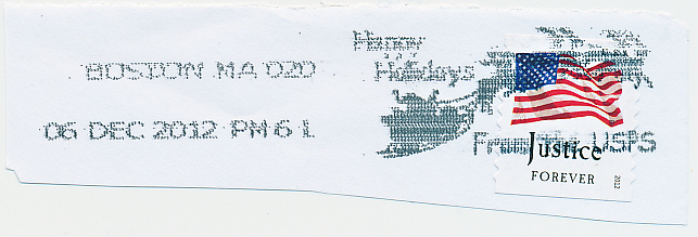
At least Boston, MA looks better than Brockton, MA for 06 Dec 2012: 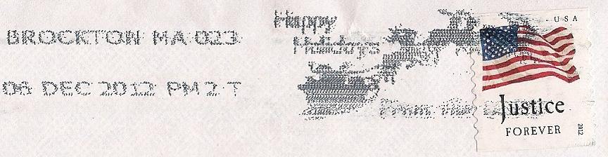 By the way, a question was raised in another thread as to the earliest dated example of a USPS Happy Holidays spray-on for 2012. I think 03 Dec 2012 will be found to be the earliest, as that was a Monday, and the first "business day" of the month of December. |
|
Send note to Staff
|
|
|
Pillar Of The Community
United States
3222 Posts |
|
|
At first I thought this was a Marker Monkey...then I saw that it is another spray cancel... You cam make out windmills and the sun, but does that black bar have actual text? If so, I sure can't read it!  |
|
Send note to Staff
|
| Edited by Nells250 - 04/11/2013 2:03 pm |
|
|
Pillar Of The Community
United States
521 Posts |
|
|
It does have text - it says "Earth Day 2013" - hard enough to read text on those spray cancels, but it's in a pretty crappy font, too. I've posted a few of my Earth Day 2013 spray cancels in this thread: https://goscf.com/t/31755 |
|
Send note to Staff
|
|
|
Rest in Peace
United States
7097 Posts |
|
|
Quote:
I have to say that today's American spray cancels are NASTY! They look awful, can be hard to read, and in my opinion, ruin the practice of collecting used copies of modern commemoratives.
What are your thoughts? I hate DESPISE them! Actually abhor may be even a better word to describe my contempt for these awful abominations? |
|
Send note to Staff
|
|
|
Replies: 45 / Views: 7,374 |
|