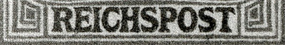
Unfortunately, it is not. In the large "REICHSPOST" printing, the word is very noticeably larger (taller AND wider) and darker. There is very little "salmon" space between the word REICHSPOST and the orange border above/below/left/right. Sorry, I don't have a picture handy to show it.
The width of "REICHSPOST" is the better comparison. Your scan is perfect for that. It shows the widths are the essentially the same.
I know there is a picture in the Michel catalog. Maybe someone can scan it? Sorry I couldn't provide one. My picture archive is microscopic compared to many of the other Forum members! I mean I've really been impressed with the uploads I've seen here!
Disclaimer: While a tremendous amount of effort goes into ensuring the accuracy of the information contained in this site, Stamp Community assumes no liability for errors. Copyright 2005 - 2026 Stamp Community Family - All rights reserved worldwide. Use of any images or content on this website without prior written permission of Stamp Community or the original lender is strictly prohibited. Privacy Policy / Terms of UseAdvertise Here