| Author |
 Replies: 13 / Views: 2,547 Replies: 13 / Views: 2,547 |
|
|
Pillar Of The Community
Australia
1251 Posts |
|
|
 Hi to all Has anyone else seen of know of this variety. Between the "N" and "T" of cents on the three cent stamp I have found one with a hyphen. It is quite visible with the naked eye I have examined it with a Gemmological Microscope it is not thinning. All comments welcome. Regards, Horamakhet. |
|
Send note to Staff
|
|
|
|
|
Pillar Of The Community
Canada
1227 Posts |
|
|
Horamkhet, that is very interesting. I checked a half dozen copies that I have in my stock books but none display the anomaly you have discovered in yours. I checked my Unitrade catalogue and there is no mention of it. |
Send note to Staff 
|
|
|
Pillar Of The Community
Canada
2277 Posts |
|
|
Not a constant error so likely a printing blemish of sorts . Unfortunatly these are seldomly worth more and usually less desirable for some reason. One to definatly put a star beside in your collection. I always thought that occasional printing errors and oddities are far more rare and should command far higher prices . |
|
Send note to Staff
|
|
|
Pillar Of The Community
Australia
1251 Posts |
|
|
Hi Mhc99 and nitrolures  Thank you for you information. I agree, I think that the occasional printing errors and oddities should command higher prices. I believe that if items like this were tested in specialist auctions they would bring a premium, but I am collecting because I love it. I am making a notated album of oddities and varieties that I find. I have included a picture of another one, this time a colour shift. I think this is Unitrade 721. The one on the right shows a very noticeable colour shift in the pine cones, but is not listed in Unitrade probably for the reason suggested by Nitrolures. Regards Horamakhet |
|
Send note to Staff
|
| Edited by Horamkhet - 05/21/2011 04:17 am |
|
|
Pillar Of The Community
Canada
1415 Posts |
|
|
I also see a minor extention of the lower right numeral frame, and what appears to be a slight doubling/line in the N of cents. This may indicate a minor re-entry. Larger scan would help to confirm. |
|
Send note to Staff
|
| Edited by Gilles le timbre - 12/21/2013 08:17 am |
|
|
Pillar Of The Community
Australia
1251 Posts |
|
|
Hi Gilles le timbre
Unfortunately that is the largest scan that I can do on my scanner.
Regards,
Horamakhet |
|
Send note to Staff
|
|
|
Pillar Of The Community
Canada
1394 Posts |
|
|
Unitrade does not list either the 78 dash between T and N of CENTS or 721 red colour shift varieties shown above. |
|
Send note to Staff
|
|
|
Pillar Of The Community
Canada
1084 Posts |
|
|
Great looking Canada Scott#78. Hopefully someone will have more to say about the hyphen feature. My colourful little 1991 Scott Specialized Catalogue of Canadian Stamps shows the issue date for each set throughout but fails to show 1898 in the heading for the Queen Victoria "Numeral Issue". Was this this just neglect or is there a reason for it? I haven't been staying awake at nights fretting about this but would like to further my education. |
|
Send note to Staff
|
|
|
Pillar Of The Community
United States
2948 Posts |
|
|
Quote:
Not a constant error so likely a printing blemish of sorts . Unfortunatly these are seldomly worth more and usually less desirable for some reason. Quote:
Hopefully someone will have more to say about the hyphen feature My opinion is that it was an inclusion or a sliver of paper (or something similar) that flaked away after the ink dried. There are all sorts of terms we could use to describe this, but the bottom line is that it's a flaw, not an error. The fact that it appears in that location is merely a coincidence. Personally, I would treat this like any other inclusion or ink flaw ... as less desirable (and less valuable). Brian |
|
Send note to Staff
|
| Edited by Rileysan - 09/21/2011 10:50 am |
|
|
Rest in Peace
Canada
5701 Posts |
|
|
Quote:
The one on the right shows a very noticeable colour shift in the pine cones That whole definitive set is plagued with colour shifts even more dramatic - they are extremely common. Even a Canadian definitive specialist like myself has very little interest in these. Quote:
I believe that if items like this were tested in specialist auctions they would bring a premium Definitely not, unless far more dramatic a shift, say 5 to 10mm off. Even then, I have seen them sell for very little (for this series). |
|
Send note to Staff
|
|
|
|
Pillar Of The Community
Canada
1394 Posts |
|
|
To enlarge images on these forums, use the "Page" button, then select the "Zoom" feature. |
|
Send note to Staff
|
|
|
Pillar Of The Community
Canada
1084 Posts |
|
|
Thought I would bump this thread by slipping this note in from an old issue of BNA Topics (1967) relating to an "ink splash" on the "c" of cents on a Canada Scott#76 1898 2 cent Queen Victoria purple numeral stamp. 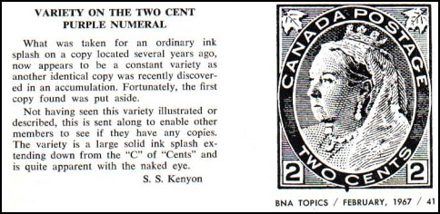 |
|
Send note to Staff
|
|
|
Pillar Of The Community
Canada
644 Posts |
|
|
Good point cynical. If more copies show up, then it becomes more interesting. |
|
Send note to Staff
|
|
|
Valued Member
Canada
242 Posts |
|
|
Definitely looks like an inclusion\debris that was on the paper during printing that fell off. Kind of funny that it happens to be right where it would look like a dash though. |
|
Send note to Staff
|
|
| |
Replies: 13 / Views: 2,547 |
|


