How can I tell the difference between these stamps? One is litho an d the other is typo. How strong a magnifying glass do I need to make this task simple? Thanks in advance for all help offered.
Check out this terrific thread about the same stamp with different printing processes. Some other Argentinian stamps are included. May answer your question.
Thanks very much for the help. I guess it is necessary to have many different copies of the more difficult to identify stamps. This increases your chance of actually having specimens of each type so that they can be compared so that the difference becomes almost obvious. I'm trying to correctly identify all the spamps in my collection and it is often frustrating. Some watermarks are so easy to see they seem to just jump out at you. Others are barely visible just by holding the stamp up to a bright light but others just seem to resist all efforts at identification. If I actually have two different specimens of a design printed by two different methods and can compare them, I have won the battledd when the differences appear so obviously. On the other hand I may have fifty copies of a stamp that appear identical because they really are. Until I acquire a copy of the other variety printed by a different method, I can't be sure what I have. The only sure solution to my problem is to get more stamps as this will increase my chance of having both varieties. Thanks again for the surprisingly rapid assistance.
An ounce of image is worth a pound of performance but if you have a pound of image, you don't have to perform at all.
Its probably just an illness on my part ...but I buy just about all the Argentina packet material I find and put them in stock books...they are probably 999 percent the common stamps..i have yet to seriously try watermarking the different sun watermarks !!
i have tried in vain to find a definitive Argentina catalog in English..strange I can get books on Guatemala a much smaller and less stamp issuing country..but not Argentina...the APS does not appear to have a chapter devoted to Argentina...
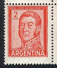
Lizardo, I am looking at two of the San Martin stamps in 102 cards that someone cataloged as 628 typo and 629 litho...under magnifying glass the decorations on San Martins collar and jacket look much clearer and better defined on the litho than on the typo !!
I am finding it a real challenge to differentiate the watermarks on stamps from Argentina. Sometimes the watermark jumps up, shouts, lights a few firecrackers and fires off several shotgun blasts. Other times, I can barely see that there is a watermark there but I can't tell which watermark it is. My suggestion is that you look at some of your stamps under a bright light and see how many have obvious watermarks. Isn't it of crucial importance to know which stamp you have. One variety may have a value of 20 cents and the other may actually have an identical value but maybe you will find one worth 25 cents. Did you ever think of getting a catalog in Spanish and try to learn some of the language? Quiero comprar lagartos. This means "I want to buy lizards."
Once you know all the mistakes, you don't have to worry about making any of them wrong.
I cannot give you the 20c difference, after several hundred stamps I have yet to find a 20c lithograph.
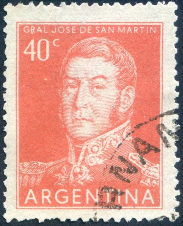
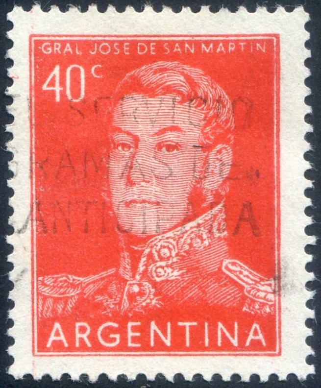
Here is the twin, the 40c San Martin.
Lithography Top, Typography Below.
Typography will always give you slight errors everywhere due to the viscocity of the ink. Look at the gentleman's sideburns, the lithograhy is a lot clearer. Look at the top outer frame between the stamps, and how irregular it is with Typography.
Disclaimer: While a tremendous amount of effort goes into ensuring the accuracy of the information contained in this site, Stamp Community assumes no liability for errors. Copyright 2005 - 2026 Stamp Community Family - All rights reserved worldwide. Use of any images or content on this website without prior written permission of Stamp Community or the original lender is strictly prohibited. Privacy Policy / Terms of UseAdvertise Here