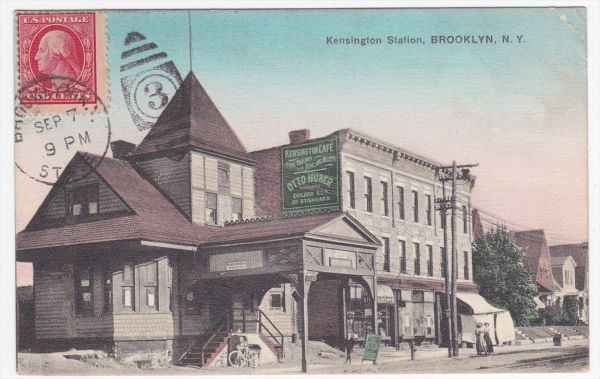
I really like the second one. It is so Americana showing an old time building in what is now a huge bustling metro. Brooklyn has changed a lot since that picture was taken. Nick
I like that your postcard has the stamp and cancel on the front (image side) rather than the back where it normally would be. Little more unusual than you would normally see. Very nice.
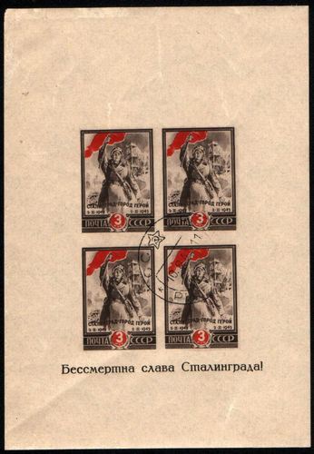
The first one is okay, looks like a crease through it and top edge looks a bit ratty. Postcard is okay, also worn. You should try and identify which Washington it is.
But the question is, why are you soliciting opinions?
Disclaimer: While a tremendous amount of effort goes into ensuring the accuracy of the information contained in this site, Stamp Community assumes no liability for errors. Copyright 2005 - 2026 Stamp Community Family - All rights reserved worldwide. Use of any images or content on this website without prior written permission of Stamp Community or the original lender is strictly prohibited. Privacy Policy / Terms of UseAdvertise Here